1. Downloading & Installation
1.1 Introduction
BeTheme brings a new look to creating websites. Features include the totally new and improved Muffin Builder, a host of short codes and pre-made layouts, a variety of portfolio layouts,swipe technology, Revolution Slider, and more. With this amazing theme at your disposal you cancreate any page. As you will discover as you browse this manual, BeTheme soptions are amazingly easy to implement.
1.2 Package from Theme Forest
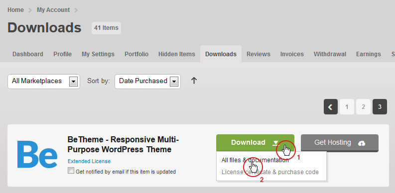
With your purchase of this theme, the first step is to download the package from ThemeForest. Move your mouse over your ThemeForest Login name in the right top corner and click Download. You will see the number of items purchased, along with the package’s content, as shown in the following diagrams.
Next, click Download > Main File(s) next to BeTheme and save the package on your computer.
The download includes documentation, license, psd files, zipped file with theme files and the BeTheme files folder.. Unpack the entire package after downloading.

1.3 Installation & Update
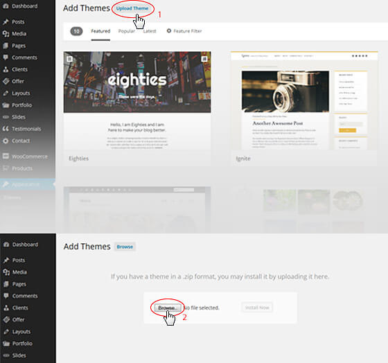
Before you can complete the installation, make certain you have unpacked the entire package. This is very important! You can complete the installation in either of two ways:
- WordPress Theme Manager - please go to Appearance > Themes > Add new > Upload, select the zipped theme folder called betheme.zip and press Install Now WordPress will do the rest for you.
- FTP upload-upload non-zipped BeThemefolder to the /wp-content/themes/ folder in the WordPress installation folder on your server.
The Second part of this guide describes how to update BeTheme. When first installing BeTheme, make sure that you don’t make any changes in the files. If you have, and you don`t want to lose them, the best way save them is to use a freeware tool for comparing files, Beyond Compare for example (How to use it can be found on their website). After comparing files, you can then upload only those files that haven’t been changed.
If you haven`t changed any theme files, all you need to do to update your current version is to download the latest package from ThemeForest, unpack the files, and upload the new files on the server while replacing the old files by overwriting them.
All your data is safe becausetheme file updates do not change anything in the database. It is still recommended to always make a backup of your files & database.
IMPORTANT!!! After theme installation, you will see a box with information about required and optional plugins. To install and activate them, navigate to Appearance > Install Plugins and install only those plugins that are required, or are optional but necessary. Plugins include: Slider Revolution (required), Contact Form 7 (required), Duplicate Post (optional), Envato WordPress Toolkit (optional), Force Regenerate Thumbnails (optional), Layer Slider (optional), Recent Tweets (optional) and Visual Composer (optional).
2. Demo content
With Be, there are two ways to upload demo content, 1 Click Demo Install, and.xml files.Both methods are described below.
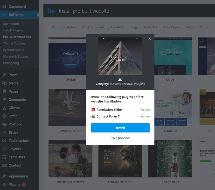
2.1 New pre-built websites installator (since version 17)
To use new pre-built website installator, simply go to BeTheme > Pre-built websites and choose the website you want to install. You can select whole content, one of homepages, slider, content, options or widgets.
For more details, please WATCH THIS VIDEO.
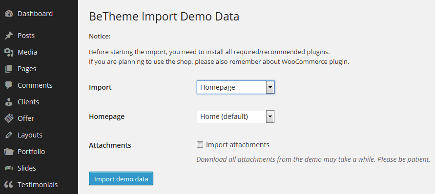
2.2 1-Click Demo Install (for 16.9 and older versions)
If you use the 1 Click Demo Install option, you don`t need to use .xml files. .Simply go to Appearance > BeTheme Demo Data and choose what you want to install. You can selectwhole content, one of homepages, content, options or widgets.
Following the 12 September 2014 (4.2) release, we created totally different demos for greater usability (not only homepages, but all settings; widgets, menus, images and other elements associated with a particular demo). For more information, navigate to https://forum.muffingroup.com/betheme/discussion/1064/how-to-re-create-one-of-full-demo-pages-betheme-demo-data
To get step-by-step instructions of how to re-create pre-built websites, please watch instructional video.
3. Header
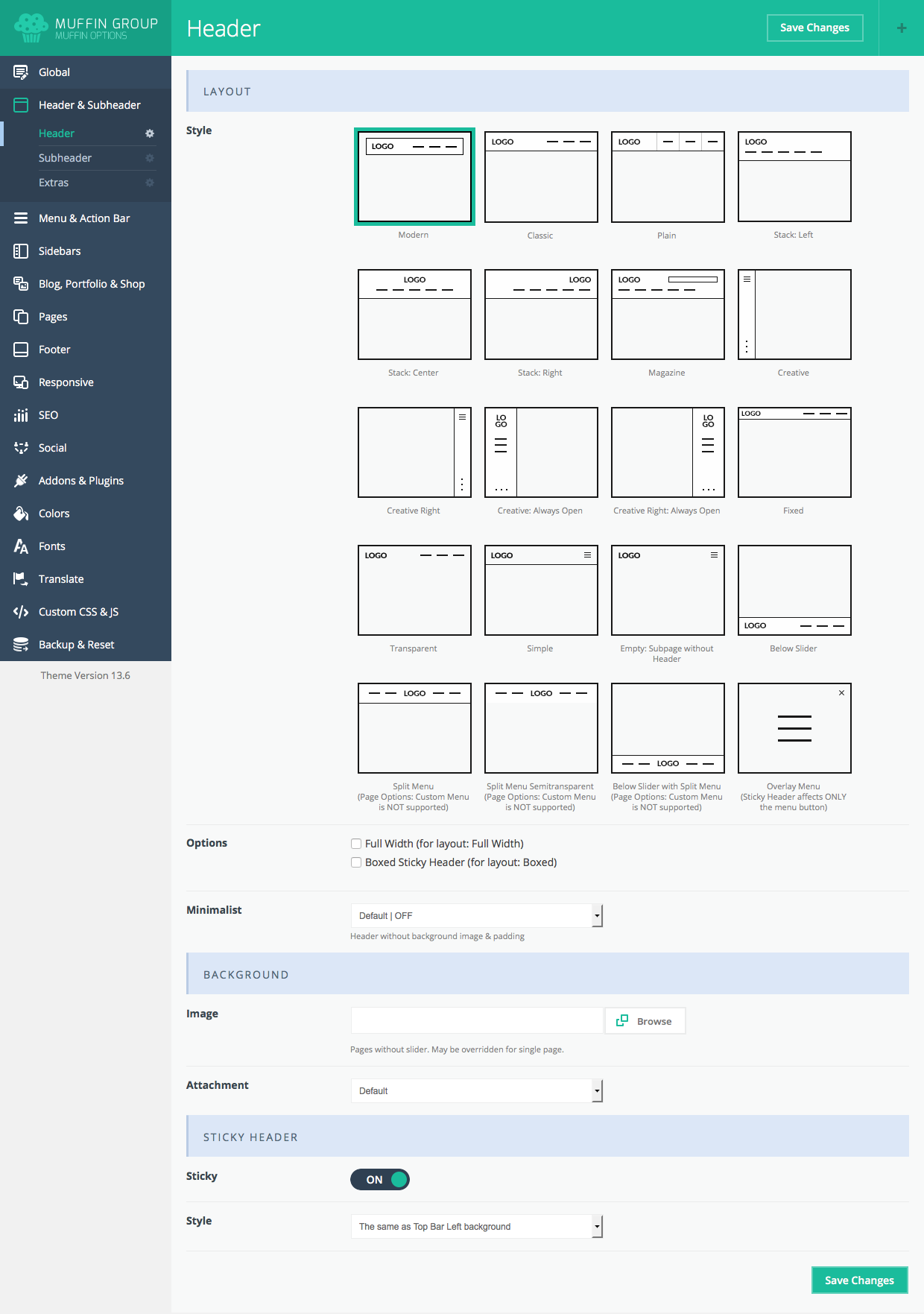
Header is an important theme feature, and is what users see first. There are 9 different header styles Options include on/off stick header, set up secondary menu, position for logo, language selector, search,andmore. You can also setup different header styles for different pages. Header options are illustrated below.
3.1 Header layout
To setup header layout,navigate to Appearance > BeTheme Options > Header & Subheader > Header and choose one of the available layouts. You can also set upuse these other options:
- Style - choose a header style (Modern, Classic, Plain, Stack: Left, Stack: Center, Stack: Right, Magazine, Creative, Creative Right, Creative: Always Open, Creative Right: Always Open, Fixed, Transparent, Simple, Empty: Subpage without Header, Below Slider, Split Menu, Split Menu Semitransparent, Below Slider with Split Menu and Overlay)
- Options - Full Width or Boxed Sicky Header.
- Header | Minimalist - choose if you want a header without background image & padding or not.
- Image - select and upload a selected header background image if you don`t want a default one (the image will be applied for all pages instead of the default). You can also upload different header images for different pages using the Set featured image option.
- Attachment choose between fixed or parallax header background position.
- Sticky - turn on/off sticky header
- Style- choose between white, dark and same as Top Bar left background colors.
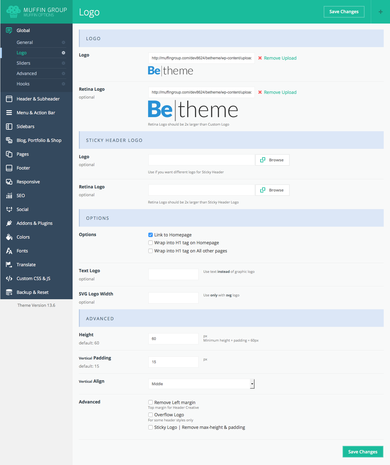
3.2 Logo & Favicon
To set up logos, it's sizes padding and other options, please navigate to Appearance > BeTheme Options > Global > Logo section.You can also set up additional logo options. Note: Retina Logo should be always 2x larger than Custom Logo (this field is optional). This section contain the following options:
- Logo (Custom & Retina) - here upload regular logo
- Sticky Header Logo (Custom & Retina) - here upload logo for header when it is sticky
- Options - You can choose if you want to link logo to homepage or not or if you prefer to wrap logo into H1 heading what some users prefer
- Text Logo - if you prefer to use simple text logo instead of image, this is the right place to do this
- SVG Logo width - if you use SVG logo type, you need to set it's width
- Height - set up custom logo size
- Vertical Padding - top and bottom padding for the logo
- Vertical Align - choose between the Top, Middle and the Bottom positions
- Advanced - there is some options like Overflow logo but please remember that these options concerns some header types only
3.4 Sliding Top
To set up widgets inside the Sliding Top Area, navigate to Appearance > Widgetsand set up widgets for Sliding Top area #1, Sliding Top area #2, Sliding Top area #3 or Sliding Top area #4. depending on your needs.You canset up for one section, or more than one. After widgets set up is complete, go to Appearance > BeTheme Options > Header & Subheader > Extras section and turn on the Sliding Top option.
4. Pages creation
Creating a page has been never so easy. To start, go to Pages > Add new. At first glance everything looks like the WordPress default, but when look under Visual/HTML area you will see Page Options.
4.1 Getting started
In first Visual/HTML area you can build your page using all available options in editor. Beyond the default options we included a []+ button for WordPress editor. With this option you can build any page you want based on short codes. BeTheme short codes are described in the Muffin Builder & Shortcodes section.
Note: You can build pages based strictly on short codes, or you can use Muffin Builder.
Muffin Builder Options:
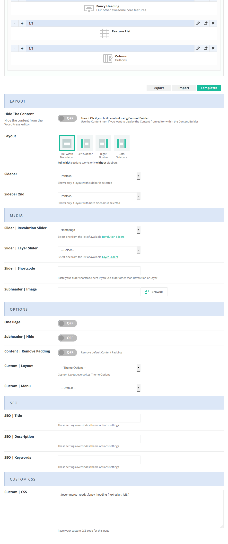
Layout
- Hide the content - this option hides the content from the WordPress editor. You can turn this button on or off. If you`re using Muffin Builder to create content, turn the button off. Otherwise, the content from the WordPress editor will show above the Muffin Builder items.
- Layout - you can choose a custom layout for each page. There are 4 options: full width without sidebar, left sidebar, right sidebar or both sidebars.
- Sidebar - You can also create your own sidebar by selecting Appearance > BeTheme Options > Sidebars.
- Sidebar 2 - You can also create a second sidebar by selecting Appearance > BeTheme Options > Sidebars.
Media
- Slider | Revolution Slider - you can select a Revolution Slider for your page. Each page can have a different slider. Before selecting a slider, you first need to create it using the amazing Revolution Slider
- Slider | Layer Slider - you can select a Layer Slider for page. Again, each page can have a different slider.
- Slider | Shortcode - if you want to use another type of slider, paste its shortcode here
- Subheader | Image - selects a background image for the sub-header section.
Options
- One Page - Turn it ON if you want to create one page with # hashtag links. For more information about this feature, please read here.
- Subheader | Hide - this option removes the Subheader section where your page’s title and bread crumbs are located.
- Content | Remove Padding - ON/OFF padding for the top content section.
- Custom Layout - if you want a custom layout for your page, you first need to create it in Layouts section located in the left-side dashboard menu. Then you can choose which one you want to use for your page. If you don`t choose any, the default layout will be used. This feature allows you to create different layouts for different pages.
- Custom Menu - if you want a custom menu for a page, you need to first create it in Appearance > Menus, which also appears in the left-side main dashboard menu. You can then choose which one you want to use for your page. If you don`t choose any, the default menu will be used. This feature allows you to create different menus for different pages.
SEO
- SEO Title - SEO title for your page (if you leave this field empty, the page will default to settings from Appearance > BeTheme options > SEO)
- SEO Description - description for your page (if you leave this field empty, the page will default settings from Appearance > BeTheme options > SEO)
- SEO Keywords - keywords for your page (if you leave this field empty, thepage default to settings from Appearance > BeTheme options > Getting started > General)
Custom CSS
- Custom CSS - you can create custom CSS for the current page you are working on only.
After selecting all of your options on right side, you can also choose right Page Template for this site.
4.2 Muffin Builder
You will enjoy working with Muffin Builder This page builder makes creating a website fun and easy. A page can be split into different work sections, where you can choose your colors, backgrounds, layouts, sidebars, classes, and more. Within each section, you simply add whatever items you need.
The new Muffin Builder allows you to clone sections or items, making website building faster and easier than ever. Read on.
To add an item inside a work section, click Add item. You will see your selected Item added below the button. There are a number of things you can do with this added Item.
- Expand the selected Item to 1/6, 1/5, 1/4, 1/3, 1/2, 2/3, 3/4, 1/1 by using "+" button in the Item. Or, you can shorten the Item using the "-" button. Note: Every Item can be sized in the same way.
- Delete an Item/Section/Row by ˟ in the right Item corner.
- Edit each Item/Section/Row by clicking on "Pencil" in the right bottom corner.
- Clone an Item/Section/Row by clicking on "Clone" in the right bottom corner.
- You can also move any Item/Section/Row by drag & drop.
- Hide Section if you don't want to display it in front-end.
Please remember that Muffin Builder works only with Default template.
Notice! To learn how to use Muffin Builder 3.0 please watch this instructional video.
4.2.1 Accordion / Toggle
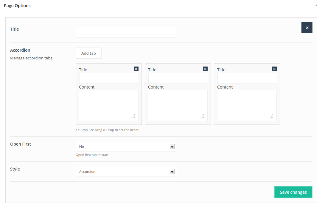
This Item adds an Accordion or Toggle on page. You can add as many tabs as you need. Just type the Title and Content (you can use html tags) for each tab. You can also use Drag & Drop option to set the order for items.
Available sizes:'1/4', '1/3', '1/2', '2/3', '3/4', '1/1'
Attributes:
- Title (accordion item title)
- Accordion ( add as many tabs you want, use drag & drop to change their order or remove them)
- Open first (you can select which tab you want to open first)
- Style (choose Accordion or Toggle)
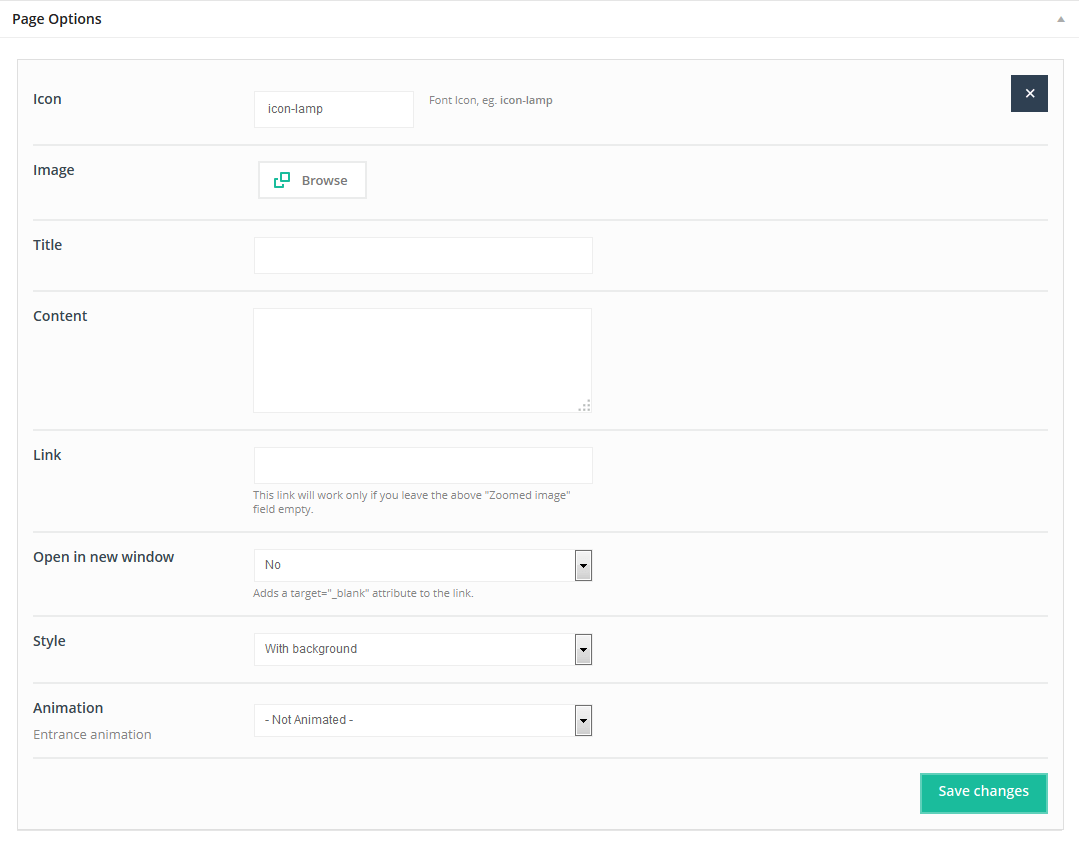
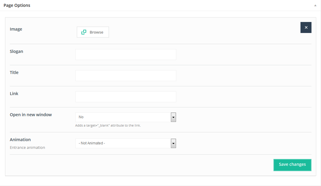
4.2.2 Article box
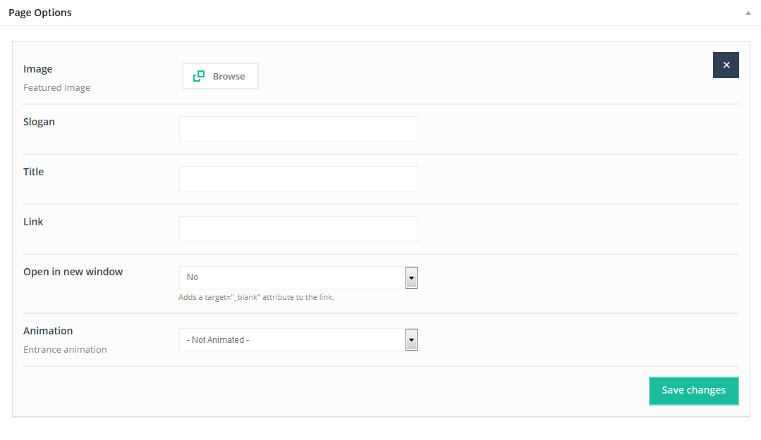
This Item adds an Article box on page. You can add as many article boxes to a page as you need, just type the content into the appropriate fields.
Available sizes:'1/3', '1/2'
Attributes:
- Image (upload image for box)
- Slogan (text available at the top of right side item)
- Title (title for article box item)
- Link (link to any page of your choosing - this field can be left empty)
- Open in new window (if you want to open the link in the new window)
- Animation (choose entrance animation on scroll or leave not animated)
4.2.3 Blockquote
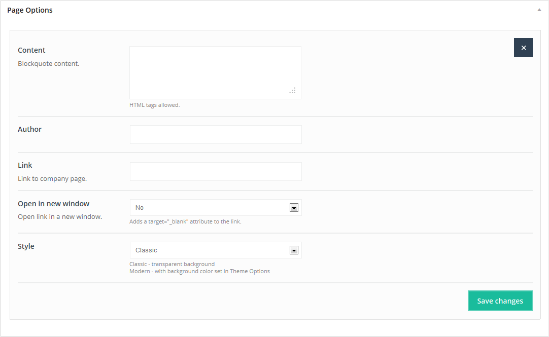
This Item adds a Blockquote box with an image and/or text..
Available sizes: '1/6', '1/5', '1/4', '1/3', '1/2', '2/3', '3/4', '1/1'
Attributes:
- Content (add your content for the Blockquote Item. You can use html tags)
- Author (Blockquote author)
- Link (link to author's page)
- Open in new window (select “Yes” if you want to open link in a new window)
- Style ( choose a style for this Item - Classic or Modern)
4.2.4 Blog
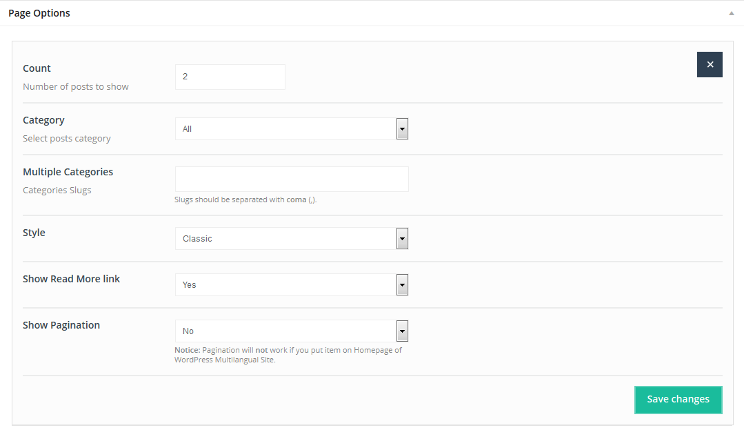
This Item allows you to add Blog on any page. Useful for those who want to incorporate blog content with other content.
Available sizes: '1/1'
Attributes:
- Count (choose the number of posts you want to show)
- Category ((select the category from which one you want to show posts)
- Multiple Categories (type in categories slugs to show posts from multiple categories)
- Style (choose Classic, Timeline or Masonry blog style)
- Show Read More link (show or don’t show the Read More button)
- Show pagination (Yes or No)
4.2.5 Blog slider
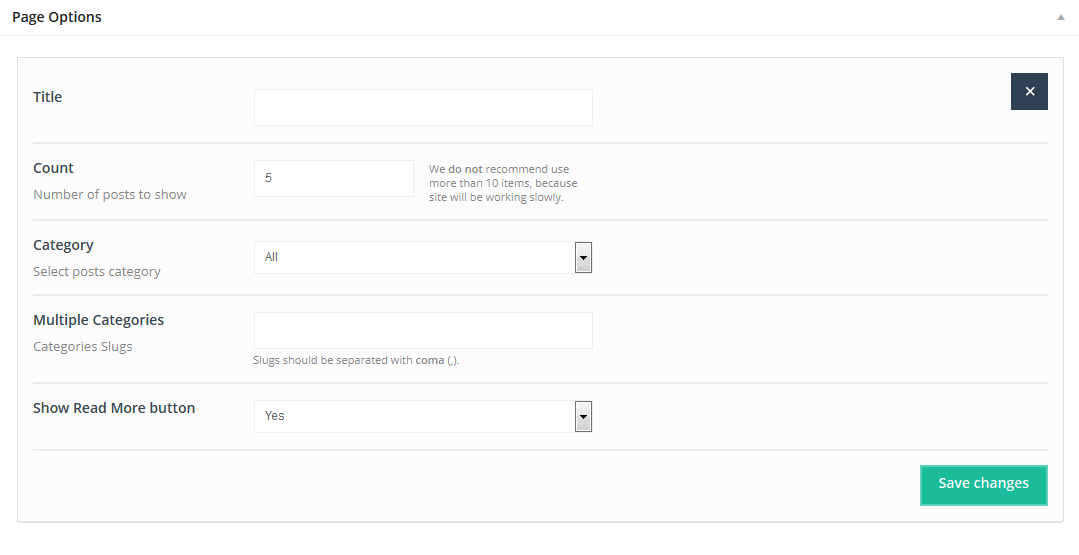
This Item allows you to add posts inside a slider. It is equipped with swipe technology for use with mobile devices and tablets.
Available sizes: '1/4', '1/3', '1/2', '2/3', '3/4', '1/1'
Attributes:
- Title (title for Blog Slider item)
- Count (type the number of items to appear within the Blog Slider)
- Category (choose a category to show posts)
- Multiple Categories (type in Categories Slugs to show posts from multiple categories)
- Show Read More button (Yes or No)
4.2.6 Call to action
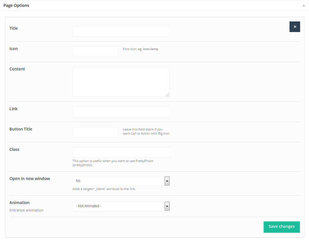
This Item allows you to create a Call to Action item with or without a background image, icons, or text.
Available sizes: '1/1'
Attributes:
- Title (Title visible onleft side of the item)
- Icon (Select an icon from the list of available icons)
- Content (Content visible on the right side of the item)
- Link (link for action icon in the middle of the item)
- Button Title (fill in this field if to show a button instead of an icon)
- Class (select if you want to open a link in a popup window)
- Open in new window (select “Yes” to open link in the new window)
- Animation (select entrance animation on scroll or leave without animation)
4.2.7 Chart
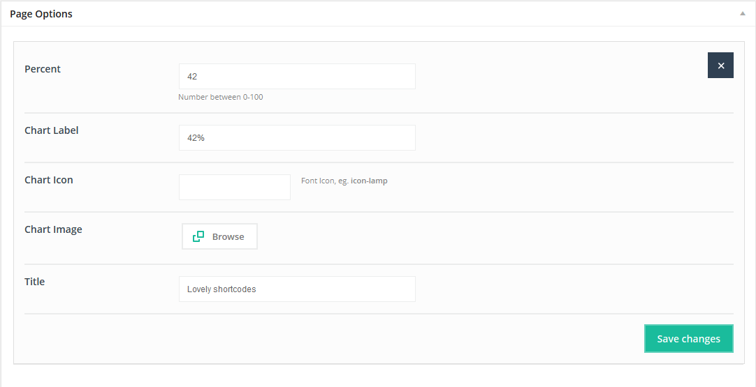
This Item allows you to create a section or single element with a Chart.
Available sizes: '1/4', '1/3', '1/2'
Attributes:
- Percent (Identify the percent desired around the circle)
- Chart label (indicates text inside Chart item)
- Chart icon (choose an iconfrom the list of available icons)
- Chart image (upload your own image inside the Chart item)
- Title (title for chart item)
4.2.8 Clients
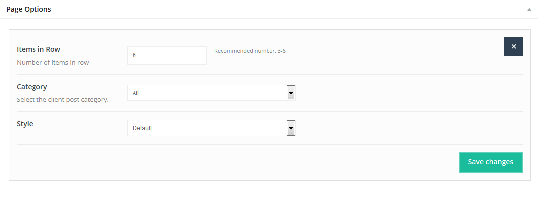
This Item creates a Clients section.
Available sizes: '1/1'
Attributes:
- Items in row ( select the desired number)
- Category (select the client post category or categories)
- Style (select Default or Tiles)
4.2.9 Code
This Item can be used to present code. It also converts HTML tags into HTML special characters.
IMPORTANT! This item does not parse html!If you want to parse, use Column item instead! Column item instead!
Available sizes: '1/6', '1/5', '1/4', '1/3', '1/2', '2/3', '3/4', '1/1'
Attributes:
- Content (add your code here)
4.2.10 Column
This Item creates a column. You can use iframes, HTML, local CSS styles, and more. Inside Column, you can enter anything you wish.
Available sizes: '1/6', '1/5', '1/4', '1/3', '1/2', '2/3', '3/4', '1/1'
Attributes:
- Title (visible only via Admin Panel - item label)
- Column content ( the only attribute for this Item; feel free to use HTML tags and shortcodes in this section)
- Animation (choose Entrance Animation on Scroll or leave Not Animated)
4.2.11 Contact box
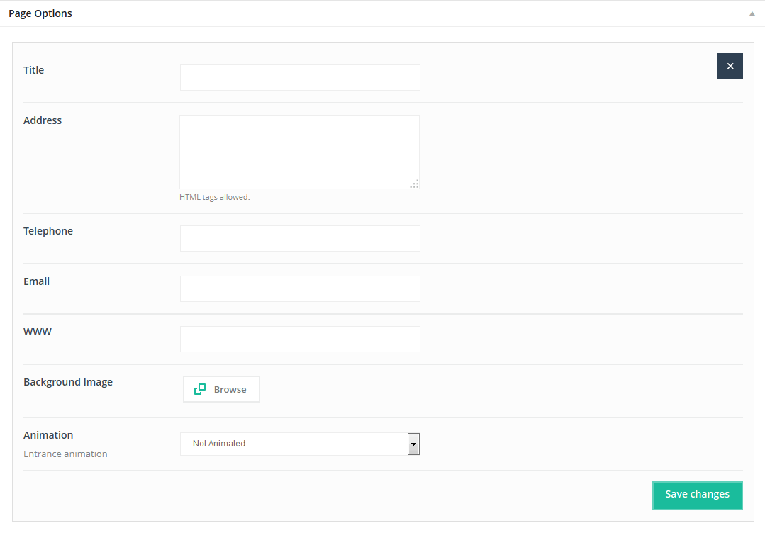
This Item creates a Contact boxthat enables others to contact you.
Available sizes: '1/6', '1/5', '1/4', '1/3', '1/2', '2/3', '3/4', '1/1'
Attributes:
- Title (contact box title)
- Address (enter your address; HTML tags are also allowed)
- Telephone (telephone number)
- Email (email address)
- WWW (website url)
- Background image (upload a background image if desired)
- Animation (select Entrance Animation on scroll or leave Not Animated)
4.2.12 Content WP
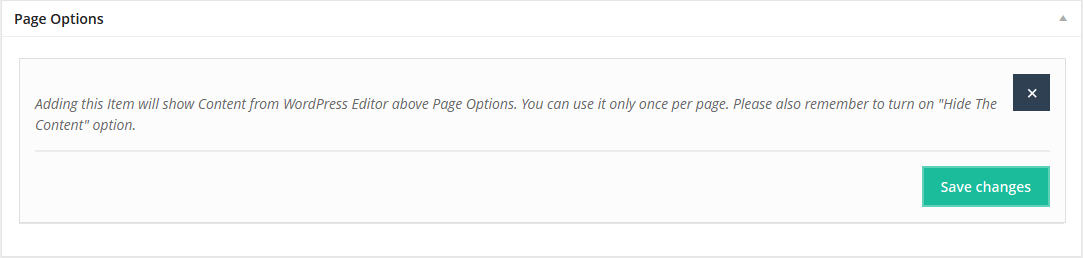
Adding this item will show Content from the WordPress Editor above the Page Options section. You can use it only once per page. Remember to turn off "Show The Content" option if you prefer using this item. Otherwise the content will be duplicated.
Available sizes: '1/6', '1/5', '1/4', '1/3', '1/2', '2/3', '3/4', '1/1'
4.2.13 Counter
This Item creates a Counter with icons or images.
Available sizes: '1/6', '1/5', '1/4', '1/3', '1/2'
Attributes:
- Icon (choose icons from our predefined icons list)
- Icon color (type in icon color)
- Image (upload an image as an alternative to using an icon)
- Number (number for Counter item)
- Prefix (additional text for the item, % or $ - before the number)
- Postfix (additional text for the item, % or $ - after the number)
- Title (text placed under number)
- Style (select Vertical or Horizontal style)
- Animation (select Entrance Animation on Scroll or leave Not Animated)
4.2.14 Divider
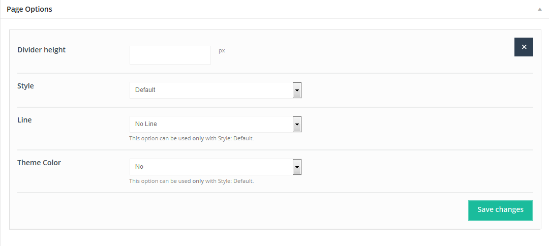
This Item creates spaces between elements. It also aligns a single line, with boxes located underneath. You can choose different styles of this item.
Available sizes: '1/1'
Attributes:
- Divider height (enter the divider height)
- Style (select Default, Dots and ZigZag)
- Line (select Default, Narrow, Wide and Default)
- Theme Color (select YES if you want line color to be the same as the theme color)
4.2.15 Fancy heading
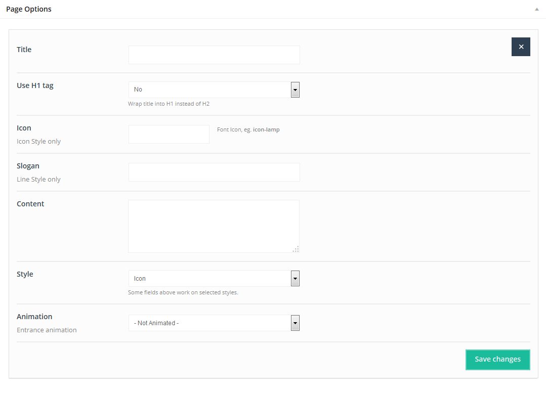
This Item is creates a Fancy heading. You can create unique headings in different locations in the preview section.
Available sizes: '1/1'
Attributes:
- Title (title for heading)
- Use H1 tag (choose YES, if you want the an H1 tag instead of H2)
- Icon (select an icon from our icon's list)
- Slogan (displays as small text under the title)
- Content (content to appear inside the heading)
- Style (select 1 of 3 different styles)
- Animation (select Entrance Animation on Scroll or leave Not Animated)
4.2.16 FAQ
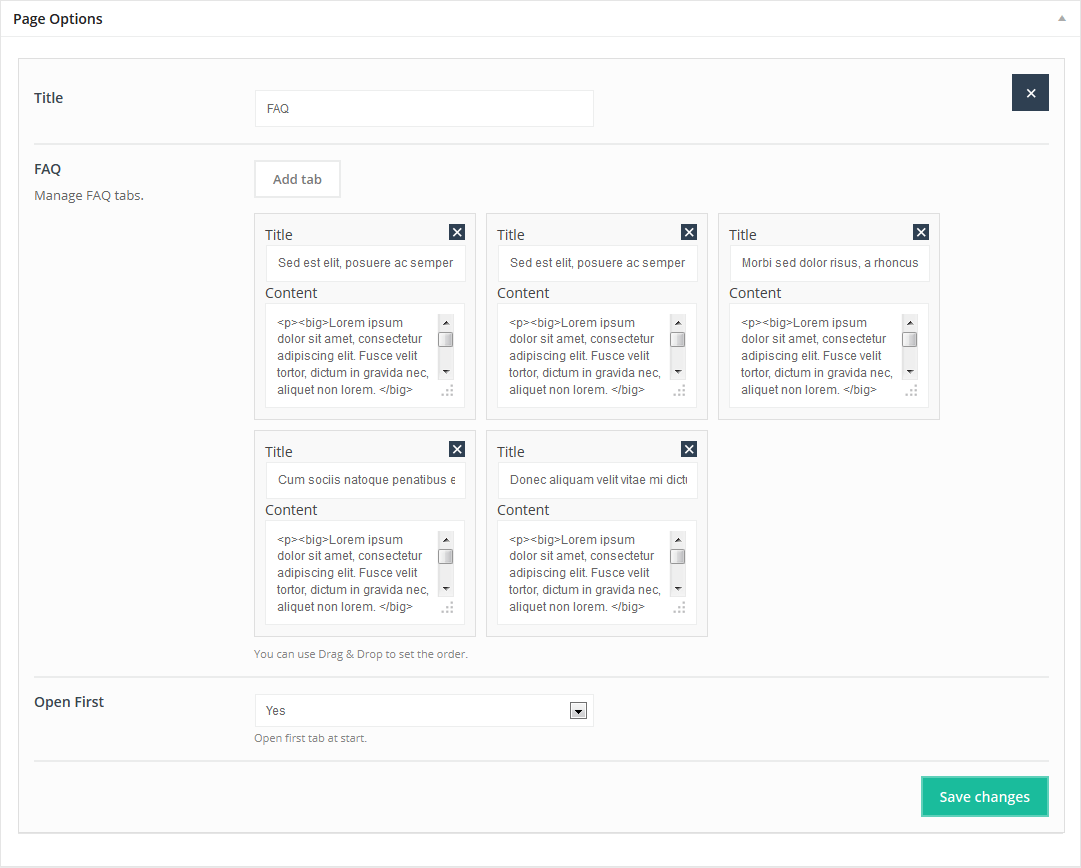
This Item creates an FAQ page. You can also use Drag & Drop option to set the order for the items on this page.
Available sizes: '1/4', '1/3', '1/2', '2/3', '3/4', '1/1'
Attributes:
- Title (type title for this item)
- Add tab (add your own tabs for FAQ item)
- Open First (ON, if you want to have the first accordion item opened)
4.2.17 Feature List
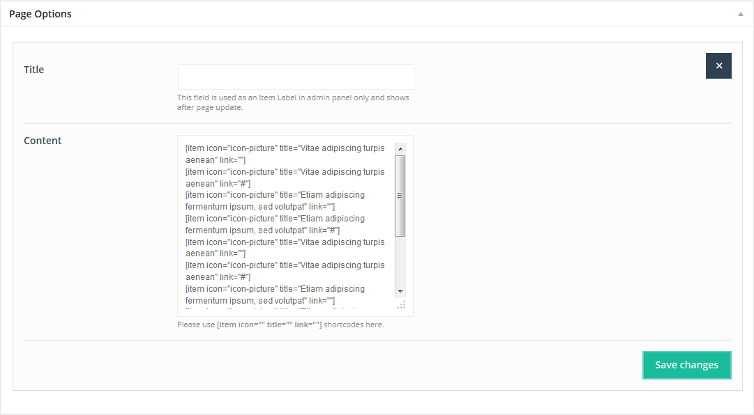
With this Item you can create a Feature List section. using icons, links, and icon colors.
Available sizes: '1/1'
Attributes:
- Title (type Feature List title)
- Content (Use text shortcode [item icon="icon-picture" title="some text" link="#"]) for each item inside. Each item can have its own icon, text, and link.
4.2.18 How it Works
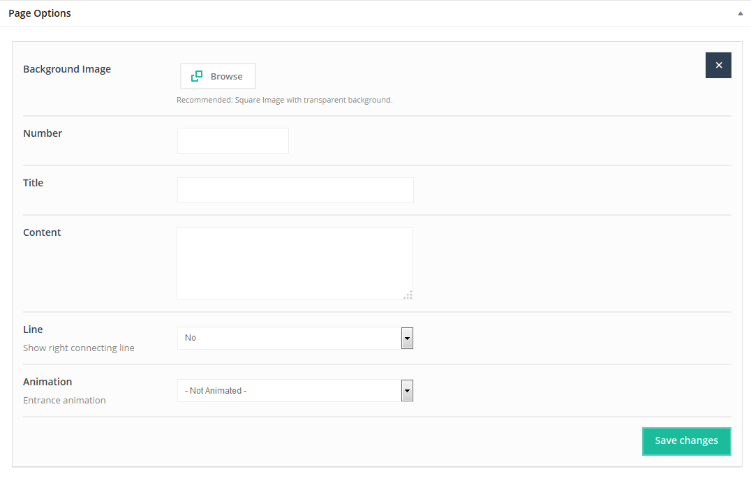
The How it Works item allows you to create steps sections that can be used on landing pages.
Available sizes: '1/4', '1/3'
Attributes:
- Background image (upload a background image for the item visible in the circle)
- Number (digit appears in the right bottom section of the item)
- Title (title appears under the circle)
- Content (enter descriptive text - it will appear under the title)
- Line (choose whether or not to show a connecting line between items)
- Animation (select Entrance Animation on Scroll or Not Animated)
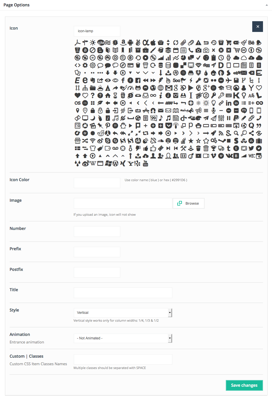
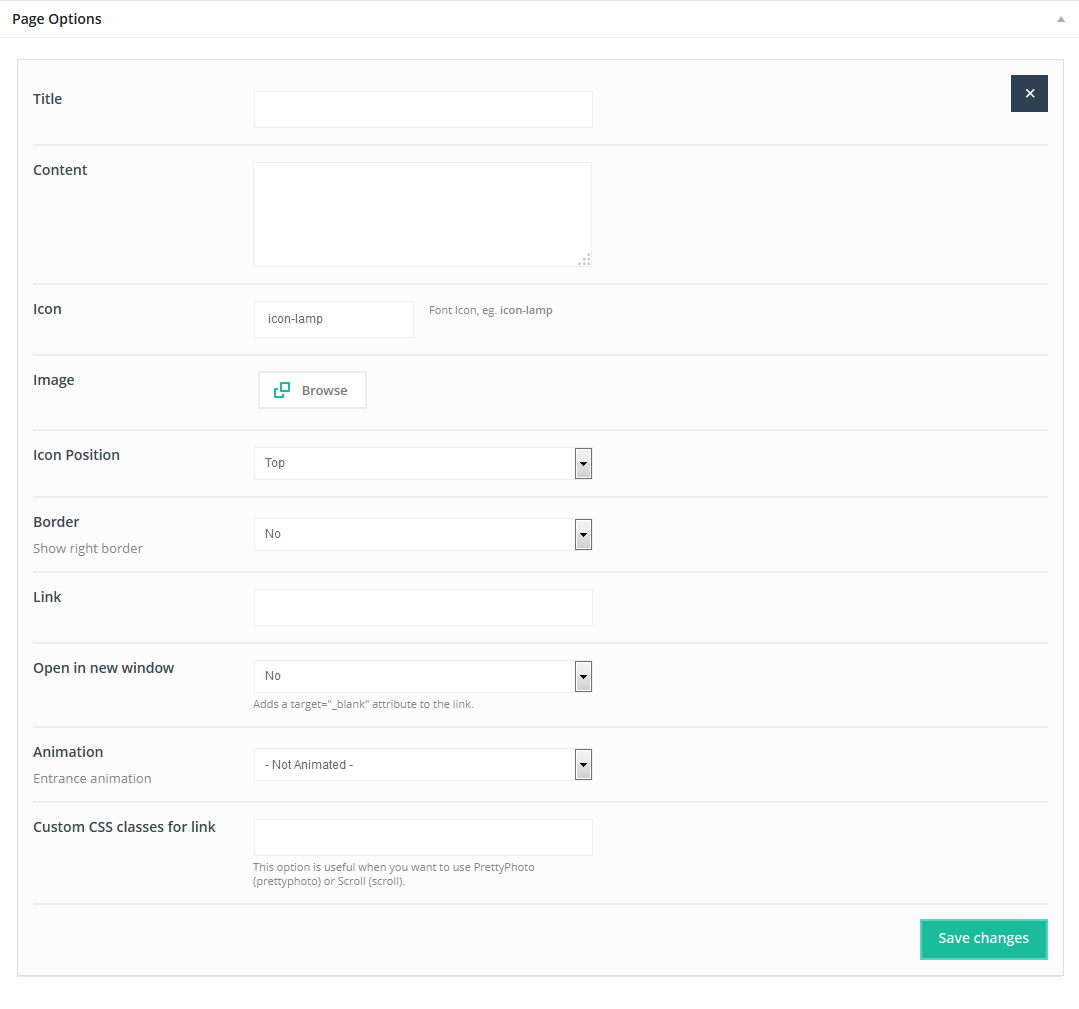
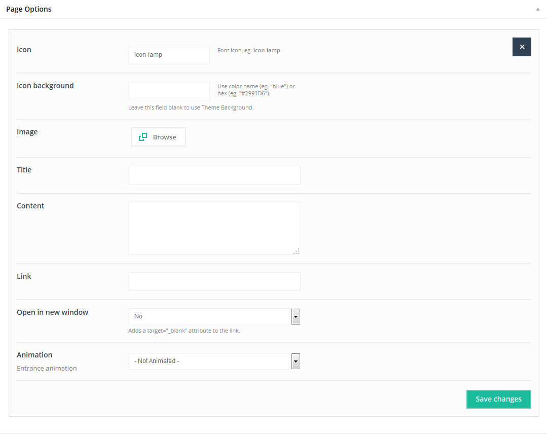
4.2.19 Icon Box
With this Item you can create an awesome Icon box featuring a hover effect. There are many different styles or you can create your own.
Available sizes: '1/6', '1/5', '1/4', '1/3', '1/2'
Attributes:
- Title ( Icon Box title)
- Content (Icon Box text)
- Icon (icon for Icon Box image - use an icon from the icon's list)
- Image( upload an image instead of using an icon)
- Icon Position (choose Top or Left position)
- Border(select if you want to show a border)
- Link (type link for Icon Box, or leave it empty)
- Open in new window (select YES to open link in a new window)
- Animation (select Entrance Animation on Scroll or No Animation)
- Custom CSS classes(type your own class for a section - this is a useful option for those who want to create a special style for a section). For example: you can type my-own-super-section class and then go to BeTheme options > Custom CSS & JS > Custom CSS and write your own styles for this class:
.my-own-super-section {margin: 30px; padding: 20px; font-size: 15px; etc... }If you want to use multiple classes separate them with a SPACE. We have one built-in class for this section which is named dark. Use it if you want to have a dark background.
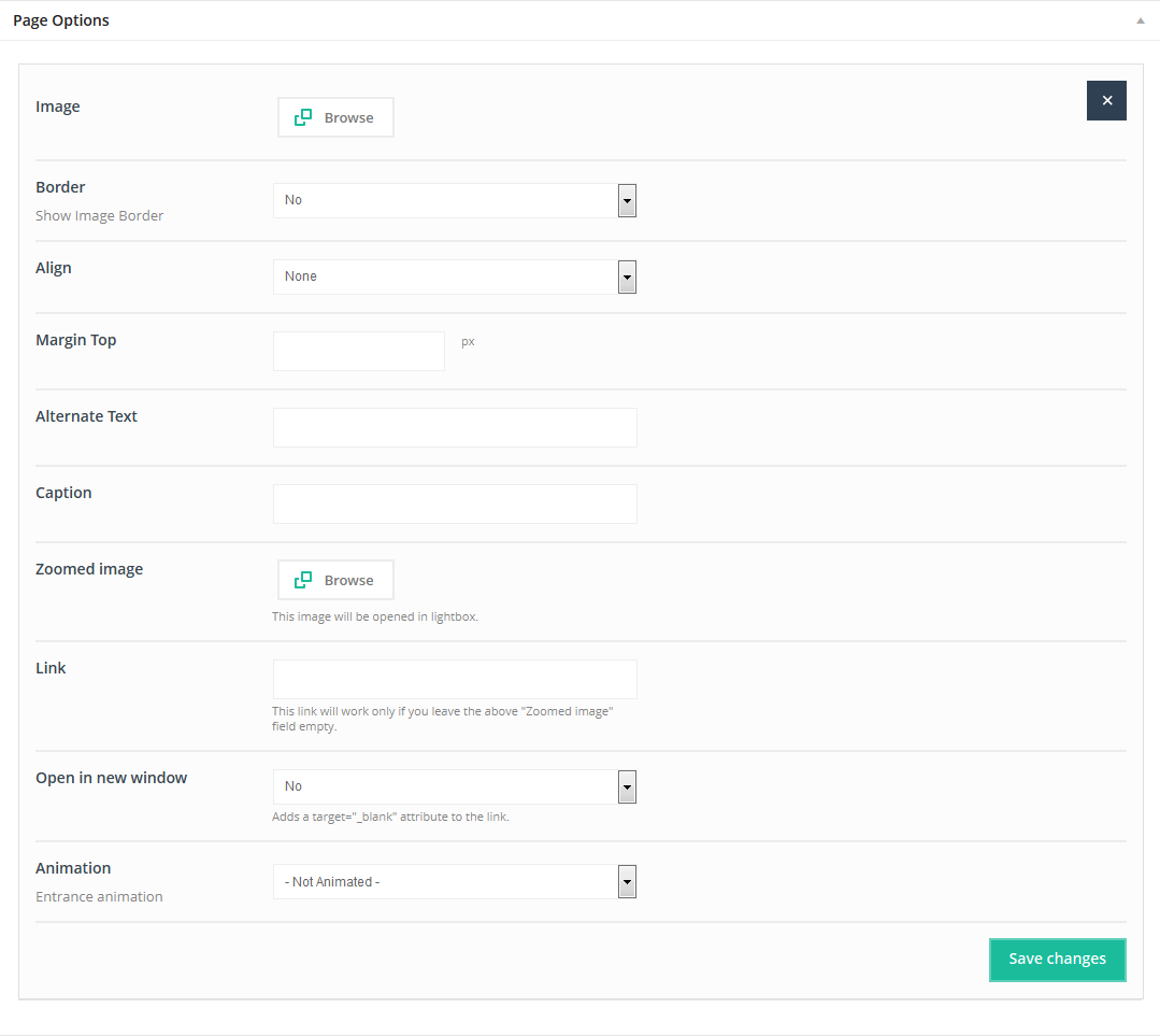
4.2.20 Image
This Item is a useful option for embedding images onto a page. Images can have links or be zoomed.
Available sizes: '1/6', '1/5', '1/4', '1/3', '1/2', '2/3', '3/4', '1/1'
Attributes:
- Image (choose your image)
- Border (select Yes if you want a border around the image)
- Align (choose how you want to align the image)
- Margin Top (margin value from top in pixels)
- Alternate text (alt text for image)
- Caption (short text under image)
- Zoomed image (choose image if you want it opened after click)
- Link (if you don`t want to open the image after click; you can type your own link for this image)
- Open in new window (select Yes if you want to open the image in a new window)
- Animation (select Entrance Animation on Scroll or No Animation)
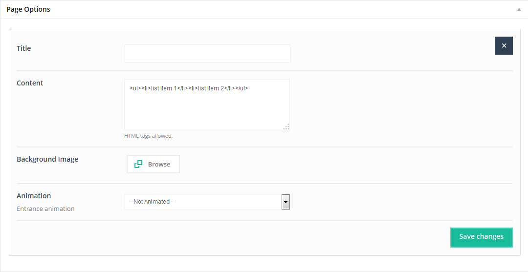
4.2.21 Info Box
This Item allows you to create an awesome Info box. You can also include a background image for an added effect.
Available sizes: '1/6', '1/5', '1/4', '1/3', '1/2', '2/3', '3/4', '1/1'
Attributes:
- Title( Info Box title)
- Content(inside Info Box text)
- Background image (select background image for Info Box )
- Animation(select Entrance Animation on Scroll or No animation)
4.2.22 List
TheList item enables you todefine and create styles, images, icons and more.
Available sizes: '1/6', '1/5', '1/4', '1/3', '1/2'
Attributes:
- Icon (use any icon in our icon's list)
- Image ( upload own image instead of selecting an icon)
- Title (List title)
- Content(List text)
- Link (List item can have link or no link)
- Open in new window (Select “Yes” if to open Item in a new window)
- Style ( choose between 4 different Item styles)
- Animation(Select Entrance Animation on Scroll or No Animation )
4.2.23 Map
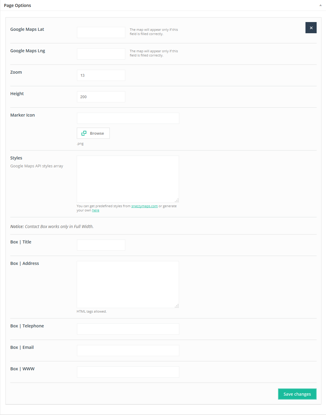
This Item will create the Google map. Map item is based on Google Maps API.
Available sizes: '1/6', '1/5', '1/6', '1/5', '1/4', '1/3', '1/2', '2/3', '3/4', '1/1'
Attributes:
- Google Maps Lat (type Lat value for your position)
- Google Maps Lng (type Lng value for your position)
- Zoom (zoom of the map)
- Height (height of the map)
- Marker Icon upload own marker icon instead of default (.png format only)
- Styles get predefined styles from snazzymaps.com or generate your own here
- Box | Title (title for address box - visible on the right side)
- Box | Address (content for address box - visible on the right side)
- Box | Telephone(phone number for address box - visible on the right side)
- Box | Email(email for address box - visible on the right side)
- Box | WWW (www for address box - visible on the right side)
The map will appear only if Google Maps Lat and Google Maps Lng are correctly entered.
IMPORTANT!!! Please remember to set up Google Maps API key under Theme options > Global > Advanced section. If you won't do this, you will get "Oops! Something went wrong. This page didn't load Google Maps correctly. See the JavaScript console for technical details" error message instead of map. More details about this option you can read on support forum.
4.2.24 Offer
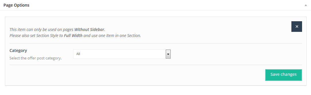
This Item will create an Offer section. To create items for Offer you need to add items in Offer section located on the left side of the main WordPress dashboard menu between"Clients" and "Portfolio" sections.
Available sizes: '1/1'
Attributes:
- Category(select category from which you want to show offer items)
This Item has no attributes. The Offer item can be used only on pages without sidebar and section must be setup on Full Width.
4.2.25 Opening hours
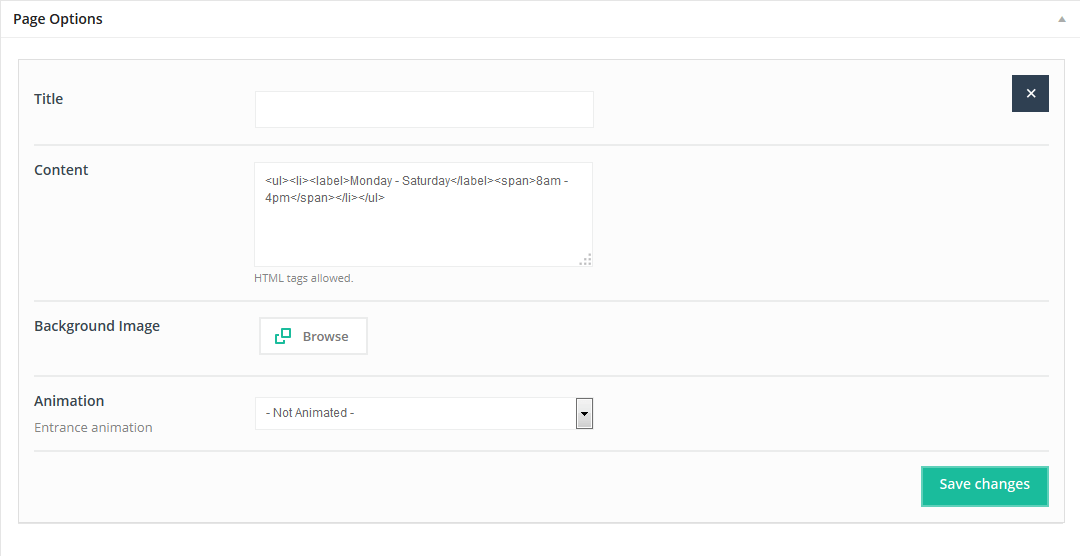
This item will create a Opening hours box in which you can type whatever content you want.You can also include a background image for an added effect.
Available sizes: '1/6', '1/5', '1/4', '1/3', '1/2', '2/3', '3/4', '1/1'
Attributes:
- Title (type Opening hours title)
- Content ( use any content you want, including plain text or html tags)
- Background image (add an image for a background)
- Animation (choose Entrance |Animation on Scroll or No Animation)
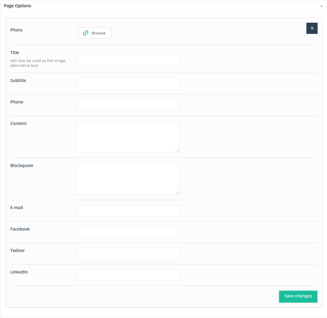
4.2.26 Our team
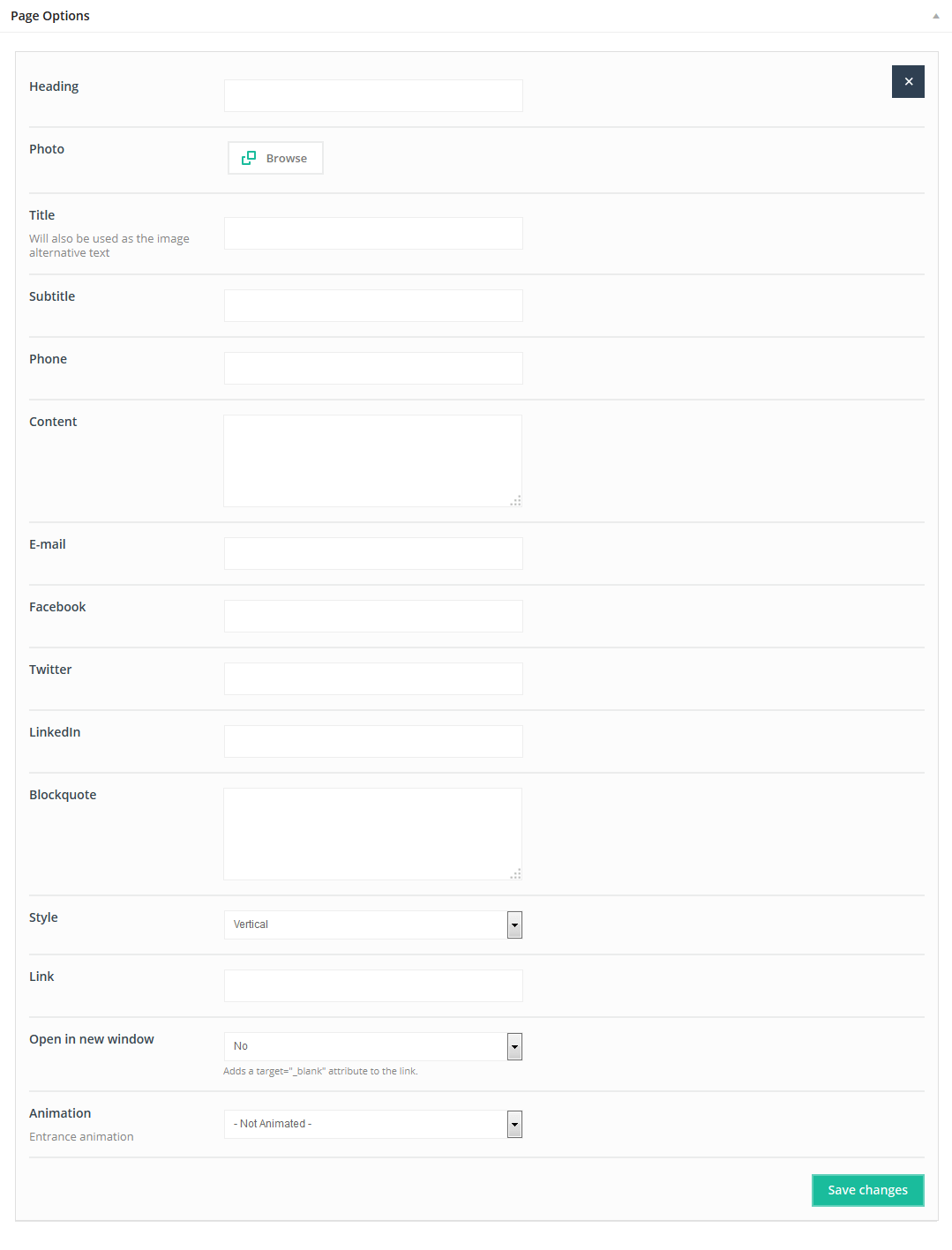
This Item creates a single Our team profile to show your team.
Available sizes: '1/6', '1/5', '1/4', '1/3', '1/2'
Attributes:
- Heading (type heading text under photo)
- Photo(choose a photo for a team profile)
- Title(title for a team profile)
- Subtitle(subtitle for a team profile)
- Phone(phone number for your team or for a member of the team)
- Email(email for one of our team's profile)
- Facebook (facebook link with http:// for a team's profile)
- Twitter (twitter link with http://for a team's profile)
- LinkedIn (LinkedIn link with http:// for a team's profile)
- Blockquote(type blockquote for the Team item)
- Style( choose between 3 different styles)
- Link (type link if you have special page for a team member)
- Open in new window(select if you want to open link in the new window)
- Animation(choose Entrance Animation on Scroll or No Animation)
You can create as many profiles for your members as you need.
4.2.27 Our Team list
This Item will create the single Our team profile.
Available sizes: '1/1'
Attributes:
- Photo (choose photo for one of your our team's profile)
- Title (title for one of your our team's profile)
- Subtitle (subtitle for one of the Our team's profile)
- Phone (phone number for one of the Our team's profile)
- Content (useful field if you want to describe an Our Team member)
- Blockquote (type a team member's blockquote here)
- Email (email for one of theOur Team’s profiles)
- Facebook (Facebook link with http:// for one of your our team's profile)
- Twitter (twitter link with http:// for one of the Our team's profile)
- LinkedIn (LinkedIn link with http://for one of the Our team's profile)
You can create as many profiles for your members as you need.
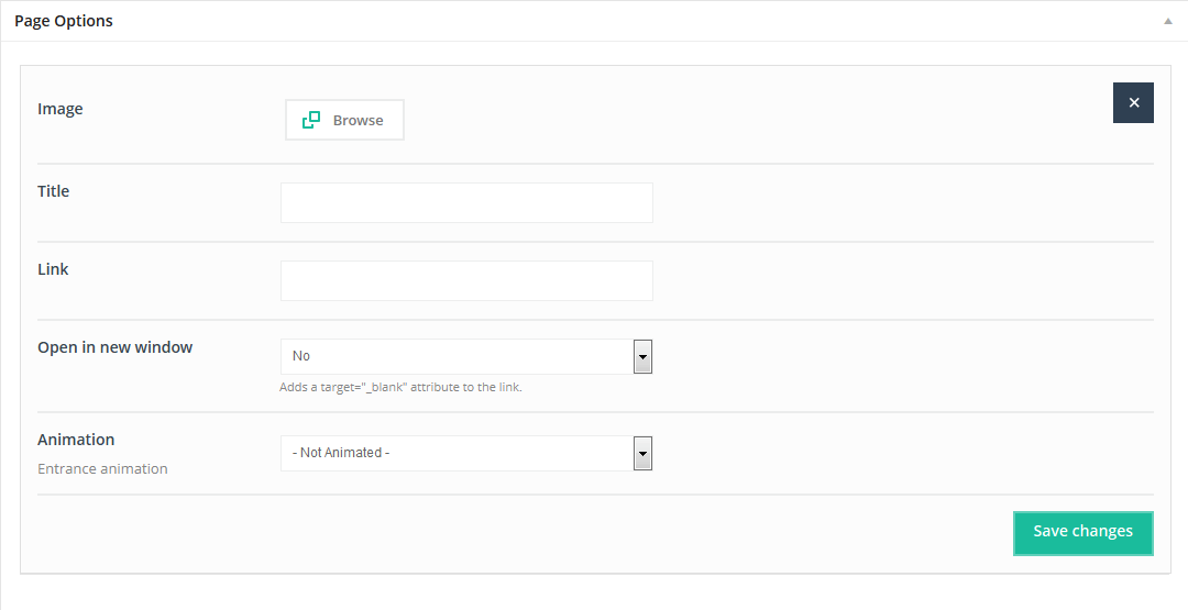
4.2.28 Photo Box
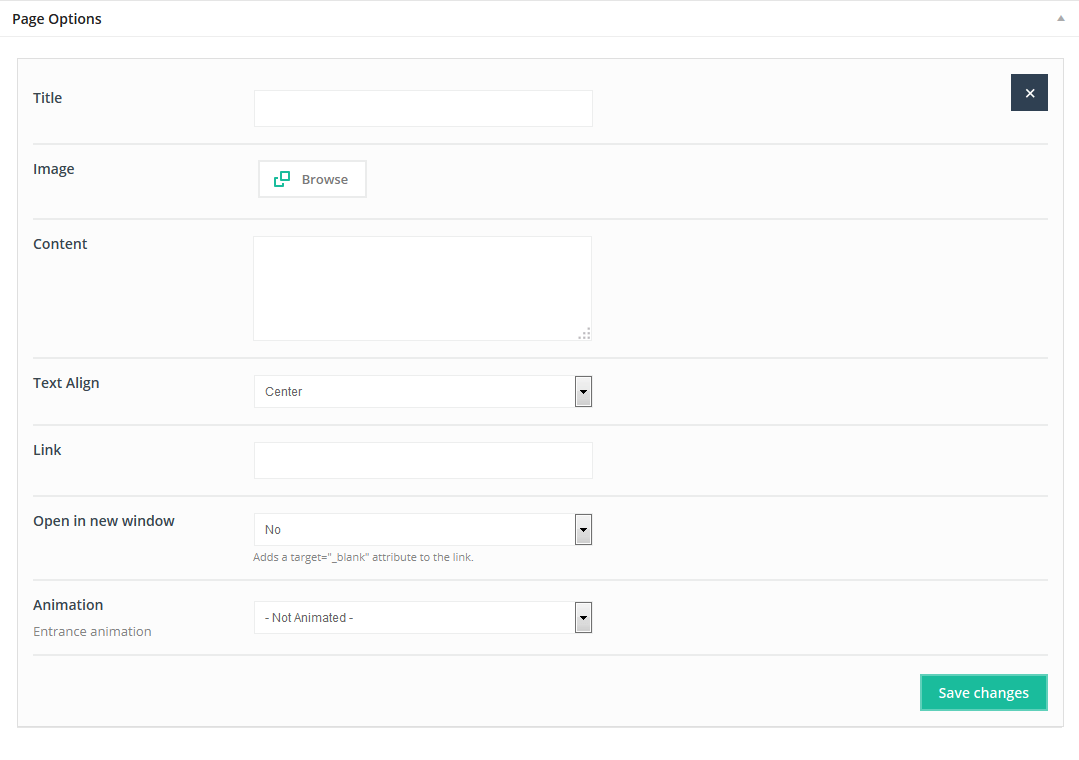
This Item will create the single Photo box item.
Available sizes: '1/6', '1/5', '1/4', '1/3', '1/2'
Attributes:
- Title (title for Photo Box)
- Image(choose photo for Photo Box )
- Content(text from this section is visible under photo)
- Text Align (choose between Center, Left or Right align for text)
- Link (type link for this item if needed)
- Open in new window (Yes to open link in a new window)
- Animation (choose Entrance Animation on Scroll or No Animation)
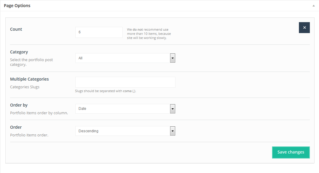
4.2.29 Portfolio
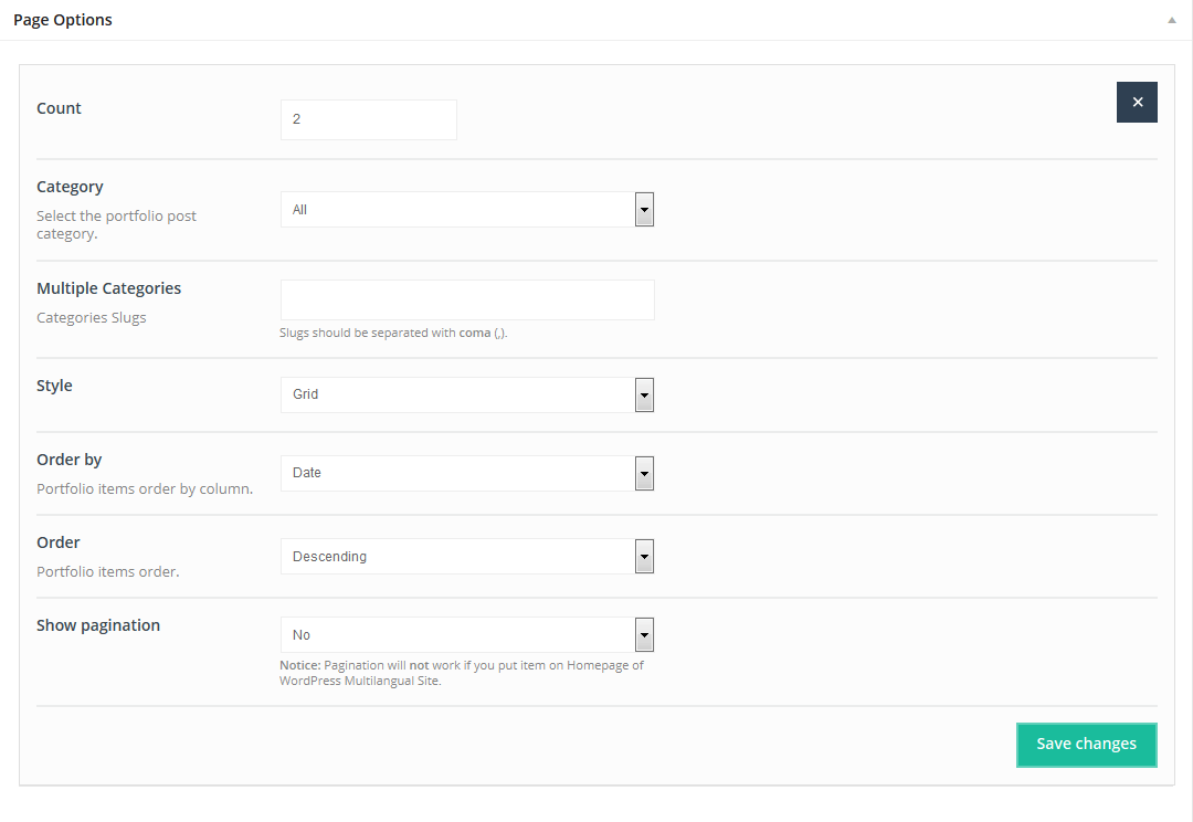
This Item will create Portfolio (the same items as on portfolio page) in any place you want. Use your portfolio items with any other shortcodes on the page.
Available sizes: '1/1'
Attributes:
- Count (specify how many Portfolio items you want to show on one page)
- Category(choose the category to show Portfolio items)
- Multiple Categories (type categories slugs toto show posts from multiple categories)
- Style(choose among 5 styles for Portfolio item)
- Order by (specify Portfolio items order )
- Order (select Ascending or Descending)
- Show pagination(Yes or No)
4.2.30 Portfolio Grid
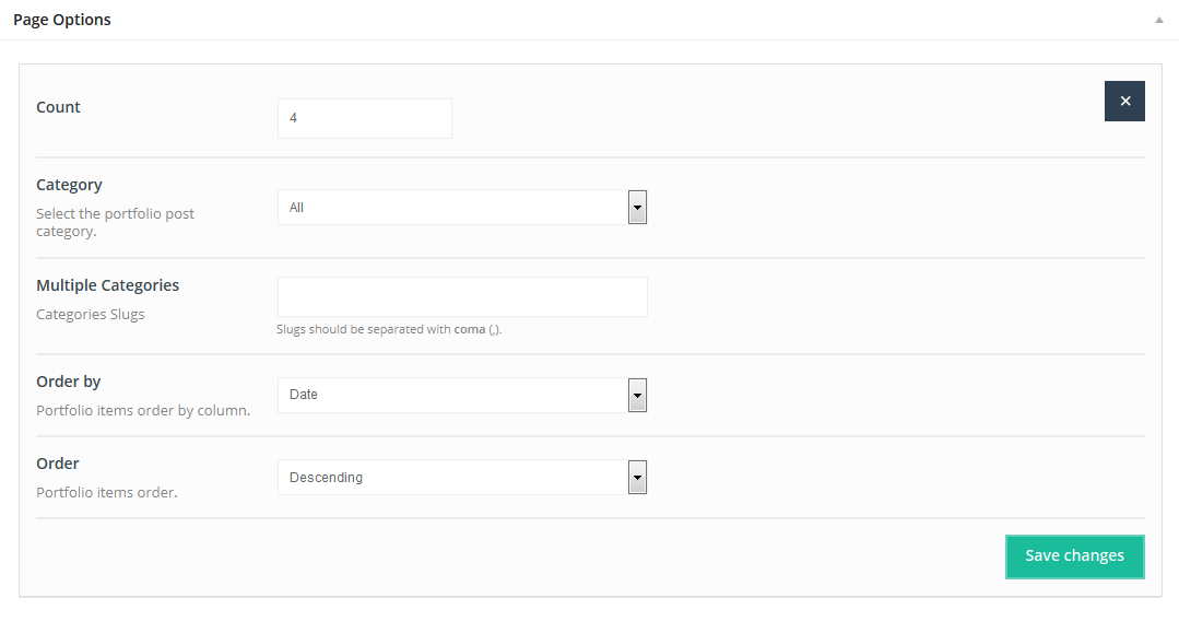
This Item will create Portfolio grid (the same items as on portfolio page) in any place you want. Use your portfolio items with any other shortcodes on the page.
Available sizes: '1/4', '1/3', '1/2', '2/3', '3/4', '1/1'
Attributes:
- Count (specify the number of portfolio items on a page)
- Category(choose the category to show portfolio items)
- Multiple Categories (type categories slugs to show posts from multiple categories)
- Order by (choose the method to order portfolio items)
- Order (select Ascending or Descending)
4.2.31 Portfolio Slider
This Item creates an awesome swipe touch Portfolio slider at any page location.Portfolio slider looks impressive on all devices.
Available sizes: '1/1'
Attributes:
- Count (enter the number of items to display in Portfolio Slider)
- Category(select the display category)
- Multiple Categories(type categories slugs to show post from multiple categories)
- Order by(choose the portfolio slider items order)
- Order (select Ascending or Descending)
4.2.32 Pricing
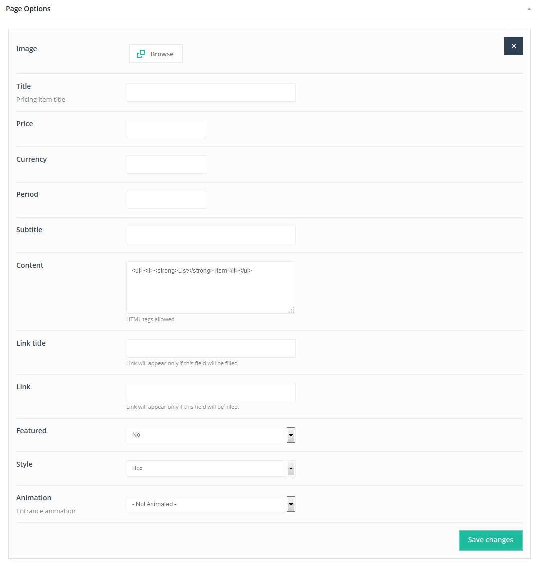
This Item creates a Pricing page. You can choose among 3 different styles. For example, you can use boxes or tables, with or without labels.
Available sizes: '1/6', '1/5', '1/4', '1/3', '1/2', '2/3', '3/4', '1/1'
Attributes:
- Image( an image field is located at the top of the page )
- Title (pricing title)
- Price (amount)
- Currency(enter pricing currency)
- Period(Pricing table period)
- Subtitle (text will be visible under price)
- Content(enter Pricing content)
- Link title(enter link title if applicable)
- Link(enter link, if applicable)
- Featured (select Yes if you want an item featured)
- Style(select one of 3 different styles)
- Animation(choose Entrance Animation on Scroll or No Animation)
4.2.33 Progress bars
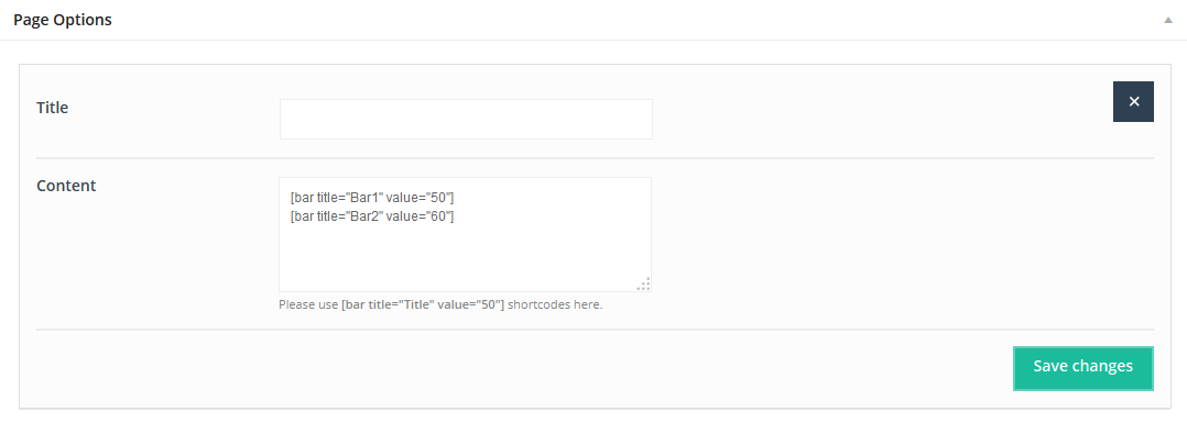
You can add as many Progress baras you want.
Available sizes: '1/6', '1/5', '1/4', '1/3', '1/2', '2/3', '3/4', '1/1'
Add your own tabs by clicking "Add tab" button. You can add as many tabs as you need.
Attributes:
- Title
- Content (type in as many bars as you need; the shortcode for a progress bar is [bar title="Photoshop" value="80"])
4.2.34 Promo Box
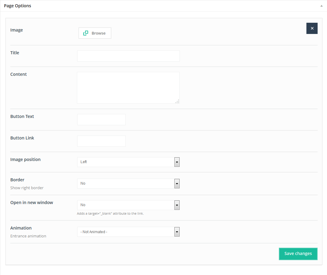
This Item creates a Promo Box with text, image and a button with a link. You can select left or right style and other settings as well.
Available sizes: '1/2'
Attributes:
- Image (upload photo for Promo Box item - can be on either the right or the left side )
- Title (Progress Box title)
- Content(enter Progress Box content)
- Button Text (enter text for the button in the Progress Box)
- Button Link(enter link for the button)
- Image position(choose between left or right side image position)
- Border(select Yes toa border on right hand side)
- Open in new window (select Yes to open link in new window)
- Animation(choose Entrance Animation on Scroll or No Animation)
4.2.35 Quick Fact
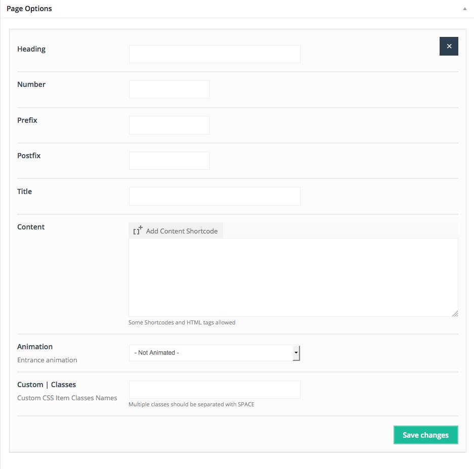
Create Quick Fact, a nice item for presenting facts with short descriptions.
Available sizes: '1/6', '1/5', '1/4', '1/3', '1/2', '2/3', '3/4', '1/1'
Attributes:
- Heading(add text above counter icon)
- Number (number appears at the top of the Quick Fact)
- Prefix (this is text e.g., % or $ - before the number)
- Postfix (this is text e.g., % or $ - after the number)
- Title (title will appeardirectly under the large number)
- Content (enter short description; it will appear under the title)
- Animation(choose Entrance Animation on Scroll or No Animation)
4.2.36 Shop Slider
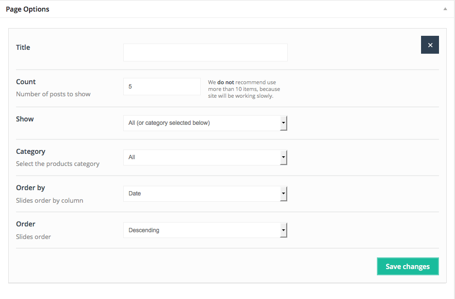
This Item creates a Shop Slider featuring WooCommerce plugin products.
Available sizes: '1/4', '1/3', '1/2', '2/3', '3/4', '1/1'
Attributes:
- Title(type title for Shop Slider item)
- Count(type the number of products to be shown)
- Show (select Featured, On sale or All products for slider)
- Category (choose the Shop Slider category)
- Order by (order by Date, Menu order and Title)
- Order (select Ascending or Descending)
4.2.37 Slider
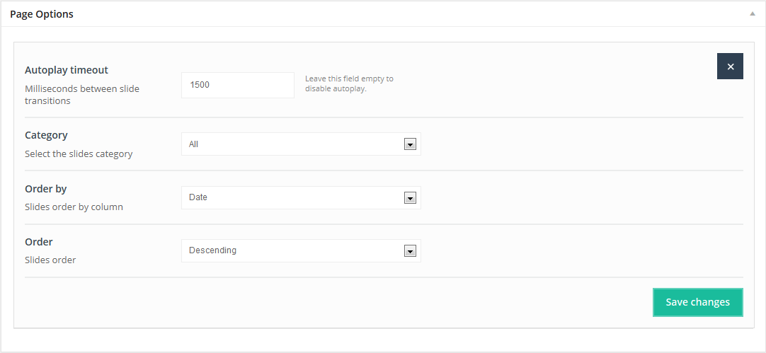
If you prefer something other than Revolution Slider we recommend the Slider Item. You can easily show simple slide images by pasting slides on a page.Youadd slides I within the "Slides" section,located on the left side of the WordPress dashboard.
Available sizes: '1/1'
Attributes:
- Autoplay timeout (the time between slide transitions, in milliseconds)
- Category (choose the Slides presentation category)
- Ordery by (enter Date, Menu order and Title)
- Order (select Ascending or Descending)
4.2.38 Sliding Box
Sliding Box allows you to create a photo box with a nice sliding effect. This box can contain a link if desired.
Available sizes: '1/6', '1/5', '1/4', '1/3', '1/2'
Attributes:
- Image (select Sliding Box photo)
- Title (enter text; it will appearunder the photo)
- Link (enter link if needed)
- Open in new window (enter Yes if you want to open the link in a new window)
- Animation (choose Entrance Animation on Scroll or No Animation)
4.2.39 Tabs
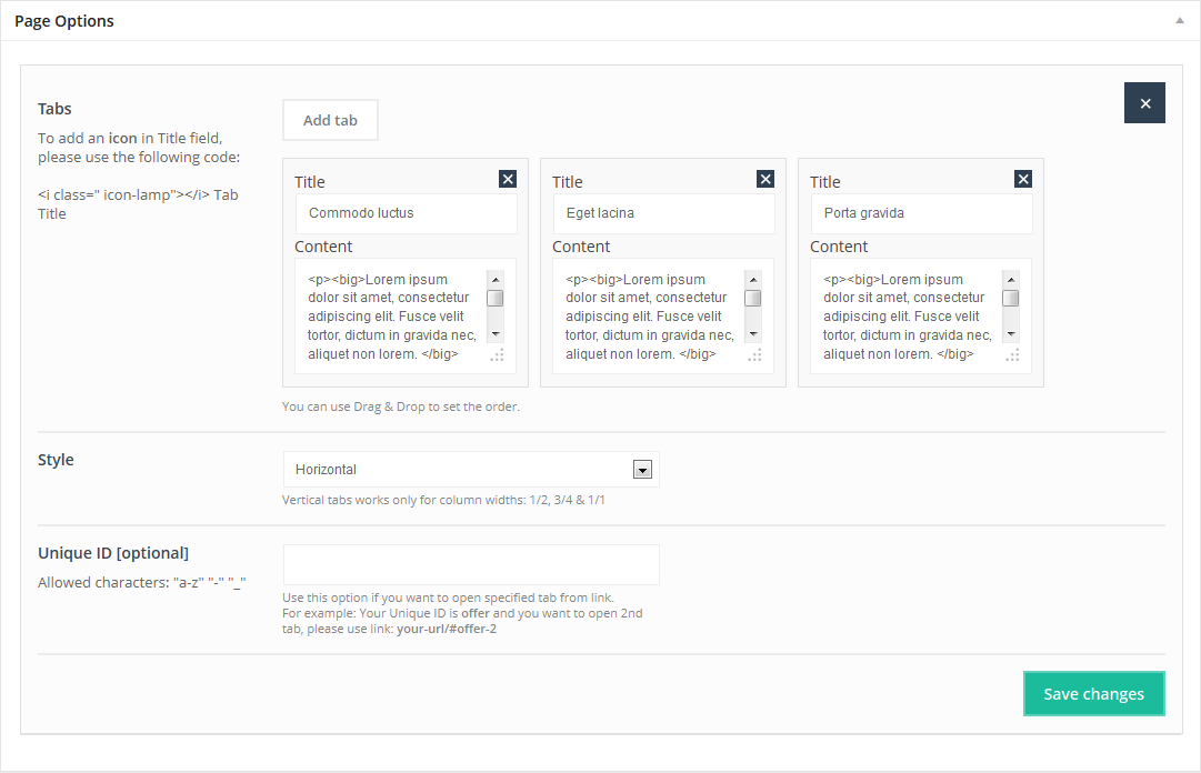
This Item allows you to create 4 different Tabs. You can add as many tabs as you want.
Available sizes: '1/4', '1/3', '1/2', '2/3', '3/4', '1/1'
Add your tabs by clicking the "Add tab" button. You can add as many as you need.
Attributes:
- Title (tabs title)
- Content (tabs content)
- Style (There are 4 different styles for this Item: Horizontal, Horizontal with Big Icon, Vertical,and Vertical with Big Icon)
- Unique ID(optional) - this item is only required if you want to build one-page with links for sections and you want send users to the correct section and tab.
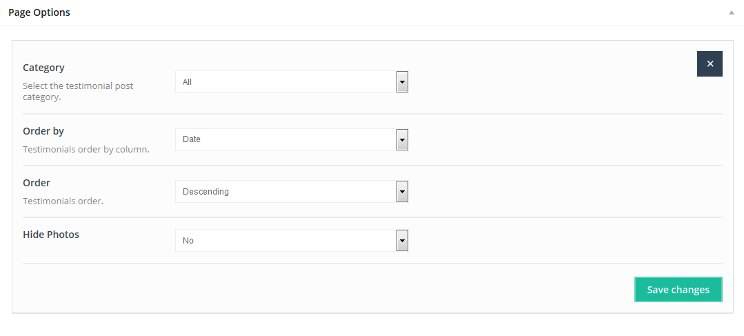
4.2.40 Testimonials
This Item creates a Testomonials slider. > Add new Add new section.
Available sizes:'1/1'
Attributes:
- Category(select a Testimonials category )
- Order by (select - Title, Menu order or Date)
- Order (select Ascending or Descending)
- Hide Photos (hide testimonials images that are not to be used)
4.2.41 Timeline
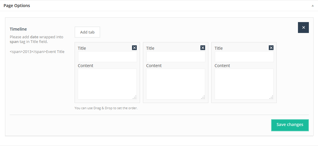
This Item creates a Timline section.You can use it for any purpose you need. It works just like Tabs or Accordion. Just Add tab and the desired content.
Available sizes: '1/1'
Attributes:
- Title (enter Timeline title)
- Content (enter Timeline section text)
4.2.42 Trailer Box
TheTrailer Box item features a slogan, a photo, and has a nice hover effect.
Available sizes: '1/6', '1/5', '1/4', '1/3', '1/2'
Attributes:
- Image (upload image for Trailer Box )
- Slogan (enter slogan; it will appear on the image on a blue background with diagonal lines)
- Title (the title will appear on the image, directly under the slogan)
- Link (enter a Trailer Box link, if needed)
- Open in new window (select Yes to open link in a new window)
- Animation (choose Entrance Animation on Scroll or No Animation)
4.2.43 Video
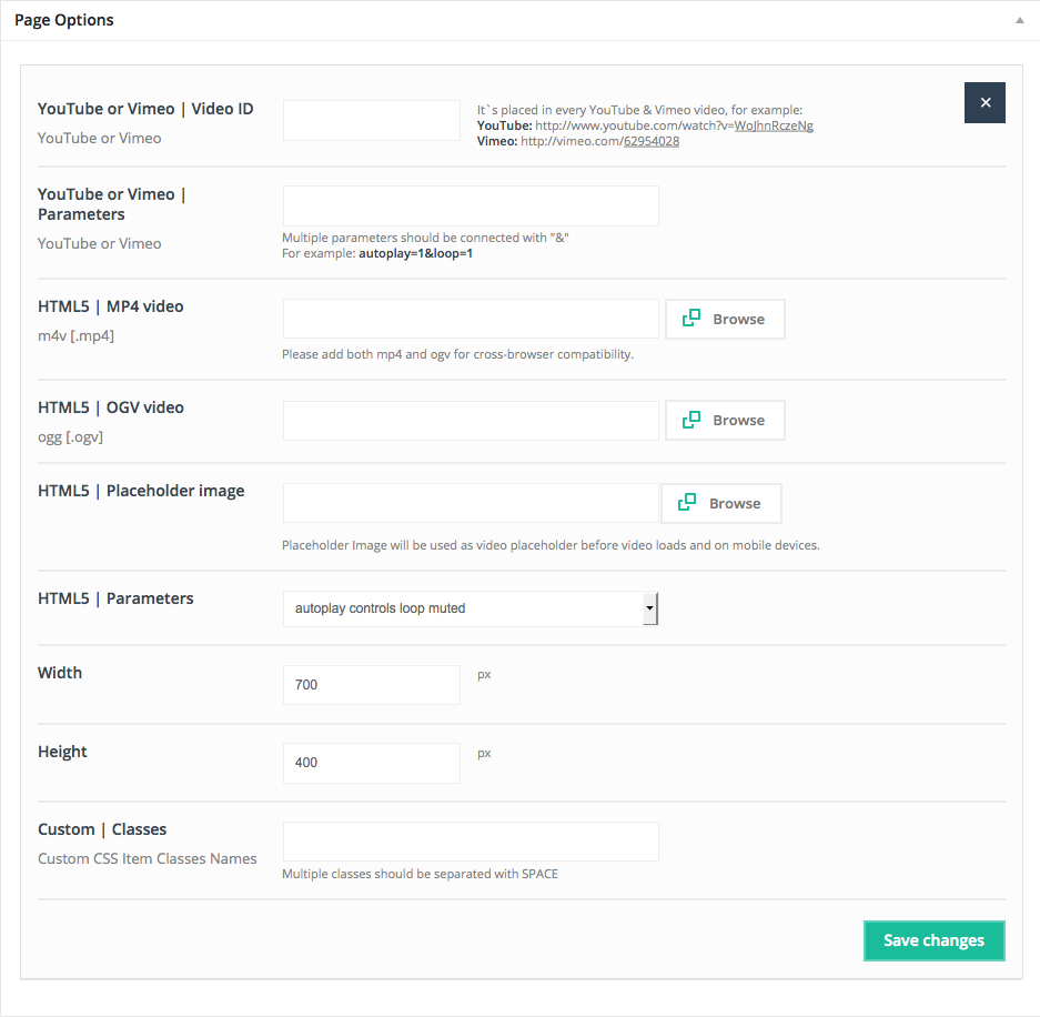
This item is a very useful option for embedding Vimeo, Youtube and HTML5 videos into page.
Available sizes: '1/6', '1/5', '1/4', '1/3', '1/2', '2/3', '3/4', '1/1'
Attributes:
- Youtube or Vimeo | Video ID - video`s ID. This value is placed at the end of every Vimeo or YouTube video
For Vimeo video ID is: http://vimeo.com/19819283
For YouTube video ID is: http://www.youtube.com/watch?v=YE7VzlLtp-4
The bolded values are ID's for videos.
- Youtube or Vimeo | Parameters -field for multiple parameters for videos.
- HTML5 mp4 video - instead of YouTube and Vimeo videos you can upload your own videos in HTML5 format.
- HTML5 ogv video - instead of YouTube and Vimeo videos you can upload your own videos in HTML5 format.
- HTML5 placeholder image - placeholder image for HTML5 videos (especially useful for mobile devices).
- HTML5 | Parameters - select autoplay, controls, loop and muted parameters.
- Width - player`s width, 700 is recommended for left or right sidebar template and 950 for a default template.
- Height - video player`s height.
4.2.44 Visual Editor
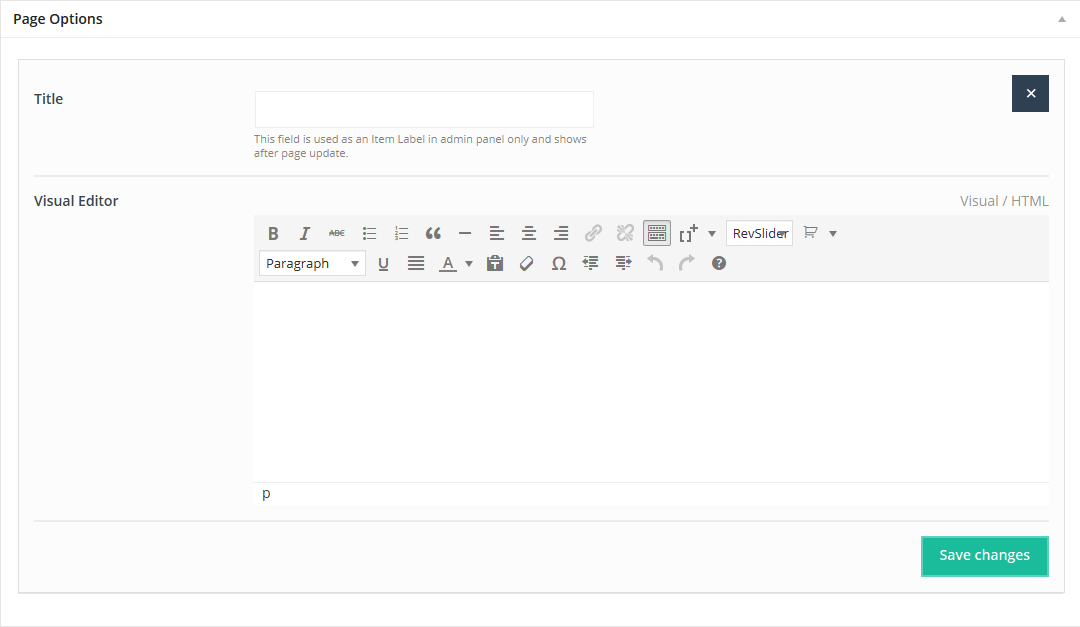
The Visual Editor Item is an option for those wishing to avoid coding with HTML or CSS.
Available sizes: '1/6', '1/5', '1/4', '1/3', '1/2', '2/3', '3/4', '1/1'
Attributes:
- Title - visible only via the admin panel - item label
- Visual Editor - put text, media or other content, and style it to suit your needs
4.2.45 Countdown
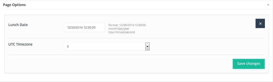
This useful Item places Count down on any location on a page.
Available sizes: '1/1'
Attributes:
- Launch Date - enter Launch Date in the following format: 12/30/2014 12:00:00 | month/day/year hour:minute:second
- UTC Timezone - choose your time zone
4.2.46 Flat Box
Flat Box features an icon on the left and an image on the right with a nice hover effect.
Available sizes: '1/4', '1/3', '1/2'
Attributes:
- Icon (select any item from the list of available icons)
- Icon background (enter color in hex format, ex: #FFFFFF)
- Image (upload image)
- Title (text appears under the image)
- Content (text appears under the title)
- Link (type link for item)
- Open in new window (select Yes to open link in a new window)
- Animation (choose Entrance Animation on Scroll or No Animation)
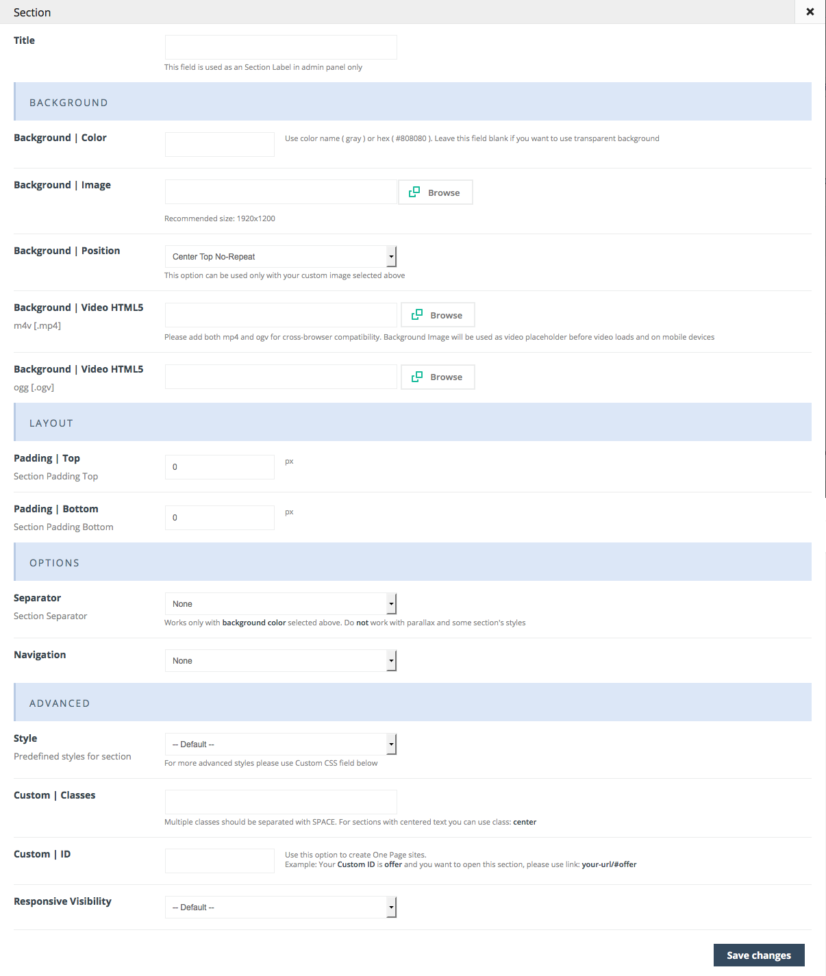
SECTION item
This is a new item which offers a variety of possibilities for creating pages. You can split a page, post or portfolio Item into sections. A section and can have its own settings.
Attributes:
- Title (for backend purposes only)
Background
- Background | Color (select background color)
- Background | Image (upload image/pattern for background section)
- Background | Position (choose position for background image)
- Separator (select 1 of 8 pre-defined separators for an improved appearance)
- HTML5 | mp4 video (upload background video for a section)
- HTML5 | ogv video (upload both: mp4 and ogv for cross-browser compatibility)
Layout
- Padding | Top (add top padding for a section if desired)
- Padding | Bottom (add bottom padding for a section if desired)
Options
- Separator choose between various separators
- Navigation add arrows between sections to scroll between them on click
Advanced
- Style (choose 1 of 5 predefined styles for a section)
- Custom CSS classes (you can enter your own class for each section - this is ahelpful option for those who want a special style for a section). For example, you can add my-own-super-section section class, and thengo to BeTheme options > Custom CSS & JS > Custom CSS and write your own style:
.my-own-super-section { margin: 30px; padding: 20px; font-size: 15px; etc... }If you want to use multiple classes, separate them with a SPACE. We have one built-in class for this section named dark you can use it if you want a dark background.
- Custom ID (useful option for one-page websites, or for custom CSS changes)
- Responsive Visibility (you can select the devices on which a section will be visible )
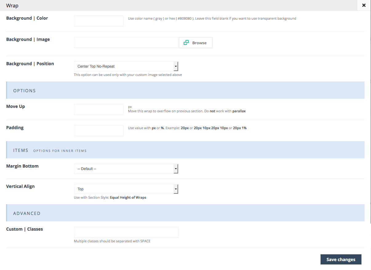
WRAP item
This is a new item which offers a variety of possibilities for creating pages. With WRAP item you can create more advanced layouts than ever before.
Attributes:
- Background | Color (select background color)
- Background | Image (upload image/pattern for background section)
- Background | Position (choose position for background image)
Options
- Move Up this option allows to move wrap to overflow previous section
- Padding set up padding for wrap items
Items
- Margin Bottom - choose bottom margin for inner items
- Vertical Align - choose between Top, Middle and the Bottom position
Advanced
- Custom | Classes (you can enter your own class for each section - this is a helpful option for those who want a special style for a section). For example, you can add my-own-super-section section class, and thengo to BeTheme options > Custom CSS & JS > Custom CSS and write your own style:
.my-own-super-section { margin: 30px; padding: 20px; font-size: 15px; etc... }If you want to use multiple classes, separate them with a SPACE. We have one built-in class for this section named dark you can use it if you want a dark background.
4.3 Page Templates
Specially designed Page Templates can be used to incorporate special features on pages. These include:
- Default Template - header and footer sections are included by default.
- Archives - this template automatically created a list that includes Available Pages, Latest Posts, Archives by Subjects and Archives by Months.
- Blank Page - this template creates a blank page.
- Portfolio -this template enables you to add Portfolio pages to a website. You can see the entries in Portfolio > Portfolio.
- Sitemap -this template enables you to create a simple sitemap.
- Under Construction - this template lets you create an Under Construction page.
4.4 Raw/Text Shortcodes
Shortcodes are useful for creating pages.Using shortcodes can significantly speed up a page building session. You will see below, how shortcodes are used in "BeTheme". There is a large number of them, and they are easy to use.
4.4.1 Adding shortcodes in content using wp-editor
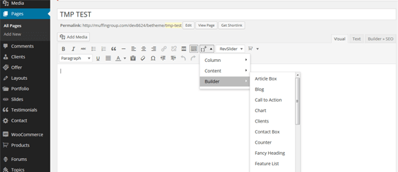
You can use shortcodes directly in the WP editor. Just click on the "[+]" button, and you will be presented with the entire list of shortcodes. Select the desired shortcode and click “Insert”. The selected shortcode will be inserted into the Editor.
4.4.2 List of available shortcodes & how to use them
The text shortcodes are divided into 3 different sections: Column, Content and Builder shortcodes.
4.4.2.1 Column shortcodes
Those shortcodes are for users who choose not to use Muffin Builder, and intend to build all pages using shortcodes only, 8 of which are shown here:
- [one_fourth]Insert your content here[/one_fourth]
- [one_third]Insert your content here[/one_third]
- [one_second]Insert your content here[/one_second]
- [two_third]Insert your content here[/two_third]
- [three_fourth]Insert your content here[/three_fourth]
- [one]Insert your content here[/one]
- [one_fifth]Insert your content here[/one_fifth]
- [one_sixth]Insert your content here[/one_sixth]
4.4.2.2 Content shortcodes
1) Alert - this shortcode allows you to add alerts. It has only one attribute:
- style (choose between error, info, success, warning)
An example of an Alert shortcode:
[alert style="warning"]Insert your content here[/alert]
Example of usage you can check on Typography page.
2) Blockquote - this shortcode creates blockquotes. Attributes available for this item:
- author (author name)
- link (link for author's page)
- target (toto open link in a new window, use: _blank value)
Below you can see the example of Blockquote shortcode:
[blockquote author="Muffin group" link="#" target="_blank"]Insert your content here[/blockquote]
See the Typography page for usage examples.
- title
- icon (to use a button with an icon, type the icon name here)
- icon_position (select left or right)
- link (enter link for button)
- target (to open link in a new window use: _blank value)
- color (use one of predefined colors or hex colors e.g., #E8E8E8)
- font_color (use hex colors, e.g., #E8E8E8)
- large (choose 1 if you want large button or 0 if regular)
- class (if you want to link a button to another section on the same page with a nice scroll effect, type scroll class. If you want the button to open the link in a frame, use the prettyphoto class)
- download (if you want a button to be a download button, type the name of the file to download)
An example of Button shortcode:
[button title="Download file" icon="icon-download" icon_position="left" link="#" target="_blank" color="" font_color="" large="0" class="" download=""]
See the Typography page for usage examples.
4) Code - this shortcode is for presenting the code on a website (code is not parsed in this section). There are no attributes; only content.
An example of the Code shortcode:
[code]Insert your content here[/code]
5) Content Link - this shortcode creates links with content inside. The attributes are:
- icon (type in icon name if you want a button with an icon)
- link (enter button link )
- target (to open link in new window, enter _blank value)
- class (if you want link a button to another section on the same page with nice scroll effect, enter the scroll class. If you want the button to open link in iframe, use the prettyphoto class)
- download (if the button is to be download button, enter the name of file to download )
An example of the Content Link shortcode:
[content_link title="Go for it" icon="icon-lamp" link="#" target="_blank" class="" download=""]
See the Content elements page for usage examples.
6) Divider - This item creates spaces between elements. It is also aligning for a single line, boxes located underneath.
Divider shortcode got 4 attributes:
- height - enter the amount of the divider height (in px)
- style - you can choose between 3 different divider styles: default, dots and zigzag
- line - you can choose between 4 different styles: default, narrow, wide or 0 (0 means no line)
- themecolor (choose between 0 or 1 - means color for this line comes from theme color option)
Example of this shortcode below:
[divider height="30" style="default" line="default" themecolor="1"]
See the Typography page for usage examples.
7) Dropcap - this shortcode creates a nice looking segment of text, where one letter is featured. Attributes for this item can be seen below:
- background - background color in hex format, ex: #000000
- color - text color in hex format, ex: #FFFFFF
- circle - choose between 0 (default look) and 1 (circle style)
Example of this shortcode below:
[dropcap background="" color="" circle="0"]I[/dropcap]nsert your content here
See the Typography page for usage examples.
8) Google font - this shortcode allows you to add text with any google font you want. Attributes for this item can be seen below:
- font - type Google font name
- subset - subset for google font (multiple separate with comma, ex. latin,latin-ext)
- size - font size in px
Example of this shortcode below:
[google_font font="Exo" subset="cyrillic-ext,latin" size="25"]Insert your content here[/google_font]
See theTypography page for usage examples.
9) Highlight - this item creates text with a nice highlight effect. This item has 2 attributes:
- background - background color for highlighted text
- color - text color for highlighted text
Example of this shortcode below:
[highlight background="" color=""]Insert your content here[/highlight]
See the Typography page for usage examples.
10) Hr - this item creates a nice line with a few different styles. Attributes for hr are:
- height - height for hr in px
- style - you can choose between 3 different divider styles: default, dots and zigzag
- line - you can choose between 4 different styles: default, narrow, wide or 0 (0 means no line)
- themecolor (choose between 0 or 1 - means color for this line comes from theme color option)
Example of this shortcode below:
[hr height=”30” style=”default” line=”default” themecolor=”1”]
See the Typography page for usage examples.
11) Icon - you can add any icon you want on a page. This item has only 1 attribute:
- type - type name of icon you want use
Example of this shortcode below:
[icon type="icon-lamp"]
See the Typography page for usage examples.
12) Icon bar - this shortcode creates an icon bar. Attributes for this item:
- icon - type name of icon you want use
- link - link for icon bar shortcode
- target - if you want to open link in new window, use _blank value
- size - if you want large icon, then type large, leave field empty if you want default size
- social - using this option makes icon colorful, available styles: facebook, google, twitter, vimeo, youtube, flickr, linkedin, pinterest i dribbble
Example of this shortcode below:
[icon_bar icon="icon-calendar" link="#" target="" size="large" social=""]
See the Content elements page for usage examples.
13) Icon block - this shortcode create icon as block. Attributes for this item:
- icon - type name of icon you want use
- align - choose between left or top style
- color - icon color in hex format
- size - icon size in px
Example of this shortcode below:
[icon_block icon="icon-lamp" align="" color="" size="25"]
See the Typography page for usage examples.
14) Idea - this shortcode creates a nice box with text inside. There are no attributes, just text.
Example of this shortcode below:
[idea]Insert your content here[/idea]
See the Boxes & Infographics page for usage examples.
15) Image - this is a very useful shortcode for embedding images into a page. This item has a long list of available attributes:
- src (url to image)
- align (optional alignment for image) - available values: none (default), left, right,center
- caption (optional) - text available under the image
- link (optional) - link for larger image or other page
- link_image (optional) - link to larger version of image
- target (optional, works only with "details" link_type) - link target, available value: "_blank" (open in new window)
- alt (optional) - alternative text for image
- border - type 1 if you want border around image or 0 if not.
An example of this shortcode:
[image src="" align="" caption="" link="" link_image="" target="" alt="" border="0"]
See the Typography page for usage examples.
16) Table - this shortcode uses html code to create a table. Content is the only thing that is needed. You can make any number of rows or columns you want and place anything you want in the table. Here are 2 examples of raw HTML used for tables:
<table>
	<thead>
		<tr>
			<th>Employee</th>
			<th>Salary</th>
			<th>Bonus</th>
			<th>Supervisor</th>
		</tr>
	</thead>
	<tbody>
		<tr>
			<td>Stephen C. Cox</td>
			<td>$300</td>
			<td>$50</td>
			<td>Bob</td>
		</tr>
		<tr>
			<td>Josephin Tan</td>
			<td>$150</td>
			<td>-</td>
			<td>Annie</td>
		</tr>
		<tr>
			<td>Joyce Ming</td>
			<td>$200</td>
			<td>$35</td>
			<td>Andy</td>
		</tr>
		<tr>
			<td>James A. Pentel</td>
			<td>$175</td>
			<td>$25</td>
			<td>Annie</td>
		</tr>
	</tbody>
</table>
or try the following HTML for a different table:
<table>
	<thead>
		<tr>
			<th class="clear"></th>
			<th>Salary</th>
			<th>Bonus</th>
			<th>Supervisor</th>
		</tr>
	</thead>
	<tbody>
		<tr>
			<th>Stephen C. Cox</th>
			<td>$300</td>
			<td>$50</td>
			<td>Bob</td>
		</tr>
		<tr>
			<th>Josephin Tan</th>
			<td>$150</td>
			<td>-</td>
			<td>Annie</td>
		</tr>
		<tr>
			<th>Joyce Ming</th>
			<td>$200</td>
			<td>$35</td>
			<td>Andy</td>
		</tr>
		<tr>
			<th>James A. Pentel</th>
			<td>$175</td>
			<td>$25</td>
			<td>Annie</td>
		</tr>
	</tbody>
</table>
See the Content blocks page for usage examples.
17) Tooltip - shortcode you can use in any place you want. Under the regular text it createsa small box win which you can rollover additional information. This item has a single attribute:
- hint - text visible in box under main text
Example of this shortcode below:
[tooltip hint="Insert your hint here"]Insert your content here[/tooltip]
See the Typography page for usage examples.
18) Video - inside this shortcode you can add Vimeo or YouTube videos. Attributes for shortcode:
- video - type just video ID (not whole link!). Example of youtube ID is: TUhNdTq1jTw but for vimeo: 85002648
- parameters - multiple parameters should be connected with &, for example: autoplay=1&loop=1
- mp4 - instead of YouTube and Vimeo videos you can upload own videos in HTML5 formats
- ogv - instead of youtube and vimeo videos you can upload own videos in HTML5 formats
- placeholder - placeholder image for HTML5 videos (useful especially on mobile devices)
- width - video width in px
- height - video height in px
Shortcode example:
[video_embed video="62954028" parameters="autoplay=1&loop=1" mp4="" ogv="" placeholder="" width="700" height="400"]
19) Tooltip Image - shortcode similar to tooltip but with additional image:
- hint - text visible in box under main text
- image - path for image
Shortcode example:
[tooltip_image hint="Insert your hint here" image=""]Insert your content here[/tooltip_image]
See the Typography page for usage examples.
20) Fancy Link - great shortcode with different variations on hover:
- title - link title
- link - please remember to use links with full path, start with http:// always
- target - if you want to open link in new window, use _blank value
- style - styles are number, choose number from 1 to 8
- class (if you want link button to other section on the same page with nice scroll effect, you must type scroll class but if you want button to open link in iframe, then use prettyphoto class)
- download (if you want button to be download button, you need to type name of file for download)
Shortcode example:
[fancy_link title="Test title" link="_blank" target="" style="2" class="" download=""]
See the Typography page for usage examples.
4.4.2.3 Builder shortcodes
1) Article Box - this shortcode creates a box with an image and some text. Box can be linked if desired.Article Box has 5 attributes:
- image (put path to image for article box shortcode)
- slogan (slogan located next to image)
- title (title for article box shortcode)
- link (link to any page)
- target (optional target for link, ex. "_blank")
An example of the Article Box shortcode:
[article_box image="#" slogan="Article slogan" title="Article title" link="#" target="_blank"]
See the Boxes & Infographics page for usage example.
2) Blog - this item gives you several options. You can put blog on any page you like and it can be used with other shortcodes as well.
Blog has 4 attributes:
- count (type number of posts that you want to show with blog shortcode)
- category (type name of category for blog shortcode, ex: "applications")
- style ( classic, masonry or timeline)
- pagination (choose 1 for pagination, otherwise select 0 )
An example of Blog shortcode:
[blog count="2" category="all" style="modern" pagination="0"]
3) Call to action - with this shortcode, you can create a section with an icon, text, and link.
Call to Action has 5 attributes:
- title - text visible on the left side
- icon - icon appears between title on the left and the content on the right
- link (you can link to any page element you want: videos, images, pages, etc.)
- class (type any class you want if you need something special. We recommend prettyphoto to open images/videos in popup window or scroll to link to another section on the same page.You get a nice, smooth scroll effect)
- target (optional target for link, ex. "_blank")
An example of the Call to action shortcode:
[call_to_action title="title text" icon="icon-lamp" link="#" class="" target="_blank"]Insert your content here[/call_to_action]
See the Content elements page for usage example.
4) Chart - use this item to put charts on your page.
Chart has 4 attributes:
- percent (type percent number for chart shortcode)
- label (enter name of chart icon)
- icon (use icon name instead of percent label)
- image (you can also put an image instead inside the chart)
- title (type Chart title)
An example of the Chart shortcode:
[chart percent="50" label="50" position="left" title=""] Insert your content here [/chart]
See the Boxes & Infographics page for usage example.
5) Clients - with this shortcode you can put Clients on a page.
Clients has one attribute, "in_row" and you enter the number of client items you want to display.
An example of the Clients shortcode:
[clients in_row="6"]
See the Loops page for usage example.
6) Contact box - this shortcode creates an attractive Contact Box item.
Contact Box has 6 attributes:
- title (type title for contact box shortcode)
- address (enter a address)
- telephone (enter phone number)
- email (enter email address)
- www (type URL–always start with http://)
- image (select image for background)
An example of the Contact Box shortcode:
[contact_box title="Ask question" address="14th Avenue Street" telephone="+40 4290-09-21" email="[email protected]" www="http://muffingroup.com" image=""]
See the Content elements page for usage example.
7) Counter - this shortcode allows you to create Counter items with icons or images. You can choose different styles.
Counter has 6 attributes:
- icon (enter any icon you want from list of available icons)
- color (enter color in hex format, ex. #000000)
- image (instead of icon you can use path to image)
- number (enter number value)
- prefix (this is additional text for item e.g., % or $ - before the number)
- label (this is additional text for item e.g., % or $ - after the number)
- title (type title)
- type (select vertical and horizontal)
An example of the Counter shortcode:
[counter icon="icon-heart-line" color="#222222" image="" number="44" prefix="" label="%" title="" type="vertical" animate=""]
See the Boxes & Infographics page for usage example.
8) Fancy heading - use this shortcode if you want a unique heading. You can create different styles with icons and other elements.
Fancy Heading has 4 attributes:
- title (type title)
- icon (enter any icon from the list of available icons)
- slogan (small text appears under the main text)
- style (choose icon, line and arrows)
An example of the Fancy heading shortcode:
[fancy_heading title="" icon="icon-heart-line" slogan="Slogan text" style="icon"] Insert your content here [/fancy_heading]
See the Content elements page for usage example.
9) Feature list - with this shortcode you can create a list of feature elements with icons and text.
Feature List has 3 attributes:
- title (type title)
- link (url address)
- icon (enter an iconfrom the list of available icons)
- target (optional target for link, ex. "_blank")
- animate (entrance animation on scroll)
An example of the Feature list shortcode:
[feature_list][item title="" link="" icon="icon-lamp"][item title="" link="" icon="icon-lamp"] [item title="" link="" icon="icon-lamp"] [/feature_list]
See the Content block page for usage example.
10) How it works - this shortcode creates a section with image, number and text.
How it Works has 4 attributes:
- image (enter path for the image)
- number (number appears next to image)
- title (large text appears under image)
- border (select 1 for border. otherwise 0)
An example of the How it works shortcode:
[how_it_works image="" number="" title="" border="1"]Insert your content here[/how_it_works]
See the Content elements page for usage example.
11) Icon box - a box with many possibilities and layouts.
Icon Box has 7 attributes:
- title (type title)
- icon (enter an iconfrom the list of available icons)
- image (instead an icon , select your own image)
- icon position (enter left or top )
- border (select 1for a border, otherwise select0)
- link (link to any page - always start with http://)
- target (optional target for link, ex. "_blank")
An example of the Icon box shortcode:
[icon_box title="" icon="icon-lamp" image="" icon_position="" border="0" link="" target="_blank"]Insert your content here[/icon_box]
See the Boxes & Infographics page for usage example.
12) Info box - creates a box containing informationand lists.
Info Box has2 attributes:
- title (type title)
- image (image will be used as background)
An example of the Info box shortcode:
[info_box title="" image=""]Insert your content here[/info_box]
See the Content elements page for usage example.
13) List - shortcode with icon or image on the left side and title/text on the right
List has 6 attributes:
- icon (type the icon name that you want use )
- image (instead of an icon, you can select an image)
- title (large text appears on the right side)
- link (URL for item)
- target (optional target for link, ex. "_blank")
- style (select style 1, 2, 3 or 4 to select right style)
An example of the List shortcode:
[list icon="icon-lamp" image="" title="title text" link="#" target="_blank" style="1"]Insert your content here[/list]
See the Content blocks page for usage example.
14) Lists - a useful tool to present something within the list. We prepared several types of lists:
List check
<ul class="list_check">
<li>List item 1</li>
<li>List item 2</li>
</ul>
List star
<ul class="list_star">
<li>List item 1</li>
<li>List item 2</li>
</ul>
List idea
<ul class="list_idea">
<li>List item 1</li>
<li>List item 2</li>
</ul>
List mixed
<ul class="list_mixed">
<li class="list_check">List item 1</li>
<li class="list_star">List item 2</li>
<li class="list_idea">List item 3</li>
</ul>
Each of these lists has a different class type. To change the type of the list, simply change the name of class.
15) Map - this shortcode allows you to add a map of any size in any location on the page.
Map has 4 attributes:
- lat - map Latitude value
- lng - map Longitude value
- height - map height in PX
- zoom - enter number for Google map zoom, ex: 13
An example of the Map shortcode:
[map lat="" lng="" height="200" zoom="13"]
See the Content elements page for usage example.
To get the correct lat & lng value we recommend the http://itouchmap.com/latlong.html tool.
IMPORTANT!!! Please remember to set up Google Maps API key under Theme options > Global > Advanced section. If you won't do this, you will get "Oops! Something went wrong. This page didn't load Google Maps correctly. See the JavaScript console for technical details" error message instead of map. More details about this option you can read on support forum.
16) Opening hours - this shortcode createsa box with information about opening hours, with an image in the background.
Opening Hours has 2 attributes:
- title - large text visible under box
- image - this is background image
An example of the Opening Hours shortcode:
[opening_hours title="Opening hours" image=""]
<p>Vitae adipiscing turpis. Aenean ligula nibh, molestie id viverra a, dapibus at dolor.</p>
<ul>
<li><label>Monday - Friday</label><span>8<sup>00</sup> - 16<sup>00</sup></span></li>
<li><label>Saturday</label><span>8<sup>00</sup> - 15<sup>00</sup></span></li>
</ul>
[/opening_hours]
See the Content elements page for usage example.
17) Our team - use this shortcode to present your staff.
Our Team has 9 attributes:
- image - type path for image
- title
- subtitle
- email - enter email
- phone - enter phone number
- facebook - enter link for Facebook profile - always start with http://
- twitter - enter link for Twitter profile - always start with http://
- linkedin - enter link for LinkedIn profile - always start with http://
- style - select vertical and horizontal styles.
An example of the Our Team shortcode:
[our_team image="http://path-to-image" title="" subtitle="" email="" phone="" facebook="" twitter="" linkedin="" style="vertical"]
See the Content elements page for usage examples.
18) Our team list - present your staff using this shortcode.
Our Team List has 9 attributes:
- image - type path for image
- title
- subtitle
- blockquote
- email - enter email
- phone - enter phone number
- facebook - enter link for Facebook profile - always start with http://
- twitter - enter link for Twitter profile - always start with http://
- linkedin - enter link for LinkedIn profile - always start with http://
An example of the Our Team List shortcode:
[our_team_list image="" title="" subtitle="" blockquote="" email="" phone="" facebook="" twitter="" linkedin=""]Insert your content here[/our_team_list]
See the Content elements page for usage example.
19) Photo box - attractive box with title, text and image, with a nice hover effect.
Photo Box has 4 attributes:
- image - type path for image
- title - large text visible under image
- link - URL to any page
- target - optional target for link, ex. "_blank"
An example of the Photo Box shortcode:
[photo_box image="http://#" title="Title" link="#" target="_blank"]Insert your content here[/photo_box]
See the Boxes & Infographics page for usage example.
20) Portfolio - this shortcode adds portfolio items to the page location you specify..
Portfolio has 6 attributes:
- count - type the number of items you wish to show
- category - type the name of the category from which you want to show portfolio items, ex: applications
- orderby - select date, menu_order or title
- order - select ASC or DESC
- style - you can choose one of the following styles: list, flat, masonry and grid
- pagination - enter 1to show pagination, otherwise enter 0
An example of the Portfolio shortcode:
[portfolio count="2" category="" orderby="date" order="DESC" style="grid" pagination="0"]
21) Pricing Item - this is the same as the Pricing table from Muffin Builder.
Pricing Item has 10 attributes:
- image- additional field for image at the top of pricing item
- title - main text visible under box
- currency - enter the appropriate currency, e.g., $
- price - enter price for pricing item
- period - enter period for pricing item
- subtitle - small text appears inside box
- link_title - enter button title
- link - enter pricing item button URL
- featured - enter 1to feature an item, otherwise enter 0
- style - select box, table and label styles
An example of the Pricing Item shortcode:
[pricing_item image="" title="Standard" currency="$" price="39" period="monthly" subtitle="" link_title="" link="#" featured="1" style="box"]
<ul>
        <li><strong>List</strong> item</li>
</ul>
[/pricing_item]
See the Content blocks page for usage example.
22) Progress bars - present your skills using this shortcode.
Progress Bars has 3 attributes and is split into2 blocks:
- title - type title for general progress bars item
- title - type title for bar inside progress bar section
- value - type value for bar
An example of the Progress Bars shortcode:
[progress_bars title=""][bar title="Bar1" value="50"][/progress_bars]
See the Boxes & Infographics page for usage example.
23) Promo box - a nice box with image, title, text and button. Available in 2 different styles.
Promo Box has 7 attributes:
- image - type path for image
- title - large text visible next to image
- btn_text - enter text for button
- btn_link - enter URL for button
- position - select left or right
- border - enter 1 if for a border, otherwiseenter 0
- target - optional target for link, ex. "_blank"
An example of the Promo Box shortcode:
[promo_box image="" title="Title text" btn_text="Read more" btn_link="#" position="left" border="0" target="_blank"]Insert your content here[/promo_box]
See the Boxes & Infographics page for usage example.
24) Table - this shortcode allows you to create a table on a page. It doesn`t have special fields. It uses standard HTML.
An example of the Promo Box shortcode:
<table>
<thead>
<tr>
<th>Column 1 heading</th>
<th>Column 2 heading</th>
<th>Column 3 heading</th>
</tr>
</thead>
<tbody>
<tr>
<td>Row 1 col 1 content</td>
<td>Row 1 col 2 content</td>
<td>Row 1 col 3 content</td>
</tr>
<tr>
<td>Row 2 col 1 content</td>
<td>Row 2 col 2 content</td>
<td>Row 2 col 3 content</td>
</tr>
</tbody>
</table>
See the Content blocks page for usage example.
25) Quick fact - create a box with number and text.
Quick Fact has 4 attributes:
- heading - you can place text above the counter icon
- number - entera number
- prefix (this is additional text, e.g.,: % or $ - before the number)
- label (this is additional text , e.g.,% or $ - after the number)
- title - large text appearsunder number
- animate - select Entrance Animation on Scroll or No Animation
An example of the Quick Fact shortcode:
[quick_fact heading="" number="" prefix="" label="%" title="" animate=""]Insert your content here[/quick_fact]
See the Boxes & Infographics page for usage example.
26) Slider - to present images in Slider mode
Slider has 3 attributes:
- category - type name of category or type all to show all slides
- orderby - select date, menu_order or title
- order - select ASC or DESC
An example of the Slider shortcode:
[slider category="" orderby="date" order="DESC"]
27) Sliding box - creates an attractive box with image and a nice hover effect
Sliding Box has 4 attributes:
- image - put path for the image
- title - text appears in the bottom of the image
- link - enter URL for the image
- target - optional target for link, ex. "_blank"
An example of the Sliding Box shortcode:
[sliding_box image="" title="" link="" target="_blank"]
See the Boxes & Infographics page for usage example.
28) Testimonials - used to present testimonials as a slider.
Testimonials has 4 attributes:
- category - - type name of the category from which portfolio items will be shown, e.g. applications
- orderby - select date, menu_order or title
- order - select ASC or DESC
- border - enter 1 for a border,otherwise enter 0
An example of the Testimonials shortcode:
[testimonials category="" orderby="menu_order" order="ASC" border="1" hide_photos="1"]
See the Loops page for usage example.
29) Trailer box - this shortcode is a great choice for presenting images. Its attractive hover effect will impress your users.
Trailer Box has 5 attributes:
- image - path for the image
- slogan - small text inside shortcode
- title - large text inside shortcode
- link - type URL
- target- optional target for link, ex. "_blank"
An example of the Trailer Box shortcode:
[trailer_box image="" slogan="" title="" link="" target="_blank"]
See the Boxes & Infographics page for usage example .
30) Countdown - this shortcode will place a time countdown in any location you specify.
Countdown has 2 attributes:
- date- enter launch date in the following format: 12/30/2014 12:00:00 | month/day/year hour:minute:second
- timezone - enter your timezone
An example of the Countdown shortcode:
[countdown date="12/30/2014 12:00:00" timezone="0"]
See the Under construction page for usage example.
31) Flat box - an item with an icon, image, and a nice hover effect.
Flat Box has 7 attributes:
- icon- type any icon from the list of available icons
- background - type color in hex format, ex: #FFFFFF
- image - upload image
- title - text appears under the image
- link - type link for item
- target - select to open link in a new window
- animate - select Entrance a Animation on Scroll or No Animation
An example of the Flat Box shortcode:
[flat_box icon="icon-lamp" background="#FFF" image="#" title="" link="#" target="_blank" animate=""]Insert your content here[/flat_box]
See the Boxes & Infographics page for usage example.
32) Accordion
Accordion has 3 attributes:
- title- Accordion title
- open1st - select 0 if all accordions should be closed or 1 if 1st should be opened
- style - select accordion or toggle
An example of the Accordion shortcode:
[accordion title="" open1st="0" style="accordion"][accordion_item title="Title"]Content[/accordion_item][/accordion]
See the Content blocks page for usage example.
33) FAQ
FAQ has 2 attributes:
- title- fFAQ title
- number - type FAQ number
An example of the FAQ shortcode:
[faq title=""][faq_item title="Title" number="1"]Content[/faq_item][/faq]
See the Content blocks page for usage example.
34) Tabs
This item has 2 attributes:
- title- tab title
- type - select horizontal or vertical
Example of this shortcode below:
[tabs title="" type=""][tab title="Title"]Content[/tab][/tabs]
See the Content blocks for usage example.
35) Shop slider
This item has 5 attributes:
- title- tab title
- count - enterthe number of product items to be shown
- category - select the category to show Shop Slider
- orderby - select date, menu and title
- order - select ASC or DESC
An example of the Shop Slider shortcode:
[shop_slider title="" count="5" category="" orderby="date" order="DESC"]
See the Loops page for usage example.
36) Portfolio slider
This item has 5 attributes:
- title - tab title
- count - enter the number of portfolio items you would like to show
- category - select the category to show portfolio items
- category_multi - type the IDs of various categories if you want to show items from different categories (separate with commas)
- orderby - select date, menu and title
- order - select ASC or DESC
An example of the Portfolio Slider shortcode:
[portfolio_slider count="5" category="" category_multi="" orderby="date" order="DESC"]
See the Loops page for a usage example.
37) Blog slider
This item has 5 attributes:
- title- tab title
- count - enter the number of portfolio items you wish to show
- category - select the category to show blog items
- category_multi - type IDs of various categories if you want to show items from different categories (separate with commas)
- orderby - select date, menu and title
- order - select ASC or DESC
An example of the Blog Slider shortcode:
[blog_slider title="" count="5" category="" category_multi="" more="0"]
See the Loops page for a usage example.
5. Slider
5.1 Revolution Slider
5.1.1 Getting demo slider
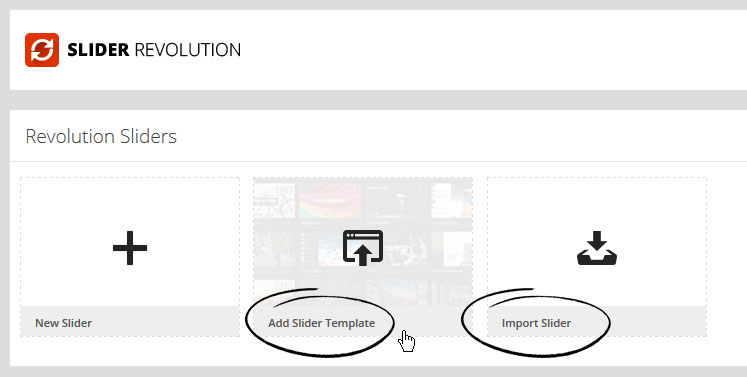
In this ThemeForest download youw ill find the revolution-slider-demo folder with its many .zip files featuring different sliders for different home pages.
On the list of available sliders, in the right bottom section you will see "Import Slider" button. All you need to do to upload a slider is choose the appropriate .zip file from the revolution-slider-demo folder, and click on the "Import Slider" button.
For more details about demo slider import please check slider's documentation where everything in 'step by step' instruction was explained.
5.1.2 Slider management
After pressing the "Create New Slider" button you will be presented with a form asking you to enter a Slider Title (used for the Slider overview in the backend) and a Slider Alias (a slug used to implement the Slider in your WP later, so keep it simple and without spaces or special chars).
You are also prompted to enter the Sliders Basic Settings, a Slider Title (for you to remember the Slider by) and a Slider Alias (do not use special characters or spaces here, this defines the shortcode for you to use in your content). The options in the boxes on the right side (General Settings, Position, Appearance, Navigation, Thumbnails) present useful tool tips on mouse over, so they are not explained here.
The Slider Type can be fixed (not responsive, fix dimensions), responsive (changes depending on the size of its max. sizes given later in relation to the screen size) or full-width (always 100% in width of the screen size, but height keeping the aspect ratio).
The Sizes section is needed to fit the slider into the specified screen sizes. The height of the slider will always be calculated to keep the correct max width and height aspect ratio.
The next step is creating/editing slides. Click on "Edit Slides" in the Slider Form window. Press "New Slide" and the native WP Media Upload dialog window will appear. Choose or Upload the slide's background image, select "Full Size" and then "Insert Into Post" (just like in your WP editor). You can always click on the pic to change it.
Use the arrow handles on the right side to change the slides position in the slider (top to bottom = first to last slide to be shown), or delete it with the "Delete" button.
The "Edit Slide" leads you to the next chapter "Slide".
In the "Edit Slide" " view you arrive at the heart of our plugin. The Drag & Drop Caption editor.
Note:You still have an opportunity to change the background image with the "Change Image" button.
To create a Layer (Caption, Image or Video), press the "Add Layer" or "Add Layer: Image". button. When you have a text layer, a basic layer will be created you can use the "Text" field in the Layer Params to change the caption. The "Style" select box shows some basic styles (CSS classes) you can use to style the caption (you can always add your own CSS classes to this field or edit the existing ones via the "Edit CSS File").
In case of an Image Layer you will see the native WP Media Uploader again. In case of a Video Layer you will prompted to a custom Video selection wizard.
When you have an Image Layer, you will again see the native WP Media Uploader. If you have a Video Layer, you will prompted to a custom Video selection wizard.
You now can move the Layers around via Drag & Drop or enter the x and y coordinate in the corresponding fields.
The "Layers Sorting" drag & drop list determines the Layers' z-index. This list specifies the stack order of an element.
An element with greater stack order is always in front of an element with a lower stack order.
Note that slider is a plugin, and the documentation is located in the documentation/revolution-slider-documentation folder in the ThemeForest package.
Remember to set up chmod on 777 on below folders listed below to show slider thumbnails,andmake it possible to edit CSS styles for slider in the admin panel.
wp-content/plugins/revslider/cache
wp-content/plugins/revslider/rs-plugin/css
All details about Slider Revolution you can find in it's documentation.
5.1.3 How to update Revolution Slider itself?
If you need to update your current version of Revolution Slider there are 2 ways to do it:
- 1. Go to Revolution Slider section on the left side of the main WP dashboard. Click on the "Update Plugin" button in the right bottom corner, go to theme-name\functions\plugins folder and select revslider.zip file and just upload it. That`s all there is to it.
- 2. 2. You can also update via FTP. Log into your FTP server and go to the wp-content/plugins/revslider/ folder. Unpack files from revslider.zip file (described in point 1) and replace files from the unpacked folder into your FTP to wp-content/plugins/revslider/ folder.
5.1.4 Revolution Slider Purchase Code
Revolution Slider is external plugin that is included with the theme because for each product, we purchase an "Extended” license. You can always update theme to its latest version from BeTheme > Install Plugins section.
We update the Revolution Slider plugin with theme updates from time to time, and with each theme update, Slider is updated as well.
The option to register Revolution Slider is included in the plugin. It allows you to get automatic updates and support directly from author. Registration is not required, but if you want to get these benefits, you need to purchase this plugin directly from author. This is how it works for all ThemeForest themes.
6. Muffin Options Panel
The BeTheme options panel has been especially created to make your work faster and easier. Using it is very easy and in just a few minutes you can change a lot of things on your page.
6.1 Global
6.1.1 General
How to set up some general options for your site including the following:
Layout
- Layout - choose Boxed and Full width layouts
- Grid width - use slider to set up own width of grid
- Style | Main - choose between Default and Simple style of theme. This concerns general look of shortcodes/items
- Style | Button - choose between 3 different button styles: Default, Flat and Stroke
Image Frame
- Style - choose between 3 different image styles
- Border - enable or disable border for image frames
- Caption - display caption on image or below
Background
- Image - upload image for background
- Position - choose background position
- Transparent - set up transparency for Header, Top Bar, Content or Footer
Icon
- Favicon - upload your custom favicon image in .ico format
- Apple Touch Icon - upload custom apple touch icon in .png format
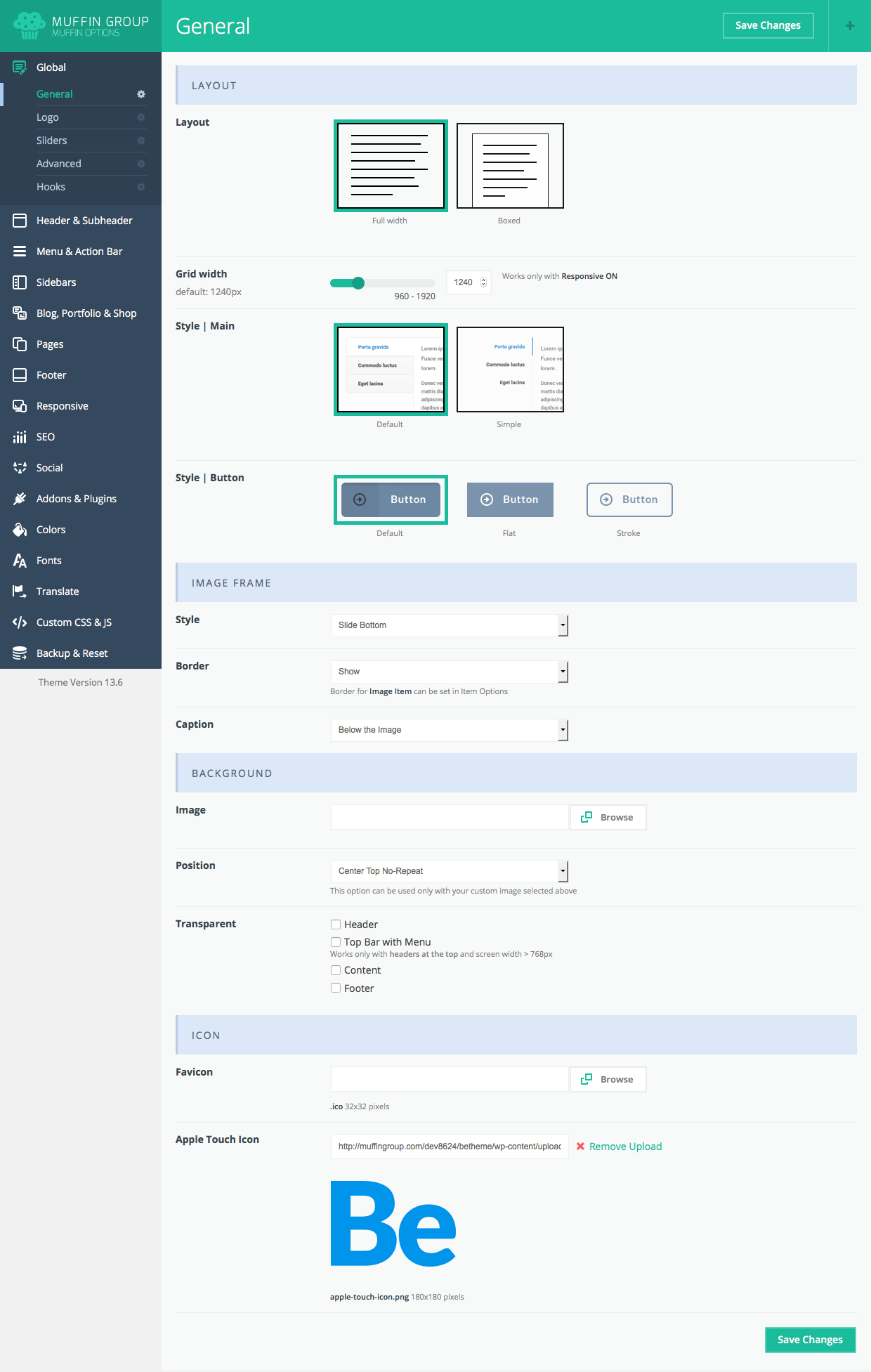
6.1.2 Logo
To set up logos, it's sizes padding and other options, please navigate to Appearance > BeTheme Options > Global > Logo section.You can also set up additional logo options. Note: Retina Logo should be always 2x larger than Custom Logo (this field is optional). This section contain the following options:
- Logo (Custom & Retina) - here upload regular logo
- Sticky Header Logo (Custom & Retina) - here upload logo for header when it is sticky
- Options - You can choose if you want to link logo to homepage or not or if you prefer to wrap logo into H1 heading what some users prefer
- Text Logo - if you prefer to use simple text logo instead of image, this is the right place to do this
- SVG Logo width - if you use SVG logo type, you need to set it's width
- Height - set up custom logo size
- Vertical Padding - top and bottom padding for the logo
- Vertical Align - choose between the Top, Middle and the Bottom positions
- Advanced - there is some options like Overflow logo but please remember that these options concerns some header types only
6.1.3 Sliders
How to set up time outs for different sliders on a page:
- Blog - type in milliseconds time between transitions.
- Clients - type in milliseconds time between transitions.
- Offer - type in miliseconds time between transitions.
- Portfolio - type in miliseconds time between transitions.
- Shop - type in miliseconds time between transitions.
- Slider - type in miliseconds time between transitions.
- Testimonials - type in miliseconds time between transitions.
Always remember to click "Save Changes" button. Otherwise you will lose your changes.
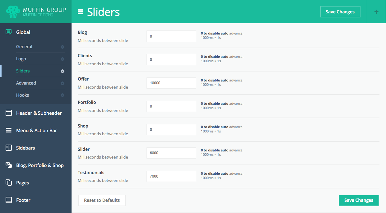
6.1.4 Advanced
How to set up the following advanced options for your site.
Layout
- Boxed Layout | Side Padding - padding for the sides inside wrapper when layout is Boxed
- Builder | Visibility - choose who can see Muffin Builder (Author, Editor, Administrator or everyone)
- Content | Display Order - choose how content should be displayed (1st Muffin Builder or WordPress editor)
- Content | Remove Padding - turn ON/OFF top padding for the content
Options
- Google Maps API Key - set Google maps api key if you generate a large amount of queries to Google
- HTML Table - choose between Default and Rows Hover options
- Math Animate | Disable - ON/OFF animation for Counter and Quick Fact items
Theme Functions
- Post Type | Disable - disable unnecessary post types
- Theme Functions | Disable - if you don't need options listed under this section, you can easily disable them
Advanced
- Builder | Data Storage - useful option for non UTF-8 users and for those who prefer to keep content in database in readable format
- Slider | Shortcode - use this option to force slider for all pages
- Static CSS - for more info please visit Static CSS section.
- Table Prefix - useful option for WP Multisite & Slider Revolution users
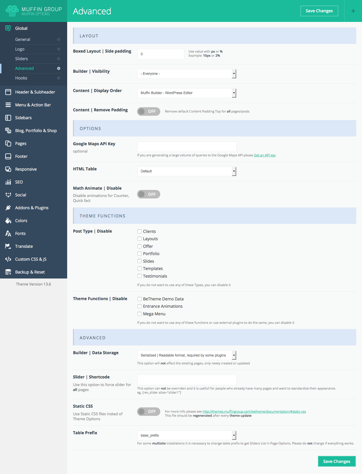
6.1.5 Hooks
How to add code, e.g., HTML that will enable you to show different items and elements in locations that are not available when using Muffin Builder or Visual ComposerFor example, if you want to put some code above the header (banner or information about cookies), place the code in Top field.
6.2 Header & Subheader
How to set up Header and Subheader options.
6.2.1 Header
To setup header layout, please navigate to Appearance > BeTheme Options > Header & Subheader > Header and choose one of the available layouts. You can also set upuse these other options:
- Style - choose a header style (Modern, Classic, Plain, Stack: Left, Stack: Center, Stack: Right, Magazine, Creative, Creative Right, Creative: Always Open, Creative Right: Always Open, Fixed, Transparent, Simple, Empty: Subpage without Header, Below Slider, Split Menu, Split Menu Semitransparent, Below Slider with Split Menu and Overlay)
- Options - Full Width or Boxed Sicky Header.
- Header | Minimalist - choose if you want a header without background image & padding or not.
- Image - select and upload a selected header background image if you don`t want a default one (the image will be applied for all pages instead of the default). You can also upload different header images for different pages using the Set featured image option.
- Attachment - choose between fixed or parallax header background position.
- Sticky - turn on/off sticky header
- Style - choose between white, dark and same as Top Bar left background colors.
Remember to click the "Save Changes" button to avoid losing your changes.
6.2.2 Subheader
How to set up Subheader options.
Layout
- Style - choose between different subheader styles
- Hide - option responsible for hiding subheader elements
- Padding - set padding for subheader
- Title tag - choose between different headings for title
Background
- Image - background image for subheader section
- Position - choose between different positions for background image
- Transparency - subheader transparency
Advanced
- Options - various advanced options for subheader
Please always remember to click "Save Changes" button. Without that you will lose all your changes.
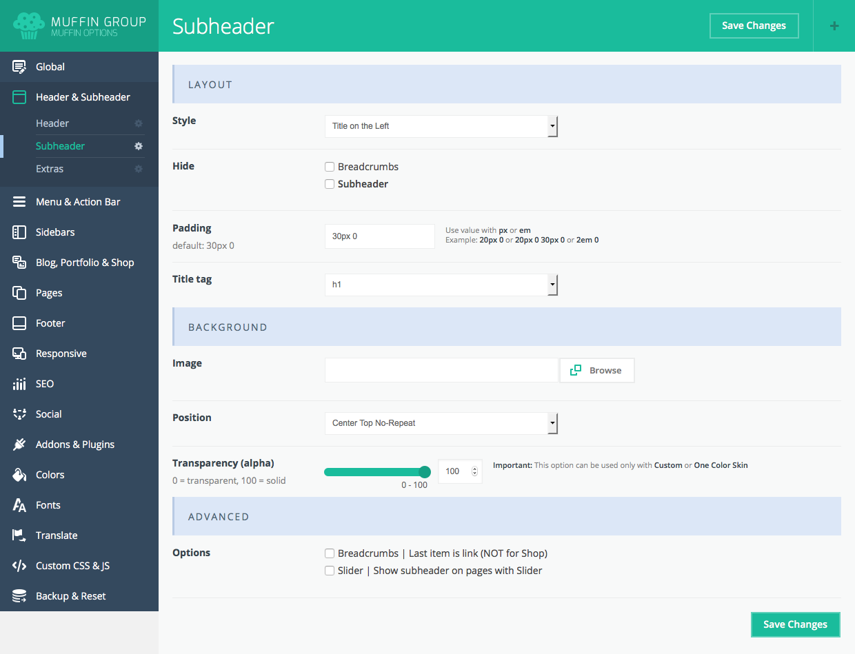
6.2.3 Extras
Additional Header and Subheader Options:
Top Bar Right
- Hide - enable/disable Right Top Bar (the section where Search, WPML flags or cart are)
Action Button
- Title - title for action button in header top bar
- Link - link for action button in header top bar
- Options - additional action button options like opening in new window or scroll to section
Search
- Search - options responsible for search icon in the right top bar
WPML
- Custom Switcher Style - choose between different WPML options like: Flags, Dropdown, Horizontal styles or just hide it
- Custom Switcher Options - link to home of language for missing translations
Sliding Top
- Sliding Top -turn On to show widgitized area sliding from top (widgets for this section can be set up in Appearance > Widgets section)
- Icon - choose icon for Sliding Top section
Other
- Banner - enter header magazine banner code
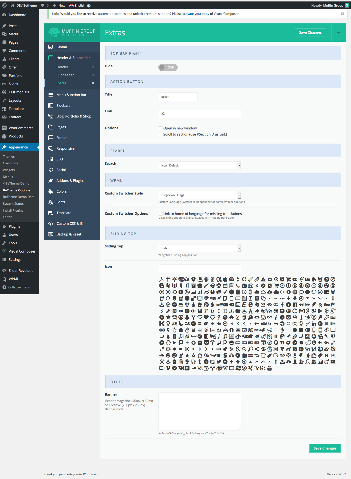
6.3 Menu & Action bar
How to set up Menu and Action Bar options:
6.3.1 Menu
This section was created especially for menu. Here you can set up some options like:
Layout
- Style - choose between 4 different menu styles
- Options - choose between an additional options for menu like: align items to the right, hide border between items, fold 2 last items if there is not enough space on the right, etc.
Creative
- Options - choose between ad additional options for Creative header type only
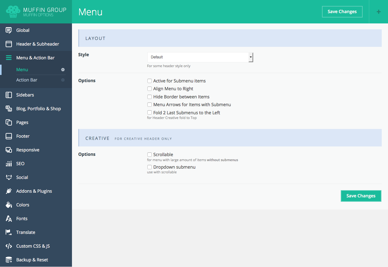
6.3.2 Action Bar
How to set up the following Action Bar options:
- Action Bar - turn the section under the header containing slogan, phone, email address and social icons On or Off.
- Slogan - slogan text visible under the menu
- Phone - phone is visible next to slogan text
- 2nd Phone - phone is visible next to slogan text
- Email - email is visible next to phone number
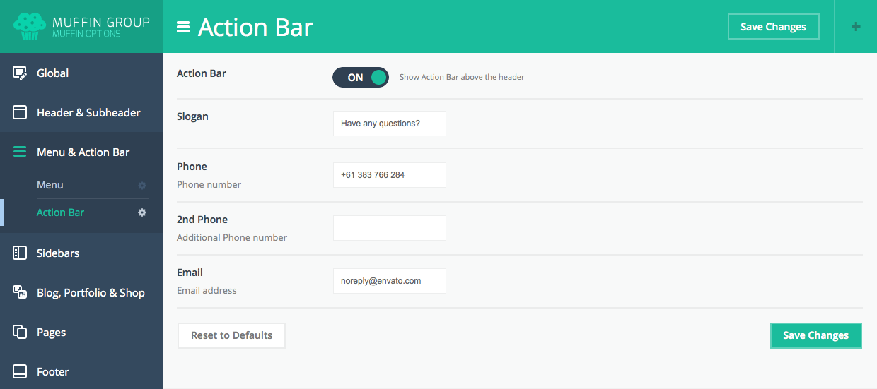
6.4 Sidebars
How to set up Sidebar options.
6.4.1 Sidebars
This is a default option for pages and posts. You can set whether your post or page will be full width include a left or right sidebar. You can always set up your own layout when creating a page or a post. You can also manage your Sidebars here.
IMPORTANT! Do not use special characters for Sidebars titles. WordPress will not accept them.
Sidebars
- Sidebars - add/delete sidebars
Layout
- Width - choose sidebar width
- Lines - choose between different sidebar lines
Pages (from this place you can force sidebar for pages)
- Page | Layout - force layout for all pages
- Page | Sidebar - force sidebar for pages
- Page | Sidebar 2 - force 2nd sidebar for pages
Single Posts (from this place you can force sidebar for post items)
- Layout - force layout for all posts
- Sidebar - force sidebar for posts
- Sidebar 2 - force 2nd sidebar for posts
Single Portfolio projects (from this place you can force sidebar for portfolio items)
- Layout - force layout for all portfolio pages
- Sidebar - force sidebar for portfolio pages
- Sidebar 2 - force 2nd sidebar for portfolio pages
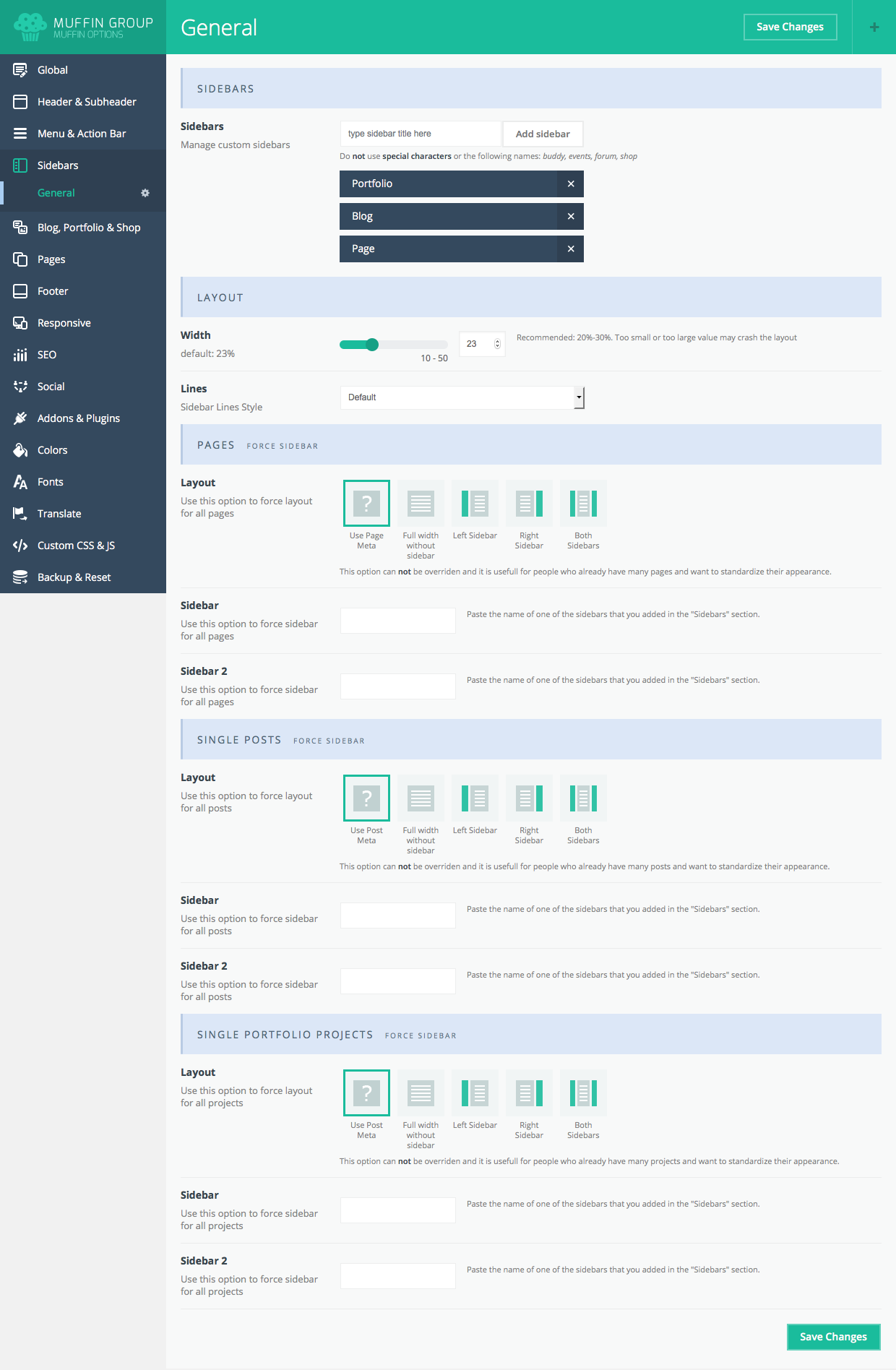
6.5 Blog, Portfolio & Shop
How to set up blog, portfolio and shop page options.
6.5.1 General
General options relating to blog, portfolio and shop pages
Blog, Portfolio, Shop
- Navigation Arrows - enable/disable navigation arrows
- Share Box - ON/OFF share box
Blog, Portfolio
- All pages in navigation - ON/OFF pagination
- Love Box - enable/disable love box feature
Single Post, Single Portfolio
- Featured Image Caption - choose between various options for image caption
- Related Style - choose between different styles for related posts
- Title Heading - set heading type for title
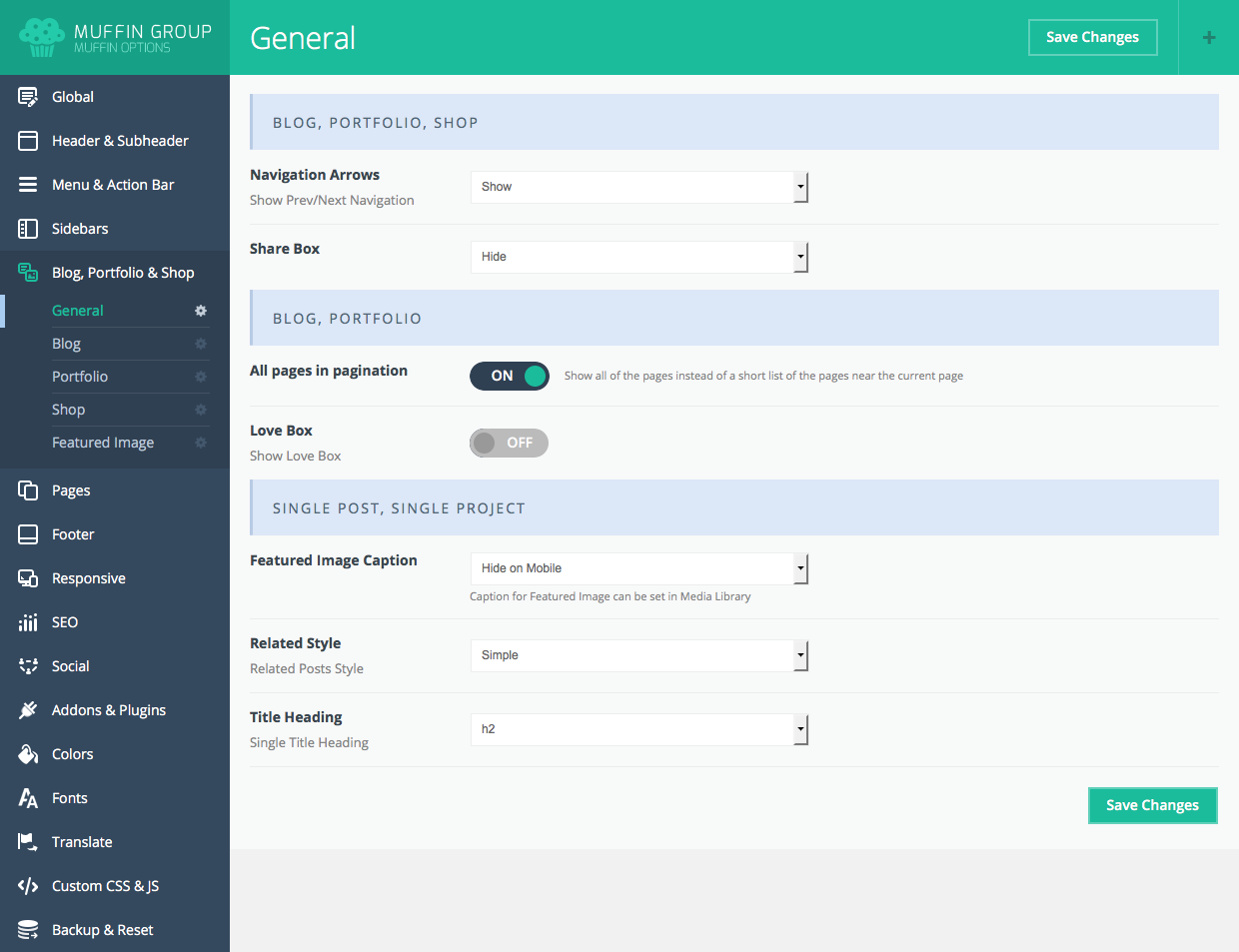
6.5.2 Blog
Options relating to blog pages only:
Layout
- Posts per page - specify how many posts are to be on a page
- Layout - choose a blog layout (Classic, Grid, Masonry Blog Style, Masonry Tiles, Photo and Timeline blog styles)
- Columns - specify the number of columns for Grid and Mansory blog layouts
- Full Width - enable/disable full width layout for Mansory blog style
Options
- Blog Page - assign correct page for blog
- Excerpt Length - number of words visible in blog page excerpt
- Exclude Category - exclude categories from Blog page (you need to type category slug)
- Filters - enable/disable filters section on Blog pages
- Load More button - turn ON/OFF blog page load more button
- Post Meta - show all post meta for blog posts
Single Post
- Title - turn ON/OFF post title for single post
- Zoom Image - ON/OFF zoom for image on single post page
- Author Box - show author box under single post page
- Related Posts | Count - specify the number of related posts
- Related Posts | Columns - specify the number of columns for related posts
- Comments - enable/disable comments for single post pages
- Layout ID - specify the layout ID for single post pages
- Menu - specify individual menu for single post pages
Single Post
- Intro | Padding - define padding
Advanced
- Random Love - click Randomize button to show random number of loves for posts
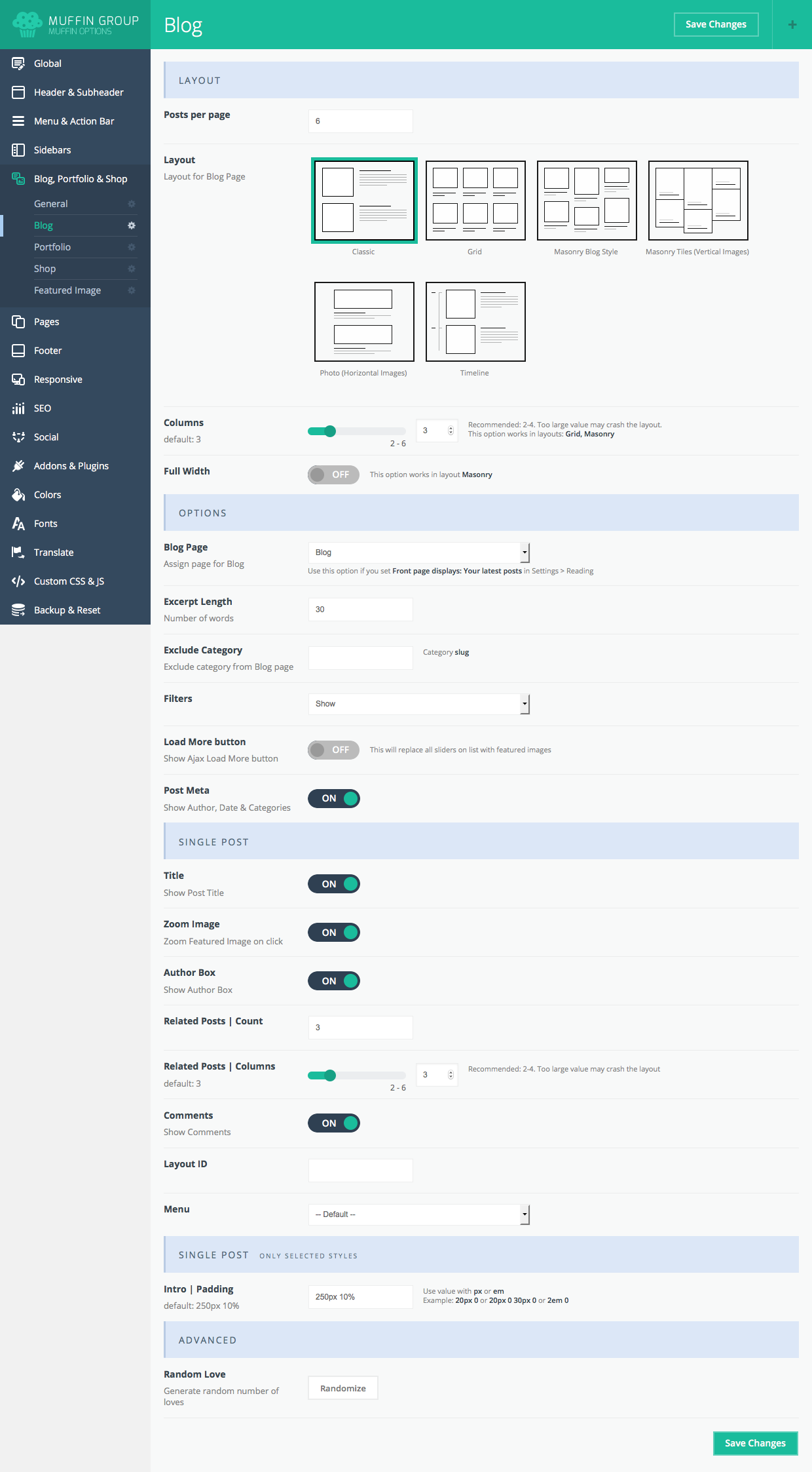
6.5.3 Portfolio
These options will be very helpful when creating your portfolio page. You can set the following options:
Layout
- Projects per page - enter the number of portfolio posts per page.
- Layout - select which layout will be best for your portfolio (Flat, Grid, Masonry Blog Style, Masonry Hover Details, Masonry Minimal, Masonry Flat | 4 columns, List | 1 column or Exposure | 1 column)
- Columns - specify the number of columns for Grid, Flat, Masonry Blog Style and Masonry Hover Details layouts
- Full Width - enable/disable full width layout for Mansory, Grid and Flat style
Options
- Portfolio page - select a portfolio page from the list of the created pages. This is necessary because the theme applies information such as layout, sidebar and link to a page in breadcrumbs
- Order by - select how the portfolio will be sorted
- Order - choose how theportfolio will be ordered (ascending or descending)
- Portfolio Link - select how toopen the portfolio link
- Hover Title - ON/OFF titles for portfolio items
- Filters - enable/disable filters section on Portfolio pages
- Load More button - turn ON/OFF portfolio page load more button
- jQuery filtering - choose whether or not to filter portfolio items using thejquery plugin to improve the l portfolio’s appearance
Single Project
- Related Projects | Count - specify the number of related portfolio items
- Related Projects | Columns - specify the number of columns for portfolio items
- Comments - enable/disable comments for single portfolio items
- Layout ID - specify the layout ID for single portfolio items
- Menu - specify individual menu for single portfolio items
Advanced
- Random Love - click Randomize button to show random number of loves for posts on start
- Permalink | Single Project Slug - this is a link to single item. After changing that option please go to "Settings > Permalinks" and click "Save changes" button.
- Permalink | Category Slug - this is a link to categories. After changing this option, go to "Settings > Permalinks" and click "Save changes" button.
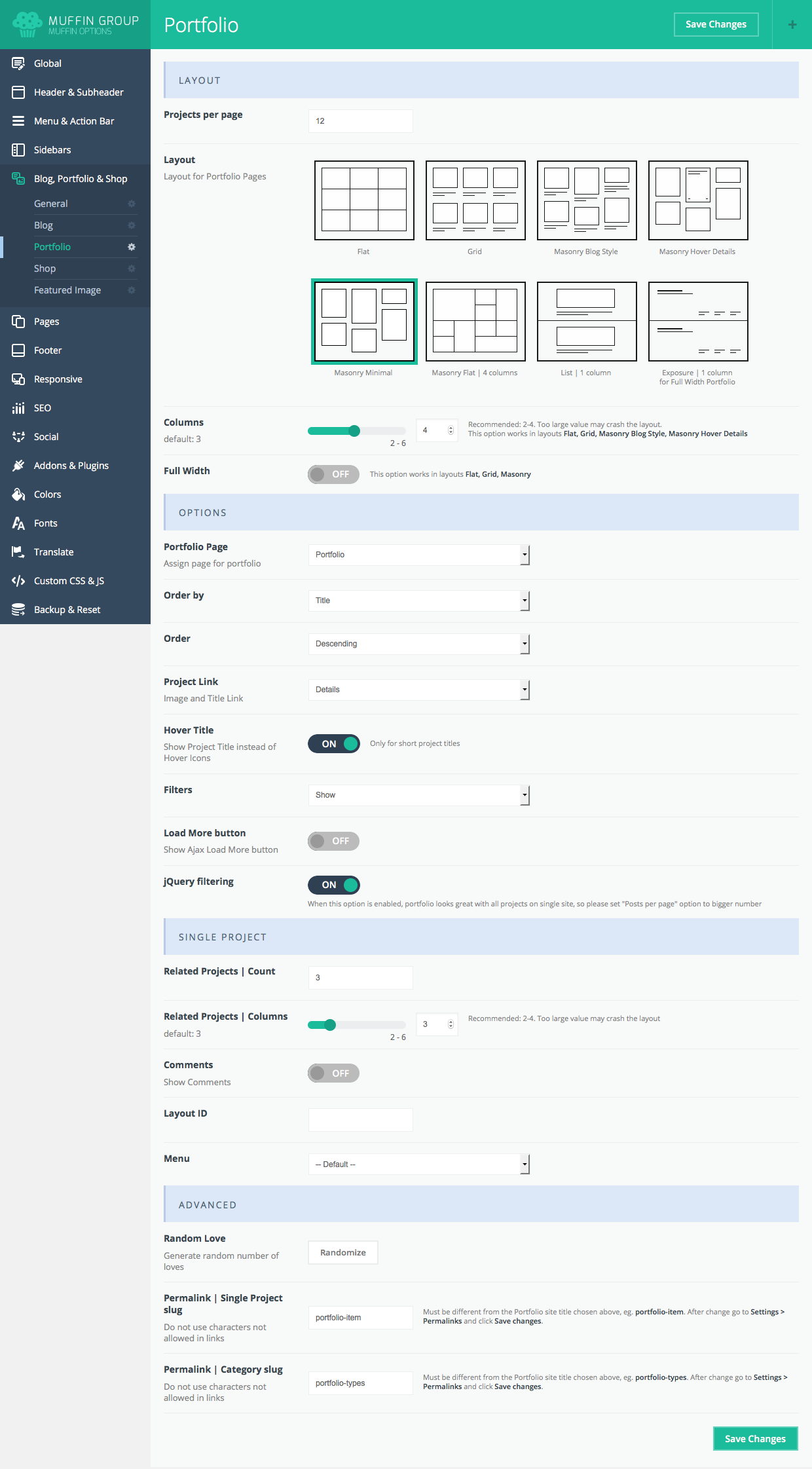
6.5.4 Shop
Options related to the WooCommerce plugin:
Layout
- Products per page - enter the number of products to display per page.
- Layout - choose between various shop page layouts
- Catalogue Mode - ON/OFF catalogue mode for shop page (catalogue is without "Add to cart" buttons)
Options
- Images - choose between various image styles
- Add to Cart Button - enable/disable Add to Cart Button
- Descriptions - enable/disable Descriptions
- Sidebar - choose where the sidebar should display
- Slider - choose where the slider should display
Single Product
- Product Image
- Style - choose between various styles for single product page
- Title - choose where title should display
- Related Products | Count - specify the number of related products
Advanced
- Cart Icon - use your own icon in the header instead of the default cart icon.
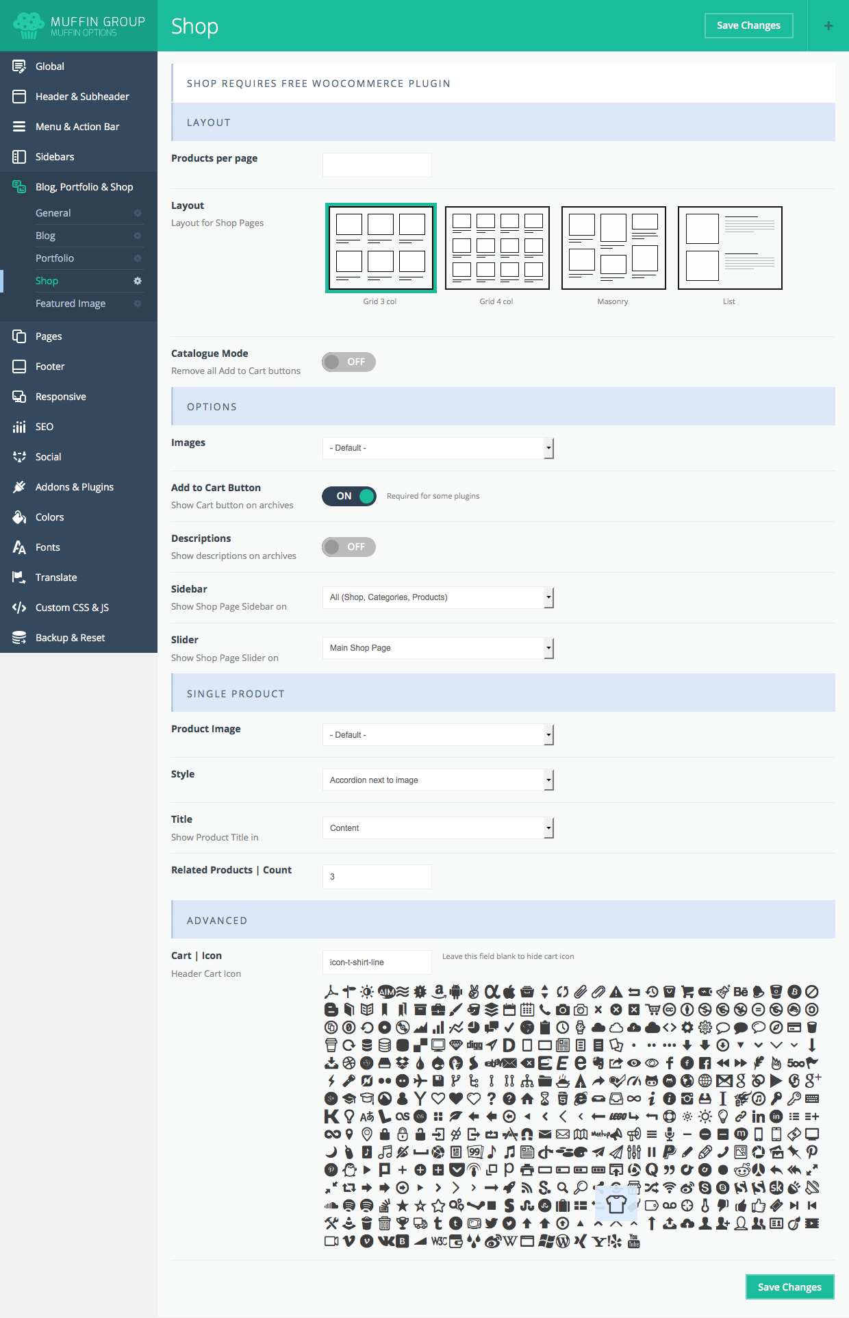
6.5.5 Featured Image
Under this section you can define sizes and style for featured images for Blog, Portfolio, Single Post and Single Portfolio pages.
6.6 Pages
In this section you can set up options relating to pages.
6.6.1 General
General options relating to pages
- Page comments - turn page comments ON/OFF
6.6.2 Error 404
Options relating to Error 404 page
- Icon - choose icon for Error 404 page
- Custom Page - choose own 404 page instead of the default
6.6.3 Under Construction
Options relating to the under construction page
- Under Construction if you will turn this button ON, the under construction page will be visible to all NOT logged in users. Click here to view this page.
- Title - title text is visible under the clock icon.
- Text - text is visible under under title.
- Launch date - enter estimated time of website completionnd show it to users.
- UTC Timezone - select the appropriate timezone.
- Contact Form Shortcode -type shortcode for the contact form created in the Contact Form 7 plugin. You can create any form you want to present to users.
- Custom Page - select your own Uncer Construction page instead of using the default.
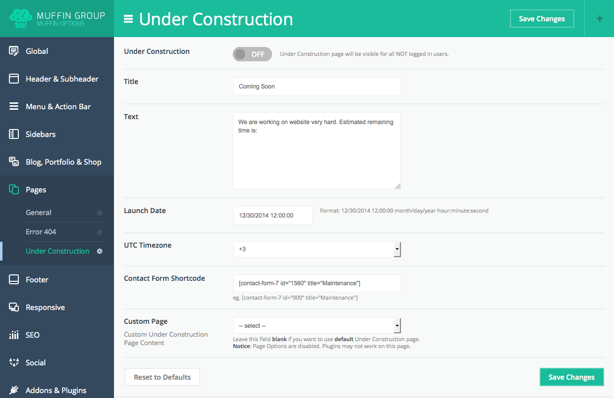
6.7 Footer
How to set up options relating to footers.
6.7.1 General
Options relating to footers:
Layout
- Layout - select a footer layout
- Style - select a footer style
- Padding - specify padding size for the footer area
Background
- Image - upload a background image if desired
- Position - choose between various background positions
Advanced
- Call To Action - call to action text appears under the footer widgets
- Copyright - type your own text for the copyright section, or select “Default”
- Copyright & Social Bar - hide the footer section where copyrights and social icons appear
Extras
- Back to Top Button - choose between various back to top button styles
- Popup Contact Form | Shortcode - type Contact Form 7 shortcode if you want the popup email icon on the correct side
- Popup Contact Form | Icon - specify icon for popup contact form
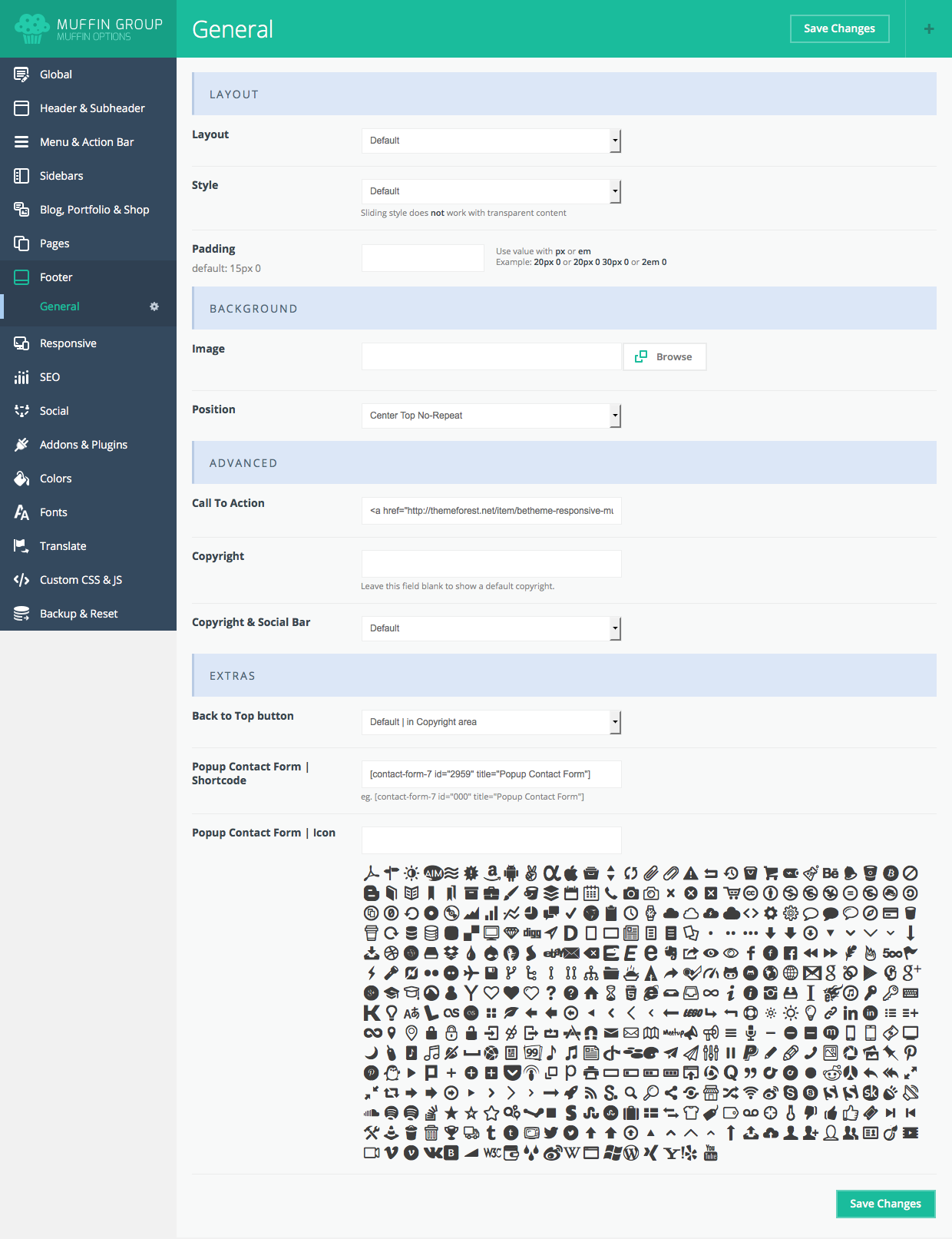
6.8 Responsive
How to set up options relating to the responsive mode.
6.8.1 General
Options relating to the responsive mode
Layout
- Responsive - responsive mode ON/OFF
- Decrease Fonts - ON/OFF smaller fonts on smaller devices
- Pinch Zoom - enable/disable pinch zoom effect on mobile devices where responsive mode is active
Header
- Responsive Menu Initial Width - specify screen width when responsive menu should replace the regular one
- Sticky on Tablet - enable/disable sticky header on tablets
- Transparent - enable/disable header transparency on mobile (screens under 768px width)
- Menu Button | Sticky - ON/OFF mobile sticky menu button
- Menu Button | Text - type own text insstead of menu icon
- Top Bar Icons - choose position for Top Bar icons
Options
- Boxed to Full Width - change layout from boxed to full width on mobile devices that are less than 768px width
- Hover Effects - enable/disable hover effects on mobile devices
- Section | Background Image - choose between various positions of background images
- Section | Parallax - enable/disbale Parallax effect on mobile devices
Logo (optional for those who wants to define different logo on mobile devices only)
- Logo
- Retina Logo
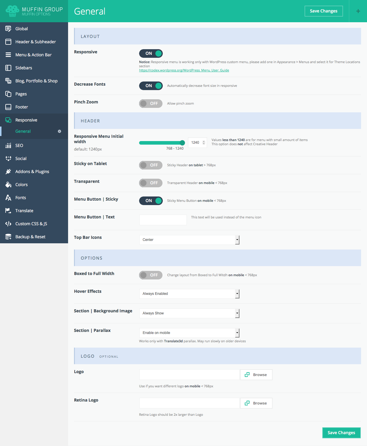
6.9 SEO
How to set up options relating to SEO ready
6.9.1 General
Options responsible for SEO
- Google Analytics - paste your Google Analytics code to track your site
- Google Remarketing - paste your Google Remarketing code to add potential customers to Google list
SEO Fields
- Use built-in SEO fields - if you are using external SEO plugin you can easily turn off built-in SEO option
- Meta Description - this is meta description for homepage;also a default description for each page added in Pages section
- Meta Keywords - meta keywords for homepage; also default keywords for each page added in Pages section
Advanced
- Schema Type - enable/disbale Schema Type for site
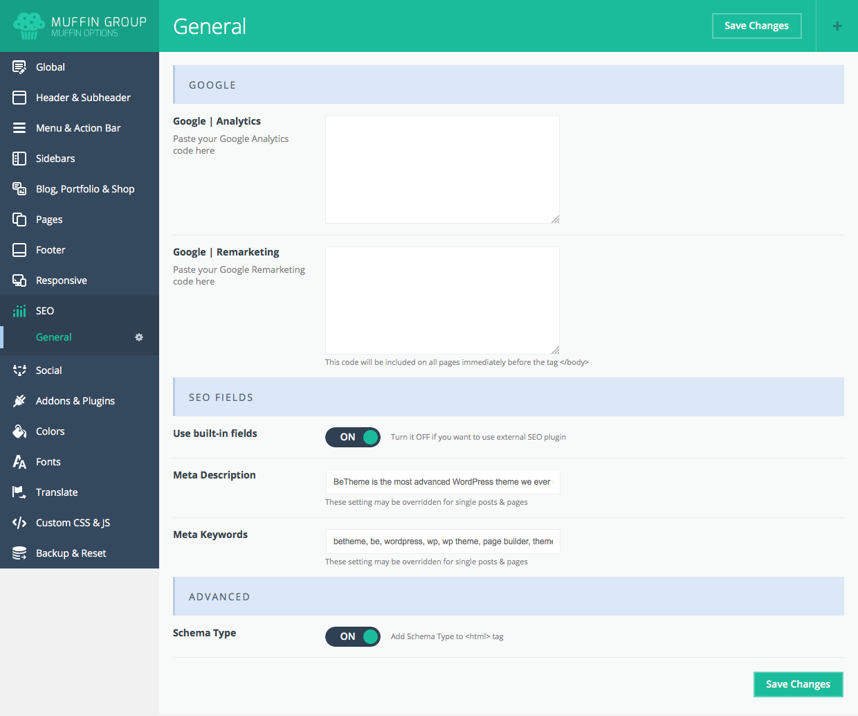
6.10 Social
How to set up options relating to social sites.
6.10.1 General
Options relating to social sites:
- Open links in new window - turn ON to open social profiles in a new window
- Skype - link to your skype profile
- Facebook - link to your facebook profile
- Google + - link to your Google + profile
- Twitter - link to your twitter profile
- Vimeo - link to your vimeo profile
- YouTube - link to your youtube profile
- Flickr - link to your flickr profile
- LinkedIn - link to your LinkedIn profile
- Pinterest - link to your Pinterest profile
- Dribbble - link to your Dribbble profile
- Instagram - link to your Instagram profile
- Behance - link to your Behance profile
- VKontakte - link to your VKontakte profile
- Viadeo - link to your Viadeo profile
- Xing - link to your Xing profile
- RSS Icon - ON/OFF RSS icon next to social icons
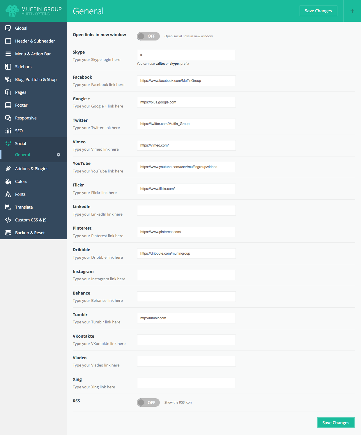
6.11 Addons & Plugins
How to set up options relating to addons and external plugins.
6.11.1 Addons
Options relating to addons:
Parallax
- Parallax | Plugin - choose between various Parallax effects
Scroll
- Scroll | Plugin - switch between various scroll plugins
- Nice Scroll | Speed - speed of nice scroll feature
Pretty Photo
- Pretty Photo | Options - additional options related with pretty photo
- Pretty Photo | Style - choose between various prettyphoto styles
- Pretty Photo | Width - specify pretty photo popup width for iframe videos
- Pretty Photo | Height - specify pretty photo popup height for iframe videos
Addons
- Gallery Shortcode | Disable - ON/OFF default gallery if using an external gallery plugin
- Retina.js | Disable - enable/disable Javascript code responsible for retina images
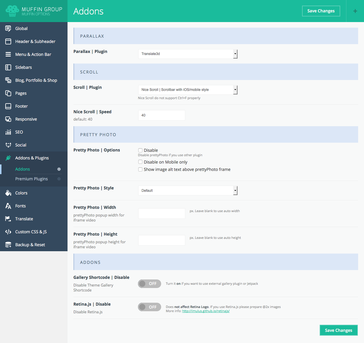
6.11.2 Premium Plugins
Options related with premium plugins, e.g., Revolution Slider, Layer Slider or Visual Composer. You can choose if you want to use the plugin bundled in the package or not.
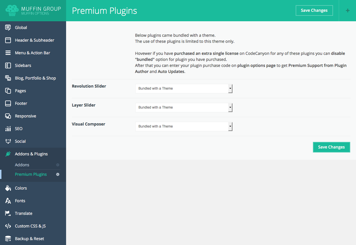
6.12 Colors
This is probably the most powerful options section in theme options panel. You can set up any color for any part of your page.
6.12.1 General
Only two options are available in this section:
- Theme skin - choose one of the predefined styles, or set your own colors. Note: Custom color can be used only with the Custom Skin.
- Body background - select your background color.
- One Color - select one color for all elements; within this option you can create your own skin color.
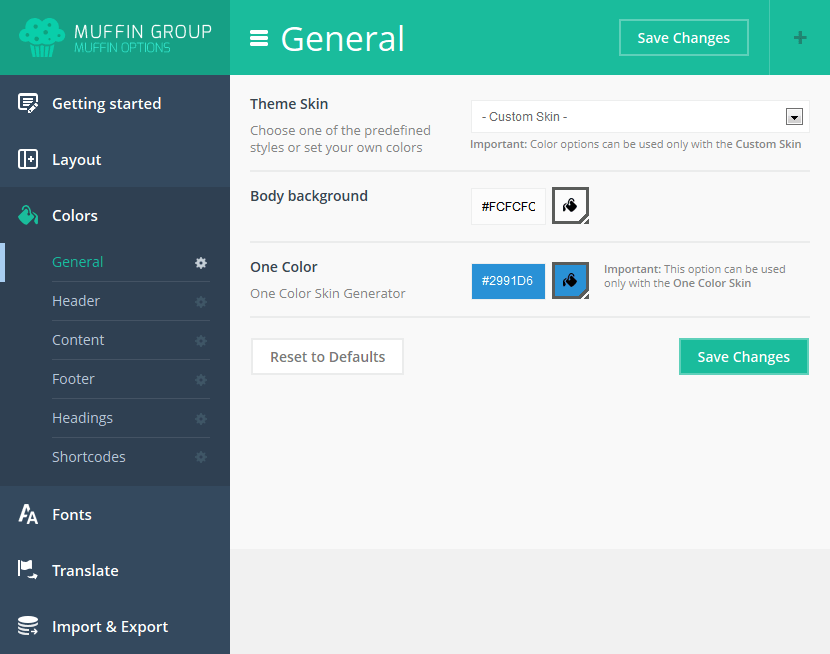
6.12.2 Header
- Action Bar background - enter hex number for the background color for the action bar
- Header background - enter header section background color
- Top Bar Left background - enter background color for left top bar section
- Top Bar Middle background - enter background color for middle top bar section
- Top Bar Right background - enter background color for right top bar section
- Menu Link color - enter menu item link color
- Menu Active Link color - enter link color for active menu item
- Submenu background - enter background color for submenu section
- Submenu Link color - link color for submenu section
- Submenu Hover Link color - link for submenu section on hover
- Search Bar background - background color for search bar section
- Subpage Title color - title text color for subpage
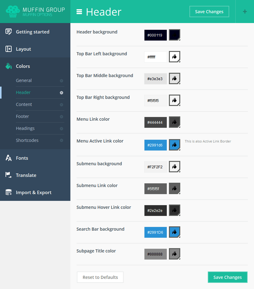
6.12.3 Content
- Theme color - you can choose a single color for multiple icons, buttons and page elements.
- Text color - text color for content
- Link color - text color for links
- Link Hover color - hover color for links
- Note color - color for note
- List color - color for list's icons
- Dropcap & Highlight background - background color for highlight and dropcap shortcodes
- Highlight Section background - font color for highlight section
- Hr color - color for line shortcode
- Button background - background color for button shortcode
- Button color - text color for button shortcode
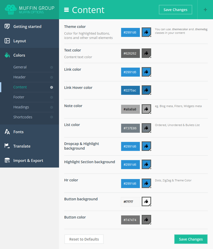
6.12.4 Footer
- Footer Theme color - color for icons and other small elements
- Footer background - background color for footer section
- Footer Text color - text color for footer section
- Footer Link color - link color for footer section
- Footer Hover Link color - link color for footer section on hover
- Footer Heading color - heading text color for footer section
- Footer Note color - note color for footer section
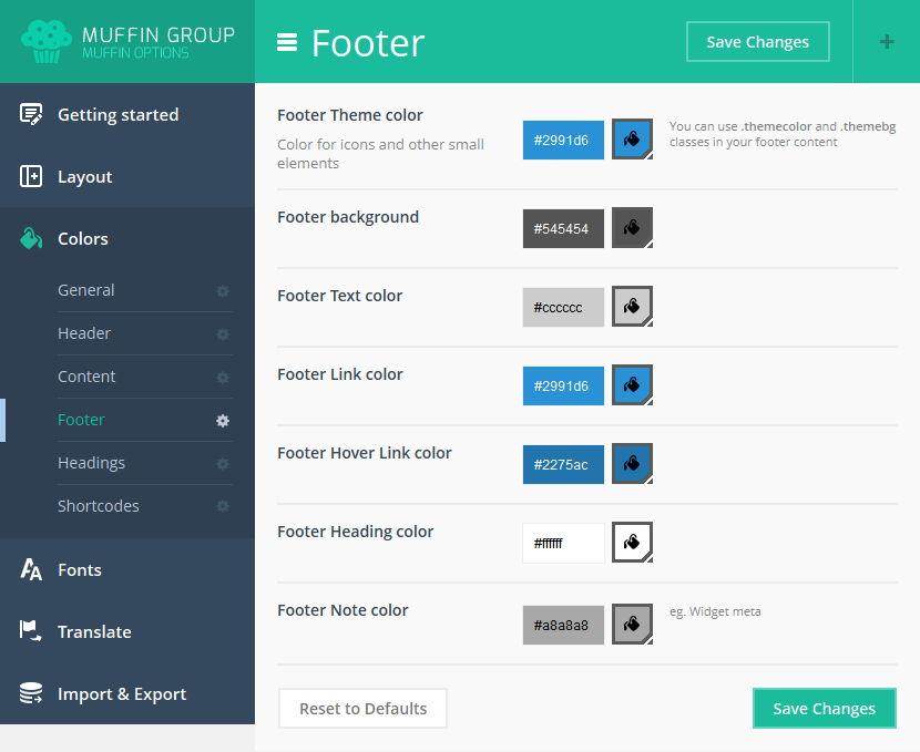
6.12.5 Sliding Top / Widgetized area
- Sliding Top Theme color - color for icons and other small elements
- Sliding Top background - background color for Sliding Top section
- Sliding Top Text color - text color for Sliding Top section
- Sliding Top Link color - link color for Sliding Top section
- Sliding Top Hover Link color - link color for Sliding Top section on hover
- Sliding Top Heading color - heading text color for Sliding Top section
- Sliding Top Note color - note color for Sliding Top section
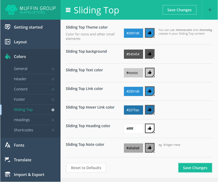
6.12.6 Headings
- Heading H1 color - text color for h1 (Subpages header title font color)
- Heading H2 color - text color for h2
- Heading H3 color - text color for h3
- Heading H4 color - text color for h4
- Heading H5 color - text color for h5
- Heading H6 color - text color for h6
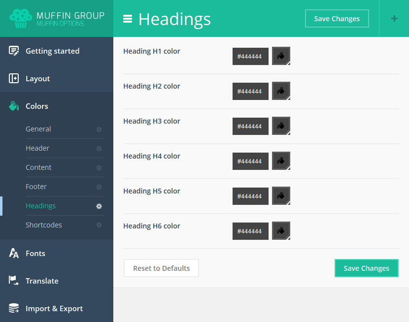
6.12.7 Shortcodes
- Accordion & Tabs Active Title color - title color for active Accordion & Tabs shortcodes
- Blockquote color - text color for Blockquote shortcode
- Content Link Icon color - icon color for Content Link shortcode
- Counter Icon color - icon color for Counter shortcode
- Get in Touch background - background color for Get in Touch shortcode
- Icon Bar Hover Icon color - icon color for Icon Bar shortcode while hover
- Icon Box Icon color - icon color for Icon Box shortcode
- Image Frame Link background - link background color for Image Frame shortcode
- Image Frame Link color - link text color for Image Frame shortcode
- List & Feature List Icon color - icon color for List and Feature List shortcodes
- Pricing Box Price color - price color for Pricing Box shortcode
- Pricing Box Featured background - featured item background color for Pricing Box shortcode
- Progress Bar background - background color for Progress Bar shortcode
- Quick Fact Number color - number color for Quick Fact shortcode
- Sliding Box Title background - title background color for Sliding Box shortcode
- Trailer Box Subtitle background - subtitle background color for Trailer Box item
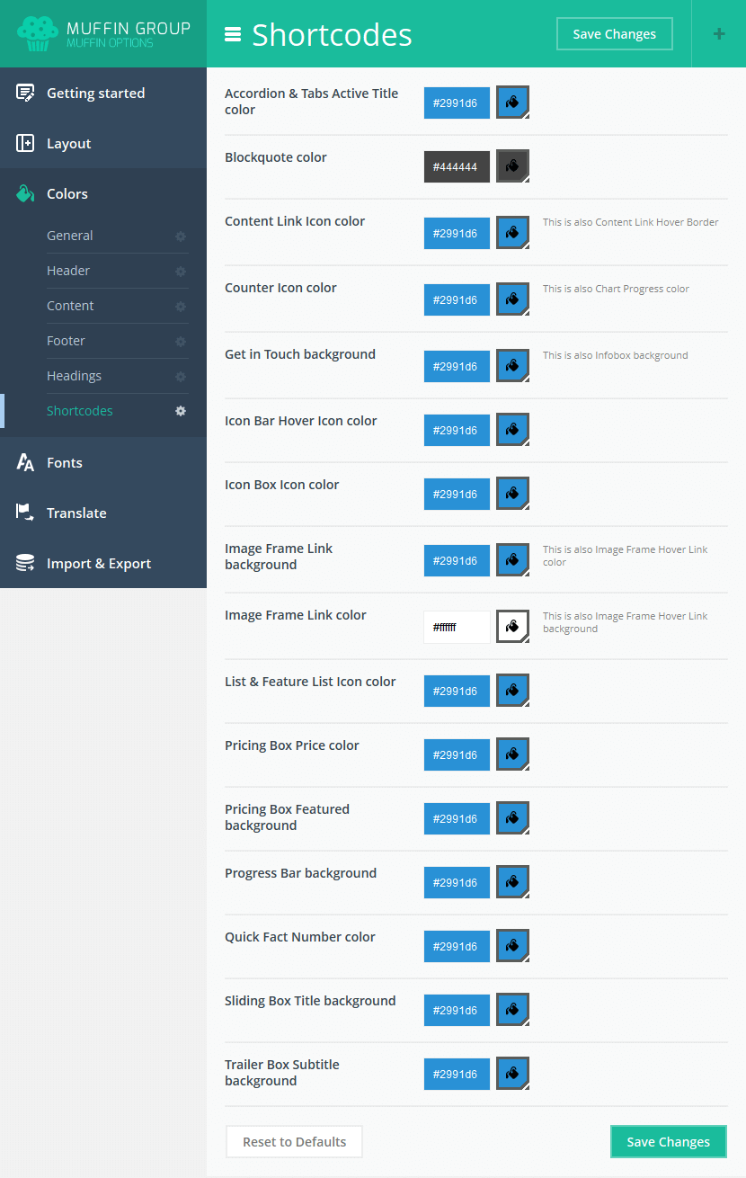
6.13 Fonts
How to set up fonts for your website. This section is divided into four blocks.
6.13.1 Family
Font Family
- Content - this font will be used for all theme texts except headings and menu
- Main Menu - this font will be used for header menu
- Page Title - this font will be used for sub-header title
- Big Headings - this font will be used for all big headings, like: H1, H2, H3 and H4
- Small Headings - this font will be used for all small headings, like: H5 and H6
- Blockquote - this font will be used for blockquote item
- Decorative - digits in some items like: Chart Box, Counter, How it Works, Quick Fact, Single Product Price
Google Fonts
- Google Font Style & Weight - you can upload only those font styles you intend use, since this option impacts page load time. Before checking an option, make sure the font selected works with a specific font style and weight at https://www.google.com/fonts
- Google Font Subset - specify which subsets should be downloaded. Multiple subsets should be separated with commas (,)
You can choose your own font from a palette of over 600 fonts.
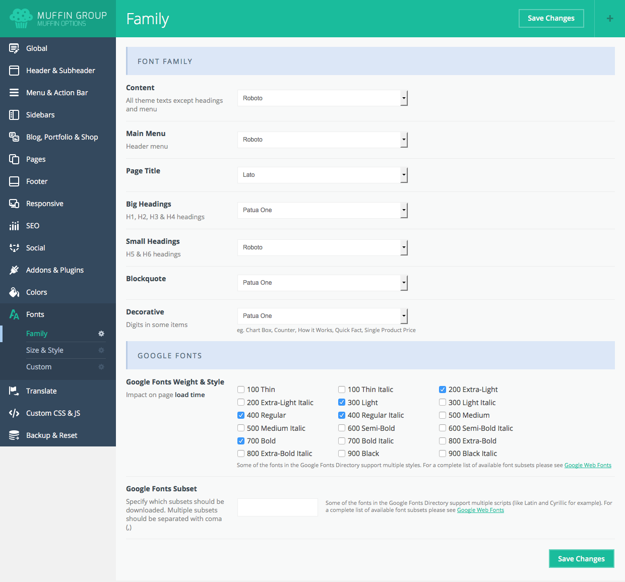
6.13.2 Size & Style
This section is responsible for typography. You can define such things like: font size, line height, weight & style and letter spacing for content, menu, page titles or headings.
Remember to click the "Save Changes" button to avoid losing your changes.
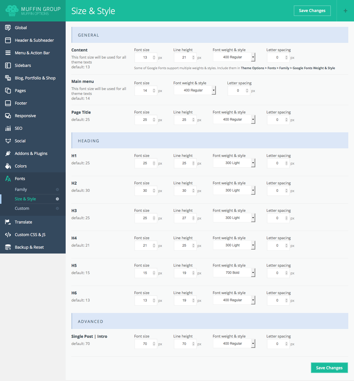
6.13.3 Custom
- Custom Font | Name – type custom font name that will be uploaded in 4 below fields
- Custom Font | .woff - .woff file for custom font
- Custom Font | .ttf - .ttf file for custom font
- Custom Font | .svg - .svg file for custom font
- Custom Font | .eot - .eot file for custom font
- Custom Font 2 | Name – type 2nd custom font name that will be uploaded in 4 below fields
- Custom Font 2 | .woff - .woff file for 2nd custom font
- Custom Font 2 | .ttf - .ttf file for 2nd custom font
- Custom Font 2 | .svg - .svg file for 2nd custom font
- Custom Font 2 | .eot - .eot file for 2nd custom font
IMPORTANT!!! We added fields for custom fonts. If you have your own font and don`t want to use a Google Font, you can upload your files for the font that you want to use with this theme. Each font consists of 4 files: .woff, .ttf, .svg and .eot and each of those files must be uploaded in the correct fields for your font to work properly. After uploading, you can select a custom font for a specified section.
6.14 Translate / Built-in Translator
Translating important sections on a page has never been so easy.
6.14.1 General
It depends how you want to translate your theme. If you don`t want to translate using the .mo and .po files you can do it easily with the options in this section.
- Enable Translate - you can turn it off if you want to use .mo/.po files for more complex translation.
- Search Placeholder - can set up placeholder text Header and Widget Search
- results found for: - set up placeholder text for search page
- Home - set up breadcrumbs text
- Prev page - text available on pages with pagination
- Next page - text available on pages with pagination
- Load more - text available on pages where Load More button is available
- No translations available for this page - text available in header when you use WPML plugin
Items (Builder items and shortcodes)
- Before
- After
- Days - text available on pages with countdown
- Hours - text available on pages with countdown
- Minutes - text available on pages with countdown
- Seconds - text available on pages with countdown
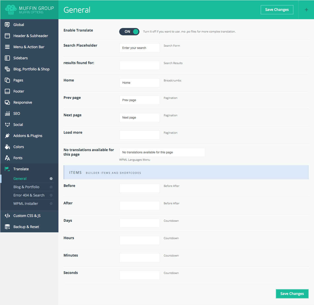
6.14.2 Blog & Portfolio
How to set up your portfolio and blog page texts.
- Filter by - text visible on blog and portfolio pages
- Tags - text visible on Blog page
- Authors - text visible on Blog page
- Show all - text visible on blog and portfolio pages
- ALL - text visible on blog and portfolio pages
- Published by - text visible on blog and portfolio pages
- at - text visible on blog and portfolio pages
- Categories - text available on Blog & Portfolio pages
- Tags - text available on Blog pages
- Read more - text visible on blog and portfolio pages
- Do you like it? - text visible on blog page
- Related projects - text visible on blog and portfolio pages
- Client - text visible on portfolio page
- Date - text visible on portfolio page
- Website - text visible on portfolio page
- View website - text visible on portfolio page
- Task - text visible on portfolio page
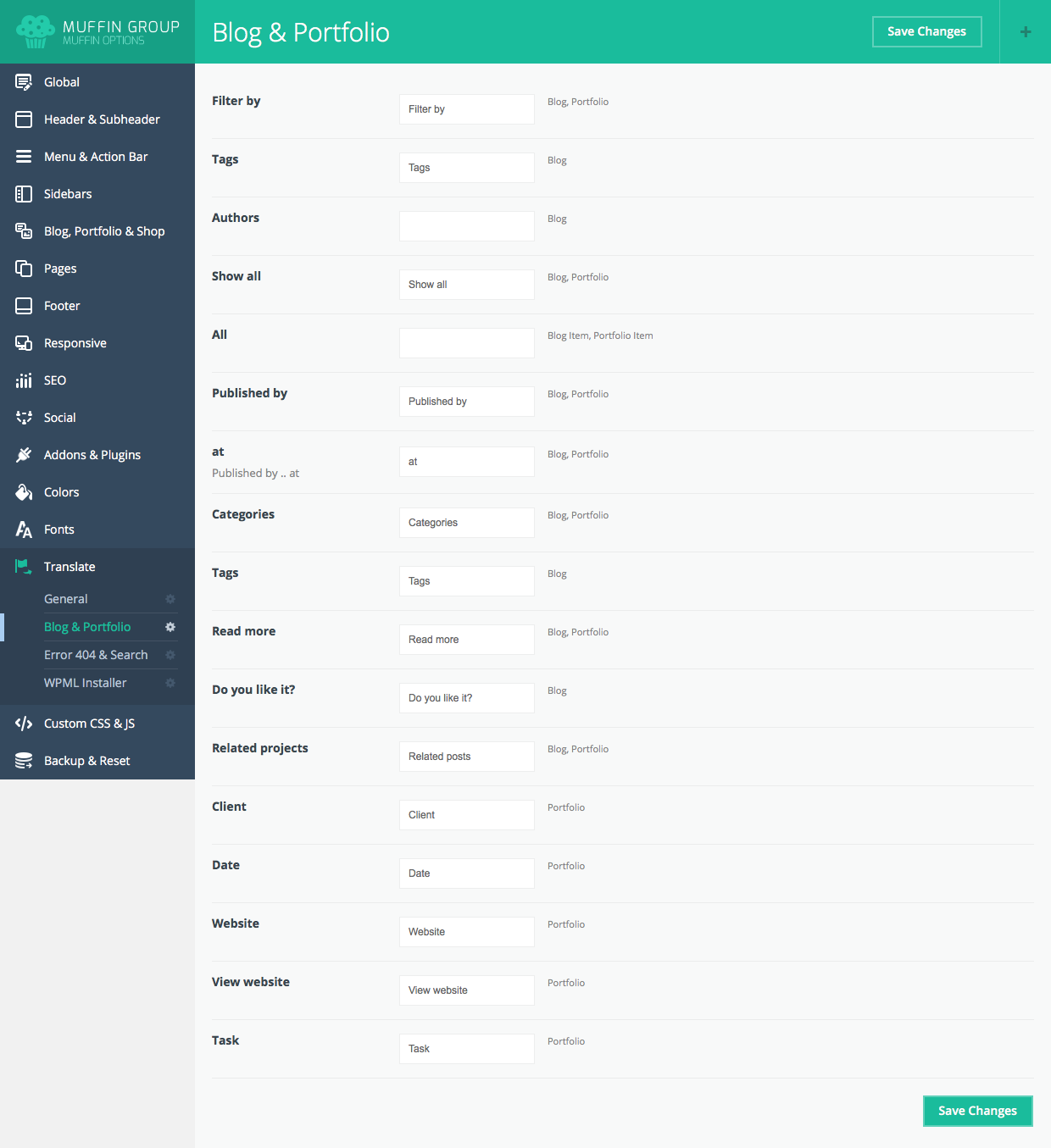
6.14.3 Error 404 & Search
Now your Error 404 and Search pages are 100% configurable. See the options below:
Error 404
- Title - this is title for error 404 page
- Subtitle - subtitle for error 404 page
- Text - text message for error 404 page
- Button - text for button on error 404 page
Search
- Title - this is title for search page
- Subtitle - subtitle for search page
For each field you can set up your own text.
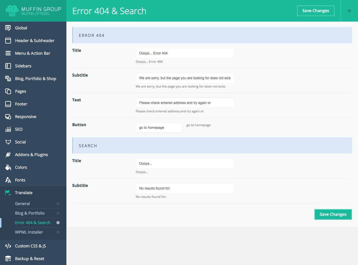
6.15 Custom CSS & JS
How to create your own CSS & JS
6.15.1 CSS
Always create/paste custom CSS here. Make sure CSS is error free.
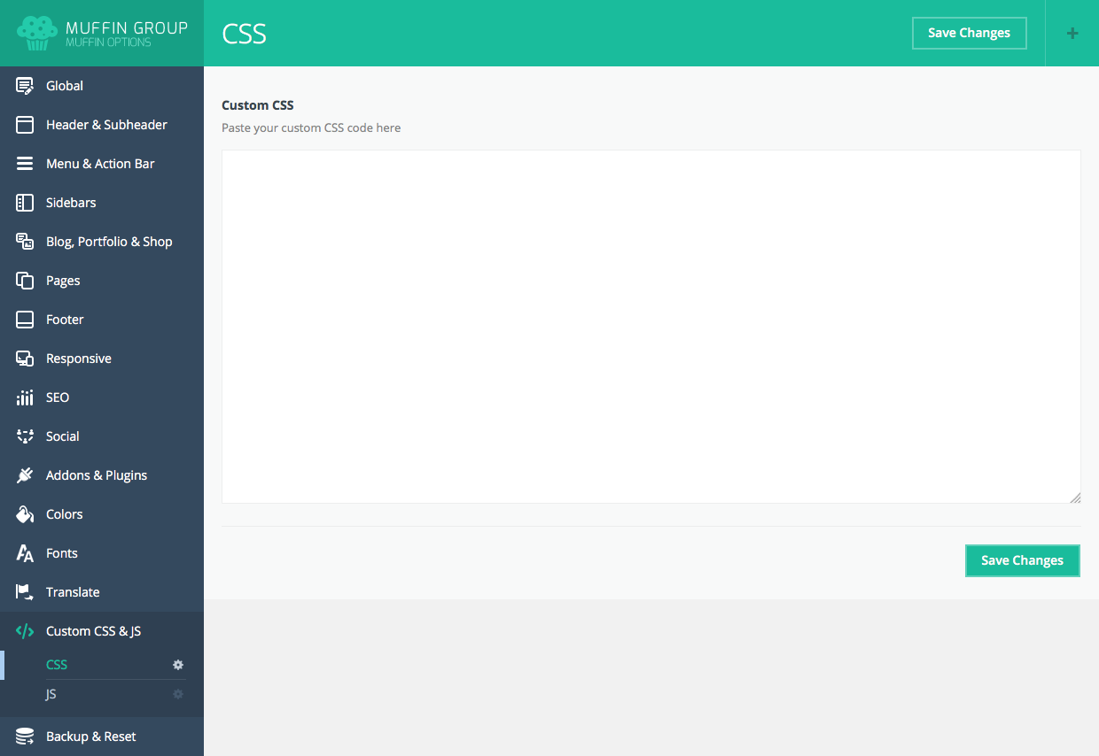
6.15.2 JS
Always create/paste custom JavaScript here. Make sure JavaScript is error free.
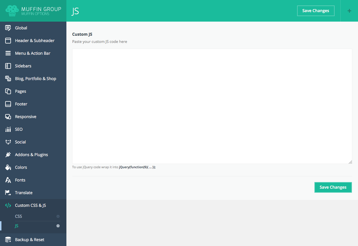
6.16 Import & Export
This information will be especially helpful for those who wish to move settings from theme options panel between themes, or move a website from a test server to a live server. There are several ways to import or export settings.
You can also Reset settings to default to make your theme look like the one on our demo version.
7. Blog
To create a blog, you first need to create a new page Pages > Add New and set up the title eg. Blog. In the Template field, leave the default option on Default Template. In the bottom section you will find Page options such as Layout and Sidebar. You can choose whether your blog should be on full width or with a left or right sidebar. You can also add a video for each post. In the Post option section, under the Visual/HTML default editor. There are several options to set. You can set up a Vimeo or YouTube video.
When you are finished, click the Publish button on the right.
For the next step, go Settings > Reading > Front page displays > A static page > Posts page, select page that you have created and click Save changes.
We have created several features specifically for bloggers. You will find them in Theme options panel > Blog, Portfolio & Shop > Blog. These options are set on default for each new post. Full descriptions of these blog options can be found in the Theme Options
Adding new posts works similar to standard WordPress Posts > Add New. Posts will be displayed on the newly-created page.
Images for posts are added using a featured image.
With the latest version, you can use Muffin Builder inside blog posts. You can still use WordPress' default editor, but if you wish to create something advanced, use Muffin Builder. Muffin Builder features a wide variety of useful options.
With this version we also created 4 posts formats: Standard Horizontal Image, Vertical Image, Quote, Video and Link.
For more information about creating posts, go to http://en.support.wordpress.com/posts/.You can also check the video on how to create a post at http://www.youtube.com/watch?v=Sa4uimrgNz8
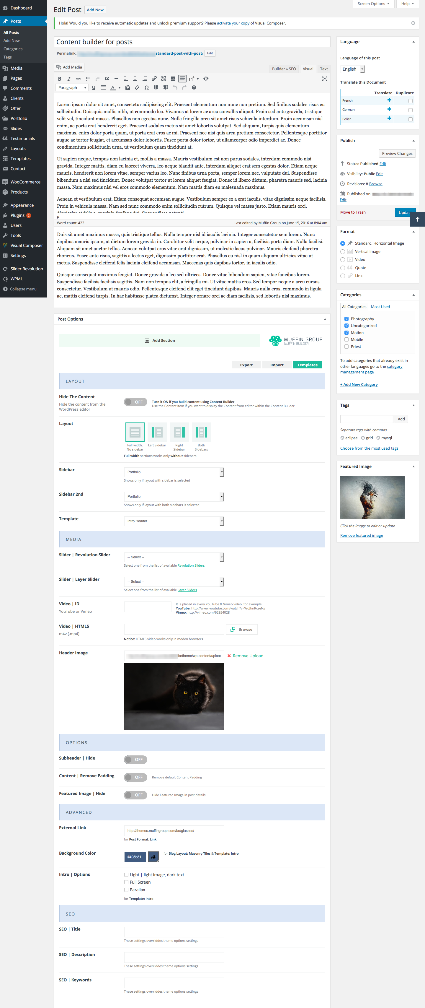
8. Portfolio
To create a portfolio please start by creating a new page Pages > Add New and setting up the title eg. Portfolio. In the Template field set the option Portfolio template. In the bottom section you will find Page options such as Layout and Sidebar. You can then select whether your portfolio should be in full width or with a left or right sidebar.
In Portfolio section you can also add videos from Vimeo or Youtube or even upload own videos in mp4 format for each portfolio item. Don’t forget to set up a featured image for a portfolio item when adding a video.
We have created several options for the Portfolio page. You can find them in Theme options panel > Blog, Portfolio & Shop > Portfolio. Additional information about these options can be found in Theme options panel.
Porfolio items are similar to those in a typical post. To add a new portfolio, go to Portfolio > Add new. As you can see, the options are similar to those for a blog. In the bottom section of the page you will find Page options, where you can choose whether you want a full width portfolio or the one with a left or right sidebar.
You can also type Excerpt and select Featured image. When finished, click the Publish button.
BeTheme features a number of new Portfolio options.It is now possible to create the entire portfolio content with Muffin Builder . It works the same way as for standard pages. Muffin Builder provides a number of valuable options, among them SEO fields, slider, sidebars and others.
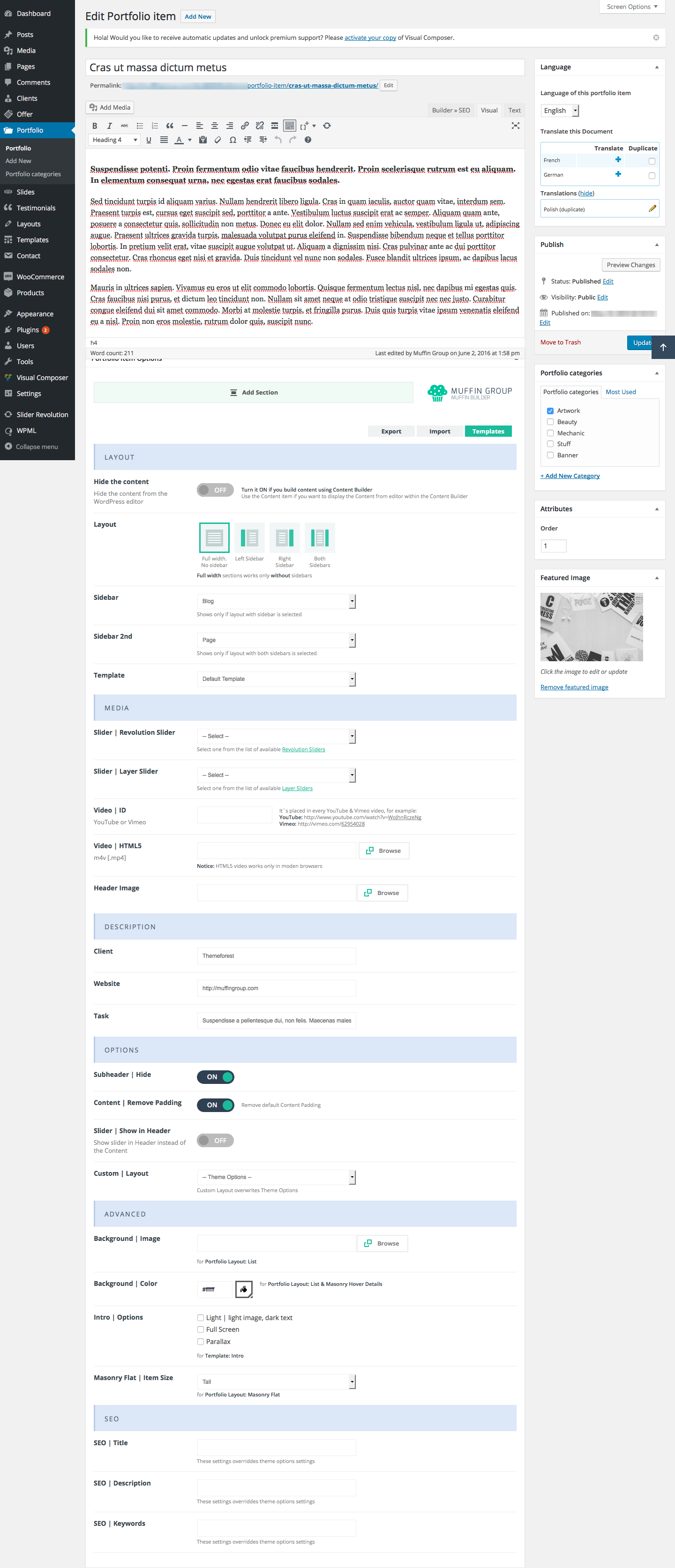
9. Menu creation
Menu creation works as in default Wordpress.
To add your own menus go to Appearance > Menus, type Name for your menu and click Create Menu.Then, in Theme Locations for position Main menu you need to choose a menu that you’ve just created.
Now you can add Pages, Posts and Custom Links from blocks located on the left. You need to save everything by clicking on Save Menu.
If you want to add special items or features to a menu such as portfolio categories, posts categories, classes for links,etc, click on the "Screen options" button in the right top corner to find additional menu item options.
For more information on creating a menu, go to http://en.support.wordpress.com/menus
This theme also features a Mega Menu option, allowing you to create attractive menuswith items in columns, with ot without titles.
Mega Menu
To create a mega menu on your website, you have to add Custom Links to your menu. Make sure that you are in Appearance > Menus tab before you start. Navigate left where you can see the custom links tab. When you click on it, it will show two fields, type a "#" in the first field and your preferred menu item name in the second field called: Link text. Click Add to Menu.
We type a "#" to make the main link not clickable, you can also type in any URL there.
The new menu item will show up on the right, click it to see more options. The most important thing to check is the Activate Mega Menu option, remember to have it enabled.
When your main menu item is ready we can get to creating the mega menu columns, to do that just add another custom link, again with the "#" as the link and in the link text field type a "-". Click add to Menu
Drag the created menu item under your previously created main menu item but set it as a subitem. To do that just move it to the right, just as you would while creating a normal menu.
If you did everything right the name of the submenu item should change from "-" to "- sub item". This is your column. Now you can add your pages under the column and they will appear on the site under each other.
To create another column just repeat the last step and set the sub item under the previous one.
For a better understanding of the placement of the menu items look at the image on the right.
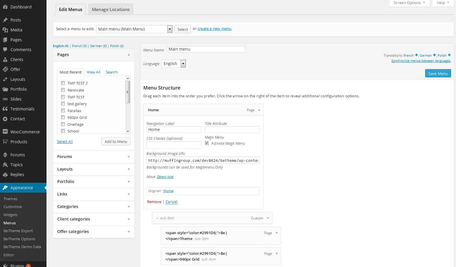
Smooth scroll effect and hashtag links for one page websites
OLD METHOD
If you create a one-page website or you want to use links with hashtags around a page, you need to create links with hashtags "#". For example, if your website is http://website.com, and on this page you want to create links with hashtags for sections go to the Appearance > Menus section where you need to create links like http://website.com#section1
For sections where you want links, you must type in the correct Custom ID which must have the same as that after the # in the link. In this case, Custom ID must be section1. Custom ID can be set up as a "Section" item inside Muffin Builder.
If you want to get smooth scroll effect for the menu items, you need to select the correct CSS Classes field for each menu item affected. To do that, go to Appearance > Menus section, click the "Screen Options" button, and check the "CSS Classes" field. Under each menu item you should see "CSS Classes" field. where you must enter the scroll value. You will then get the desired scrolling effect for each menu item for which you entered a scroll value.
NEW METHOD
The only difference between the OLD and NEW method is that you don`t need to set up a scroll class for menu items. Everything else works the same. Instead of the scroll class, you need to turn ON the One Page option in Page options section while creating or editing a page.
We recommend the NEW method, as it is much faster to use and scrolling is smoother.
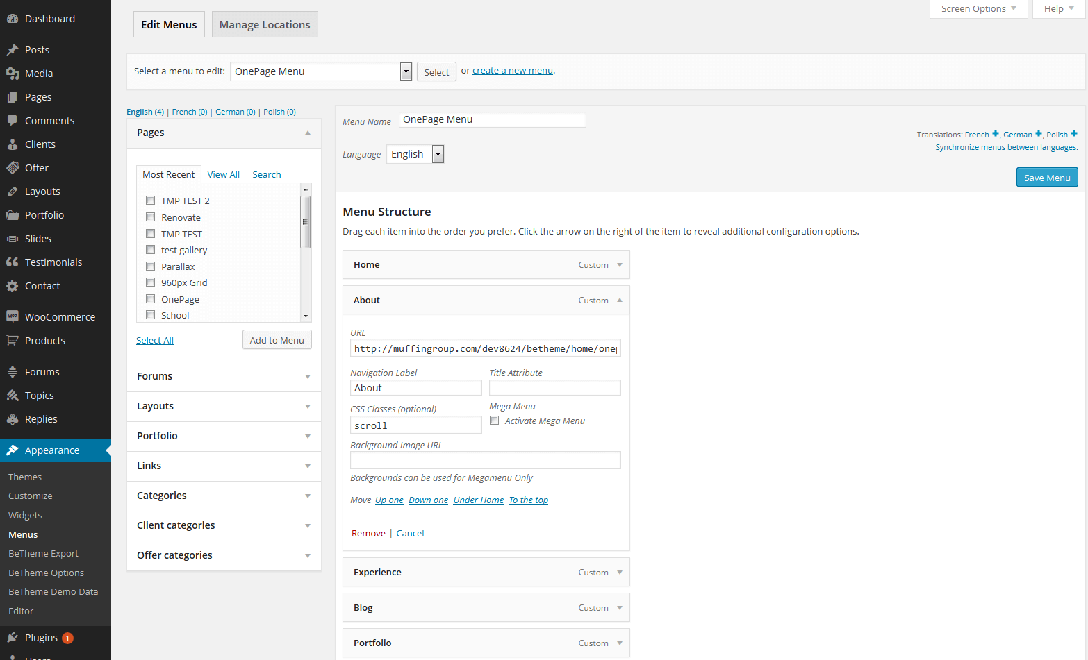
10. WooCommerce / Shop integration
BeTheme is fully compatible with the WooCommerce plugin. We carefully designed BeTheme so you can build a nice shop that is loaded with options, and one that is perfect in appearance. Since WooCommerce is an external plugin, you will find any information you may need about it in the WooCommerce author’s page. Here are several useful links:
10.1 How to install WooCommerce and setup the default shop pages
First go to Plugins > Add new section and type "WooCommerce" into search field. Then click "Search Plugins" button.
Once that is done, and you see the result, click on the"Install now" button next to "WooCommerce - excelling eCommerce" plugin.
Once WooCommerce is installed, click on the "Activate plugin" link.
In a few moments you will see a WooCommerce Purple Notification Bar at the top of the plugin page. Clicking the Install WooCommmerce Pages button in the purple bar will install all the default pages.
Please Note: Once you are done installing WooComerce and the default pages, you can go to the Appearance > Menu section of your admin and add all the WooCommerce pages to your menu. They will be listed at the top under the most recent pages.
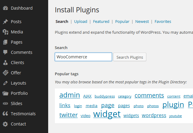
10.2 How to add new product
Go to Products > Add product section. You will see a page that looks like the one below.All you need to do is fill those fields with your own values.
Information about adding a new product will be found at on http://docs.woothemes.com/document/managing-products/
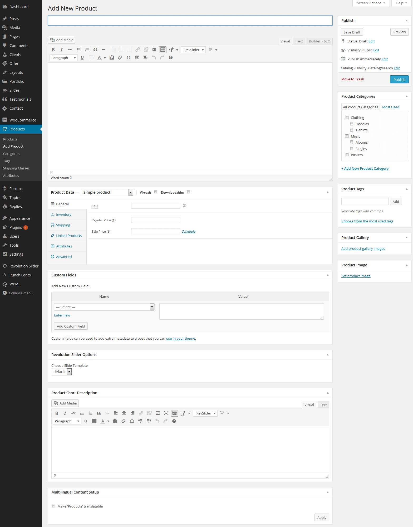
10.3 How to use WooCommerce shortcodes and setup pages for shop
The pages you need for WooCommerce are in WooCommerce > Settings > Catalog section. If you want shortcodes for pages like cart or checkout you need go to WooCommerce > Settings > Pages section. (Most WooCommerce pages must be created manually.That’s why for each one you need a shortcode).
To locate the full listing of WooCommerce plugin shortcodes go to http://docs.woothemes.com/document/woocommerce-shortcodes/
For a list of all the available pages for the WooCommerce plugin,go to http://docs.woothemes.com/document/woocommerce-pages/
11. Translation & WPML
10.1 Use .mo/.po files and Poedit software
For all those who prefer translation using files included in the theme we recommend using the .mo/.po files. Those files work in pairs, so for each language you need to have 2 files with the same name but a different extension. For example, if you want to translate into German language, your files would be de_DE.mo and de_DE.po
To edit these files you need to use Poedit an easy to use software application. Simply upload the files into Poedit, edit them and upload them into the"languages" folder included in the theme.
10.2 Use our built-in translator
If you don`t want to bother with the above files and would prefer to use an easier and faster way to translate your theme, we recommend using our built-in translator, which you will find in Theme options > Translate section.
Multilingual website / WPML integration
BeTheme has been thoroughly tested, and is fully compatible with the WPML plugin. If you want a multilingual website, this is the best way to do it. If you want to use this plugin however, you must purchase it first, and install it into your WordPress platform. The following links contain useful WPML plugin information.
11. Footer & Widgets
11.1 Footer
Footer is divided into 3 different sections:Call to action, Widgets and Copyright & Social icons. This screenshot illustrates how these sections are presented:
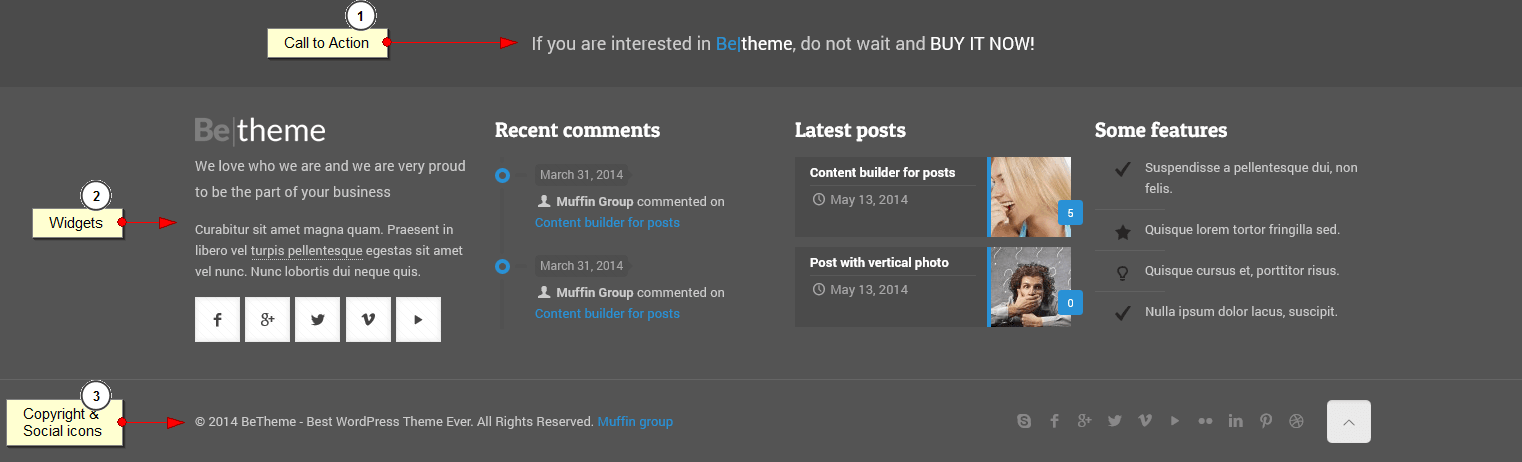
- Call to Action - text for this item can be edited in Appearance > BeTheme Options > Footer section in Footer Call To Action field
- Widgets -We created 4 sections for widgets. To add/edit widgets inside a footer, navigate to the Appearance > Widgets section and choose widgets for Footer area #1, Footer area #2, Footer area #3 and/or Footer area #4 sidebars.
- Copyright & Social icons - copyright text can be changed in Appearance > BeTheme Options > Footer section. There is field called Footer Copyright. If you leave this field empty, the default copyright will be displayed. Social icons will only show when you fill Appearance > BeTheme Options > Social section with proper links to social media pages.
Check developers and contractors specialized in WPML and BeTheme
11.2 Widgets
We included 9 custom widgets but in total there are 33 different widgets available. To access them, all you need to do is to drag any available widget and drop into the correct sidebar. If you prefer to create your own sidebar, navigate to Appearance > BeTheme Options > Sidebars and you can create as many sidebars as you need.You can then go back to the Appearance > Widgets section and continue to move widgets into new sidebars.
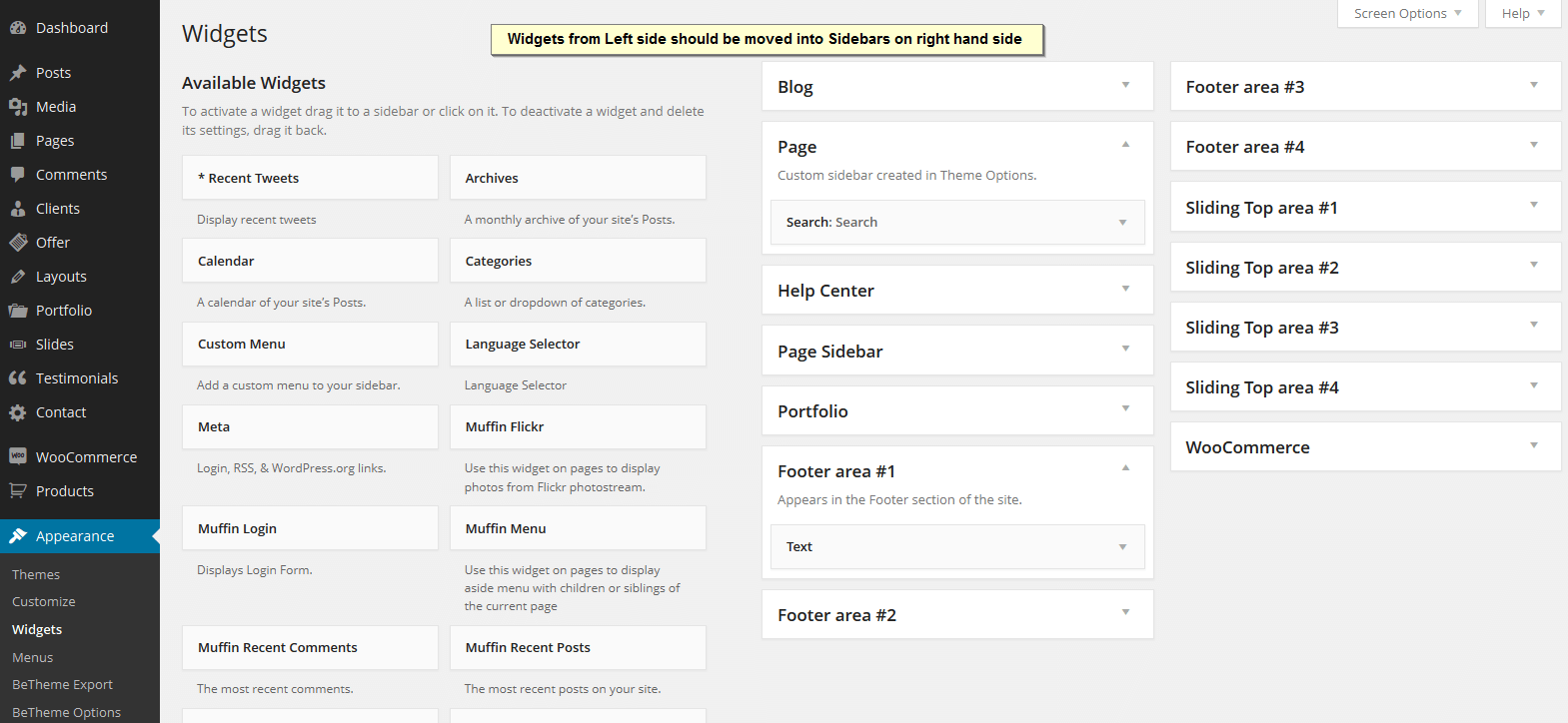
12. Extras
These extra sections are designed to help you with several other items that can be important when creating a website.
12.1 Retina Ready
BeTheme is fully Retina Ready. Images can have two different sizes - a standard image for most screens, and a second image for devices with HQ screens like Retina.
For logos, there is an additional field in the BeTheme options > Global > Logo section, where you can upload a standard logo and a retina logo that must be 2x larger than the standard image.
The same applies to all other images if you want to get perfect looking images on Retina screens. If for example you build a website where you upload regular images into Content or Muffin Builder, you must always upload 2 images in Media > Add new section as shown below:
my_image.png - this is the name for standard image
[email protected] - this is the example name for retina image and file must be always 2x larger than regular image
As you can see, the second file( for retina) must have an @ 2x additional name for the file.
If you upload all images twice as shown here, your entire website will feature perfect images on all the standard devices.
12.2 SEO
In response to what is constantly transpiring in the search engine world (especially Google) we added the SEO option to our theme.
To set up general options for SEO, go to BeTheme options > SEO where you can introduce features like Meta Description or Meta Keywords for homepage (this is also the default option for each new page).
If you are using external SEO plugin you can easily turn it off.
You can also set up options like Title, Meta Description and Meta Keywords for individual page by going Pages > Add page > Page options.
In the Page Options, Post Options & Portfolio Item Options you can find fields like SEO Title, SEO Description and SEO Keywords fields. If you fill those fields, your page will adopt those parameters. If you leave the fields empty, the pages will adopt the default values under BeTheme options > SEO.
12.3 Support & contact us
You can contact us in several ways, depending on your needs.
- If you have a question about the theme,enter your question in the forum at http://forum.muffingroup.com/betheme . We will answer support questions in comments or emails, but we prefer that you use the forum as your question and our response can be helpful to others.
- If you use Comments, please limit your questions to presale questions or comments that are not related to support.
- If you have a major problem, and you need to give us access to your account (which can only be accessed by support personnel) you can contact us by using the contact form on our profile`s page on Themeforest http://themeforest.net/user/muffingroup
There is no other way contact us, so please don`t attempt to contact us through YouTube, Facebook, or Twitter. Your question could easily get lost in these communication channels.

12.4 Advanced theme customization
Sometimes you may occasionally encounter a moment when you want to change something on your site that is not available in theme options panel. , e.g., font size, color, margin, or some other customization. You don`t have to contact us and wait for a response. With BeTheme, you can easily do it on your own.
12.4.1 Google Chrome
To do so, you can use two free, highly useful tools that are available on your web browser. If you`re using Google Chrome you can inspect element that you need to change by "Inspect element". Simply hover your mouse on the element and click "Inspect element". After that, you`ll see something like the image below.
As you can see, on the left side there is a list of styles used for each class/id. If you want to change something, you can edit it on the screen and see what the elements will look like. If everything looks good, and you want to make the same changes on your site, just copy the corrected styles from the box on the side, for example:
#weekly-features .inner-border {
    height: 80px;
    padding: 20px;
}
and paste this code into: Theme options > Styles > Custom CSS section.
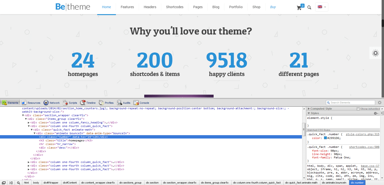
12.4.2 Firebug for Firefox
Apart from Google Chrome, we suggest using Firebug for Firefox. In contrast to Google Chrome, Firebug must first be installed before you can use it. To do so click Firefox in the left top corner > Add-ons search for Firebug, and install it. Once it is in your browser you can use it the same way as Google Chrome, but instead of clicking "Inspect element" click "Inspect element with Firebug". On the screen below you will see that it looks very similar to Inspect Element in Google Chrome.
As you can see on the image, on the left side there is a list of styles used for each class/id. If you want to change anything you can edit it on the screen and check what the elements look like. If everything is good, and you want to make the same changes on your site, simply copy the correct styles from for the box
#weekly-features .inner-border {
     height: 80px;
    padding: 20px;
}
and paste this code into: Theme options > Styles > Custom CSS code. If you want to paste this code instead of Custom CSS code you can do it in style.css file. The result will be identical.
As you can see, it`s not difficult to use either tool and you can save a lot of time.
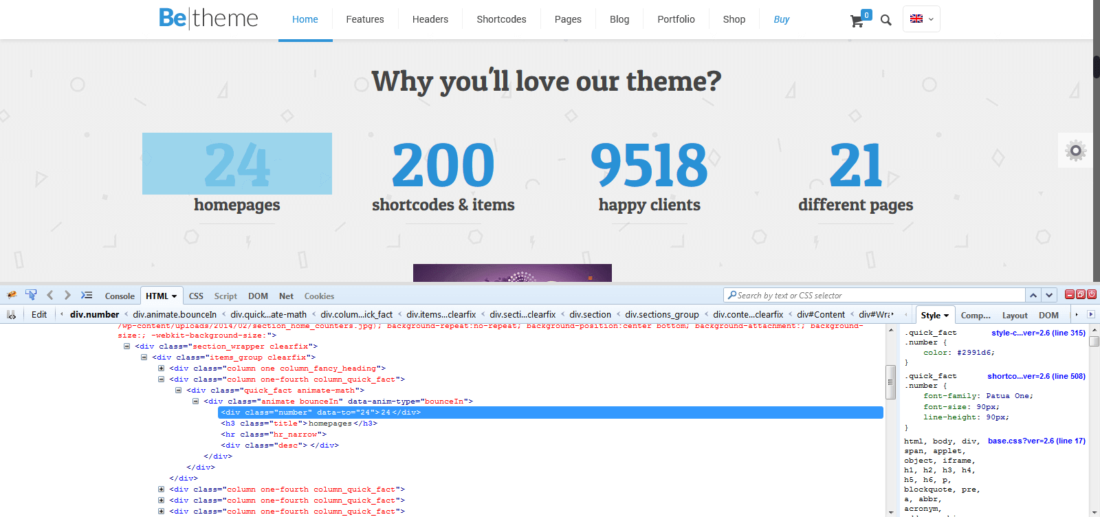
13. Hosting


3.3 Social icons
To set up social icons, right top corner, navigate Appearance > BeTheme Options > Social > Social Icons and set up links for social profiles.
Please Note: Each external link should always start with https://